


NISSAN FE TOKYO RACE
-
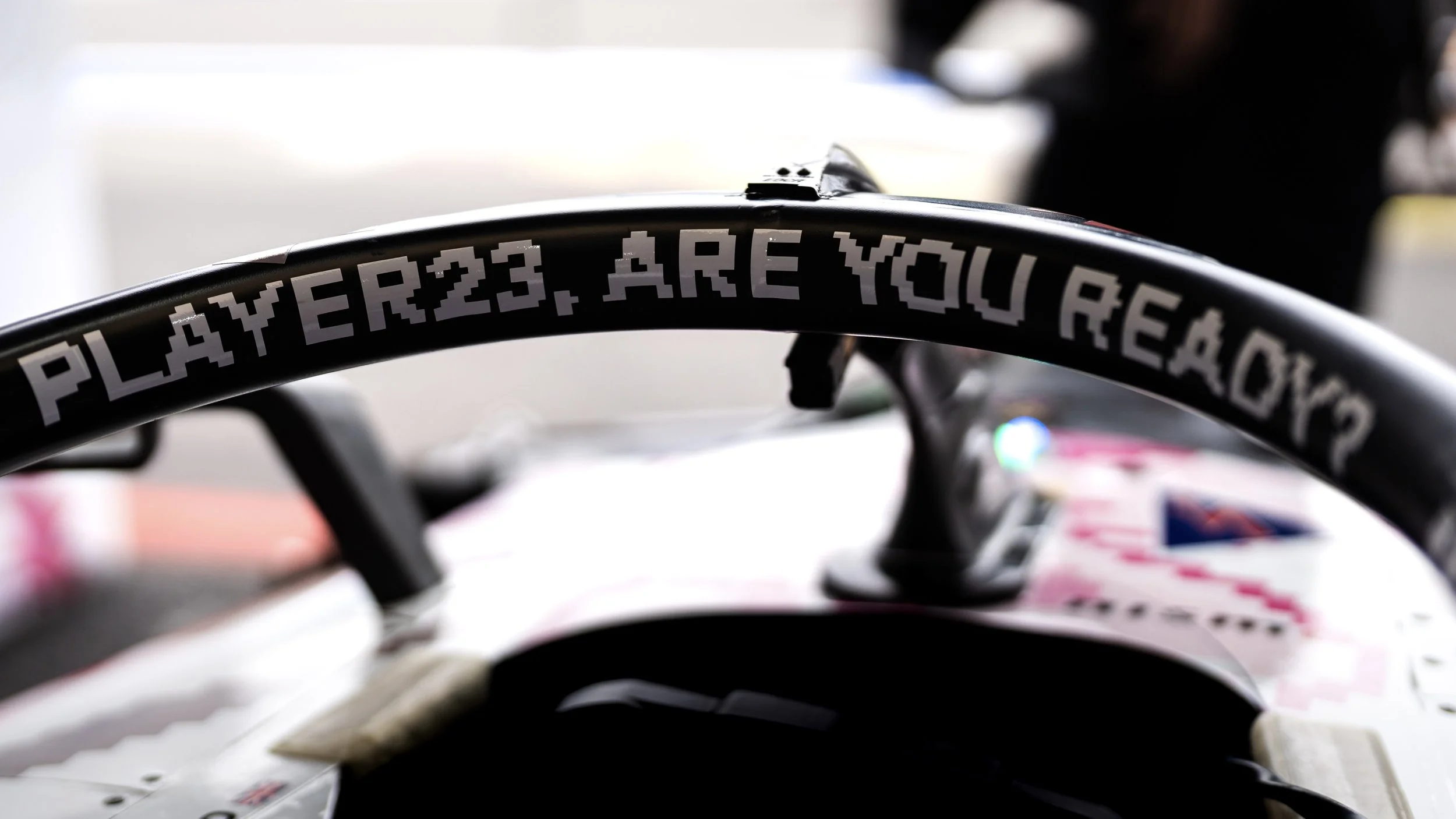
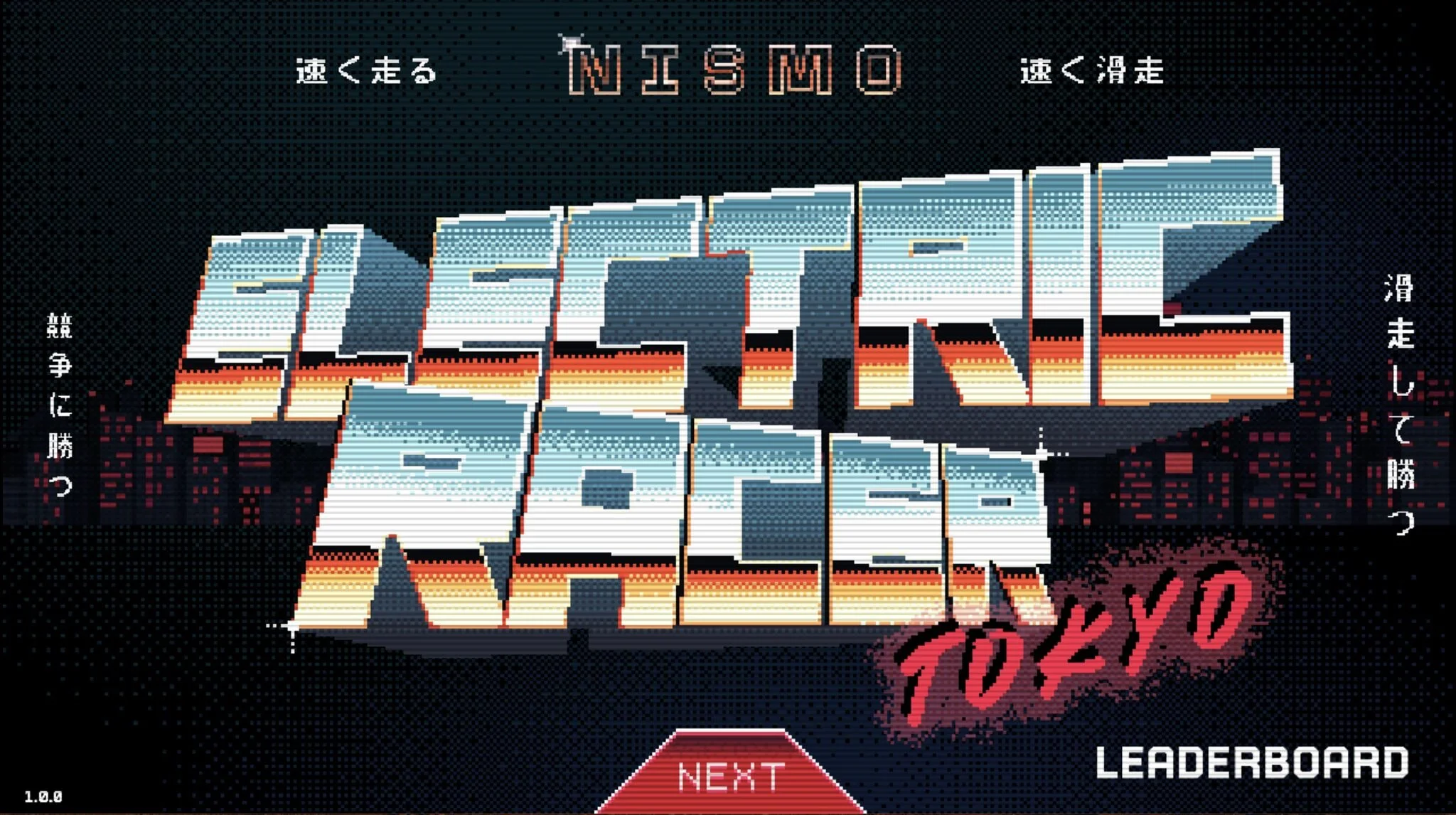
We created Nismo: Electric Racer, an 8-bit racing game to celebrate the Nissan Formula E team’s home race in Tokyo. I had the chance to design a special livery for it, working with Japanese illustrator Kentaro Yoshida.
When developing the Nissan visual world, I found myself thinking a lot about what “Japanese design” really means.
Rather than leaning on surface-level “Japaneseness” the kind that often gets flattened into symbols, I tried to explore something more personal. Something messier, more electric, and alive.I called it a shift from Japaneseness to Japan-ness.
Not just what Japan looks like, but what it feels like to grow up in it, to love it, and to rethink it from the inside out.Designing something for my hometown was one of those rare moments where everything clicked. It wasn’t about aesthetics anymore. It was about essence.
Client: NISSAN FE TEAM
Role: Designer
Year: 2025
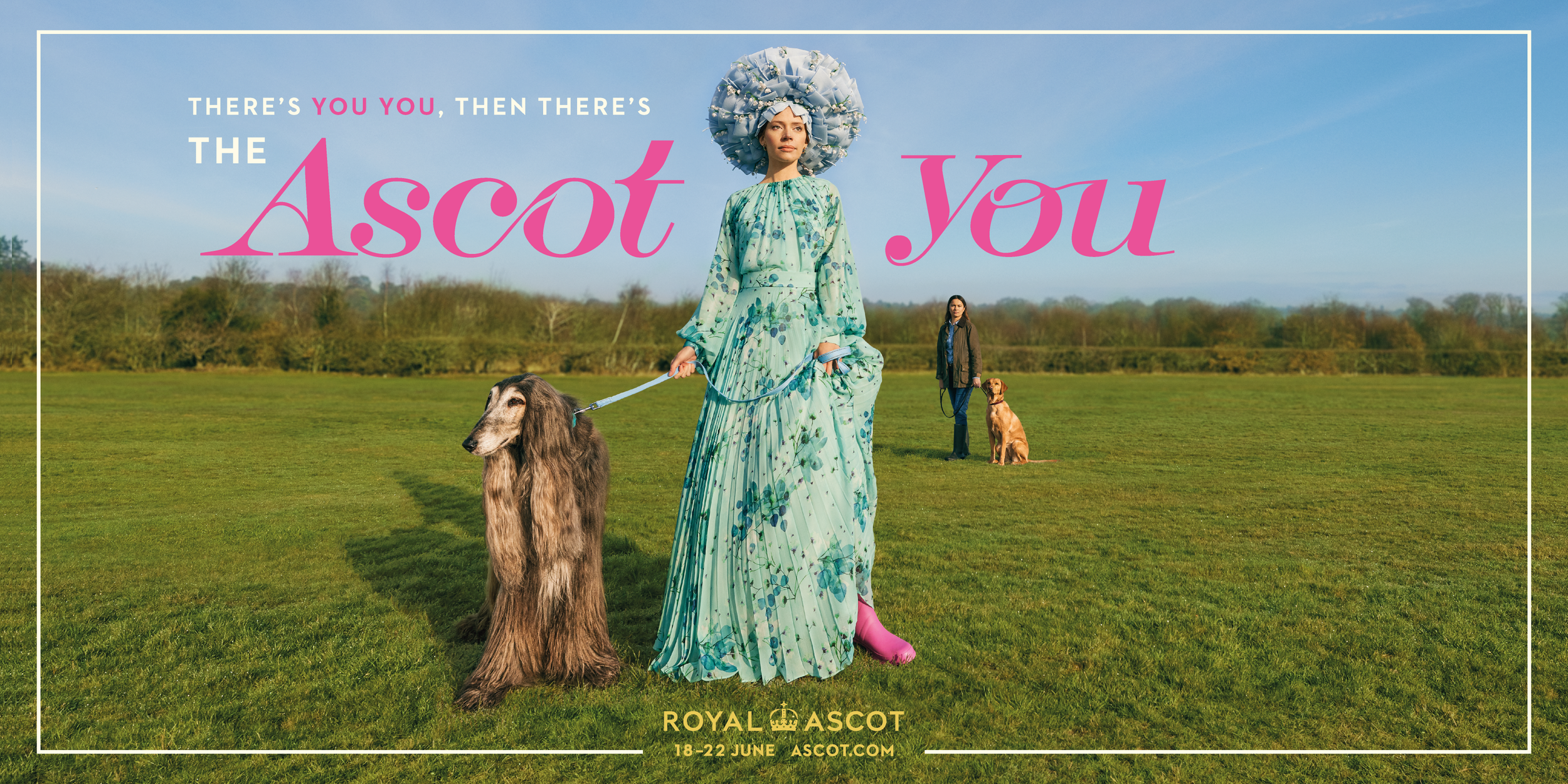
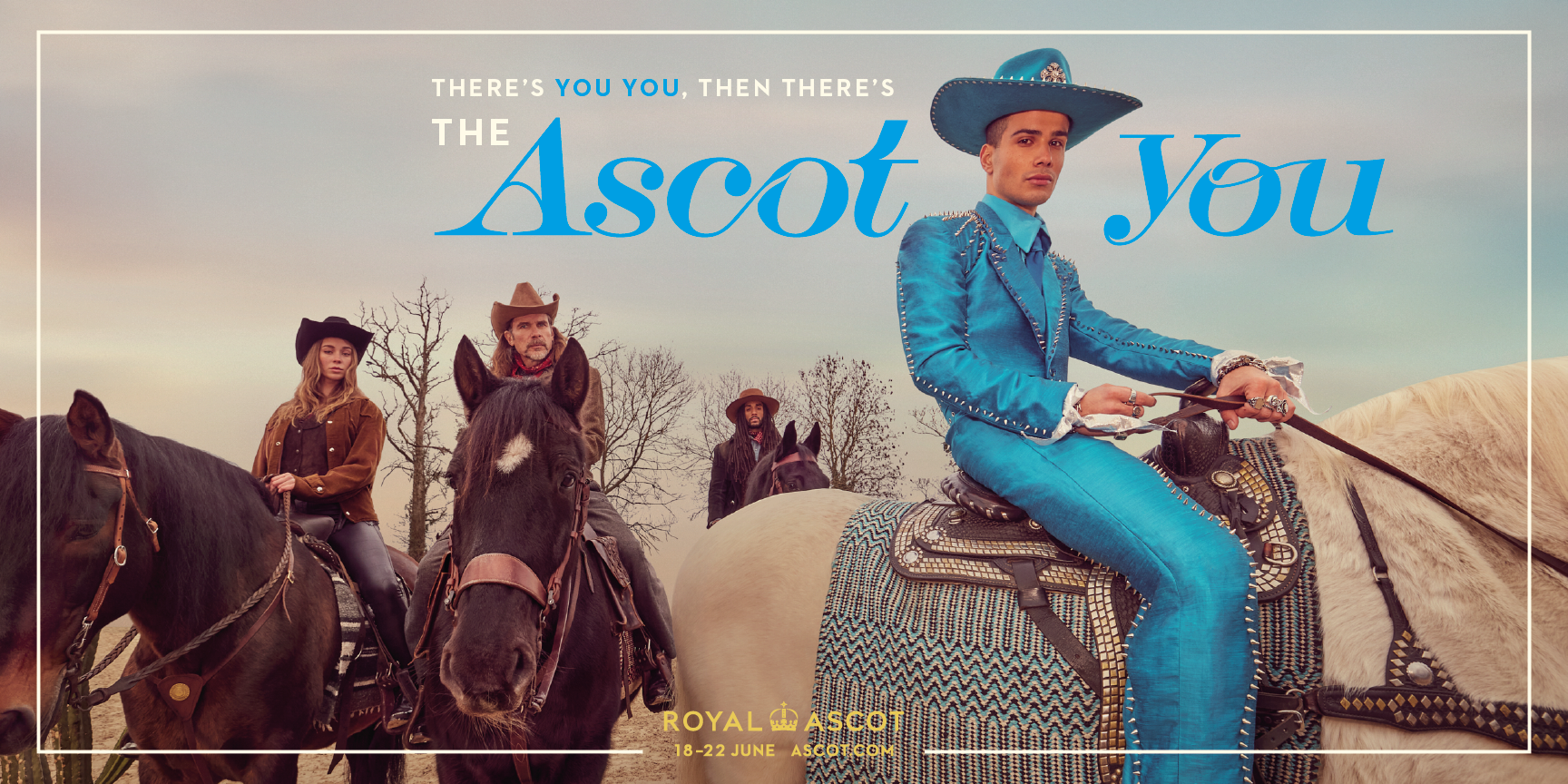
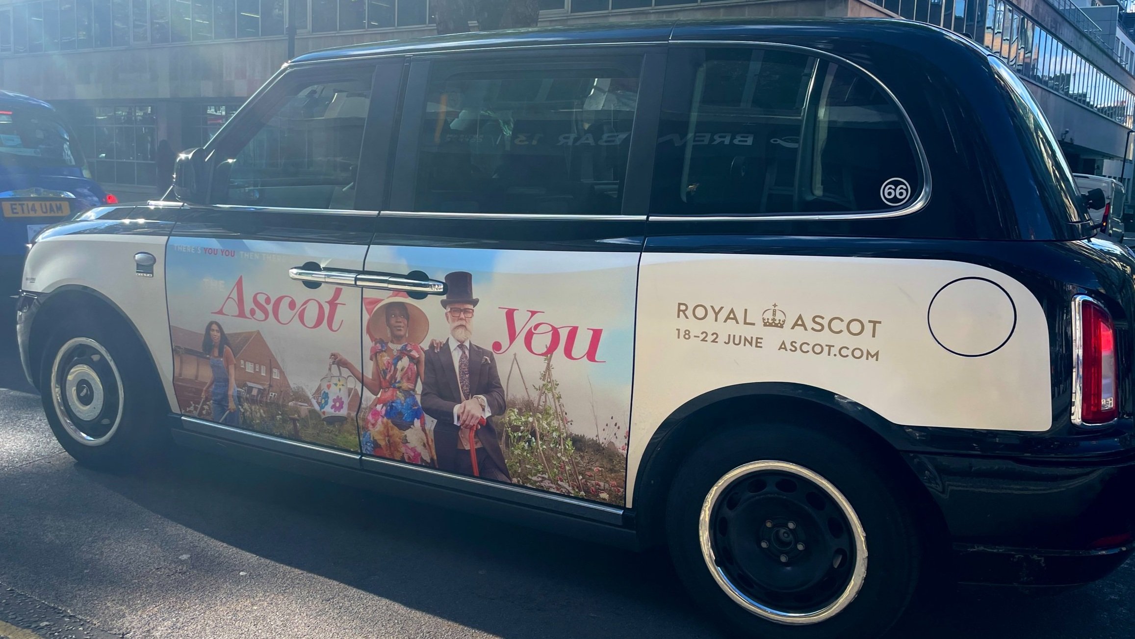
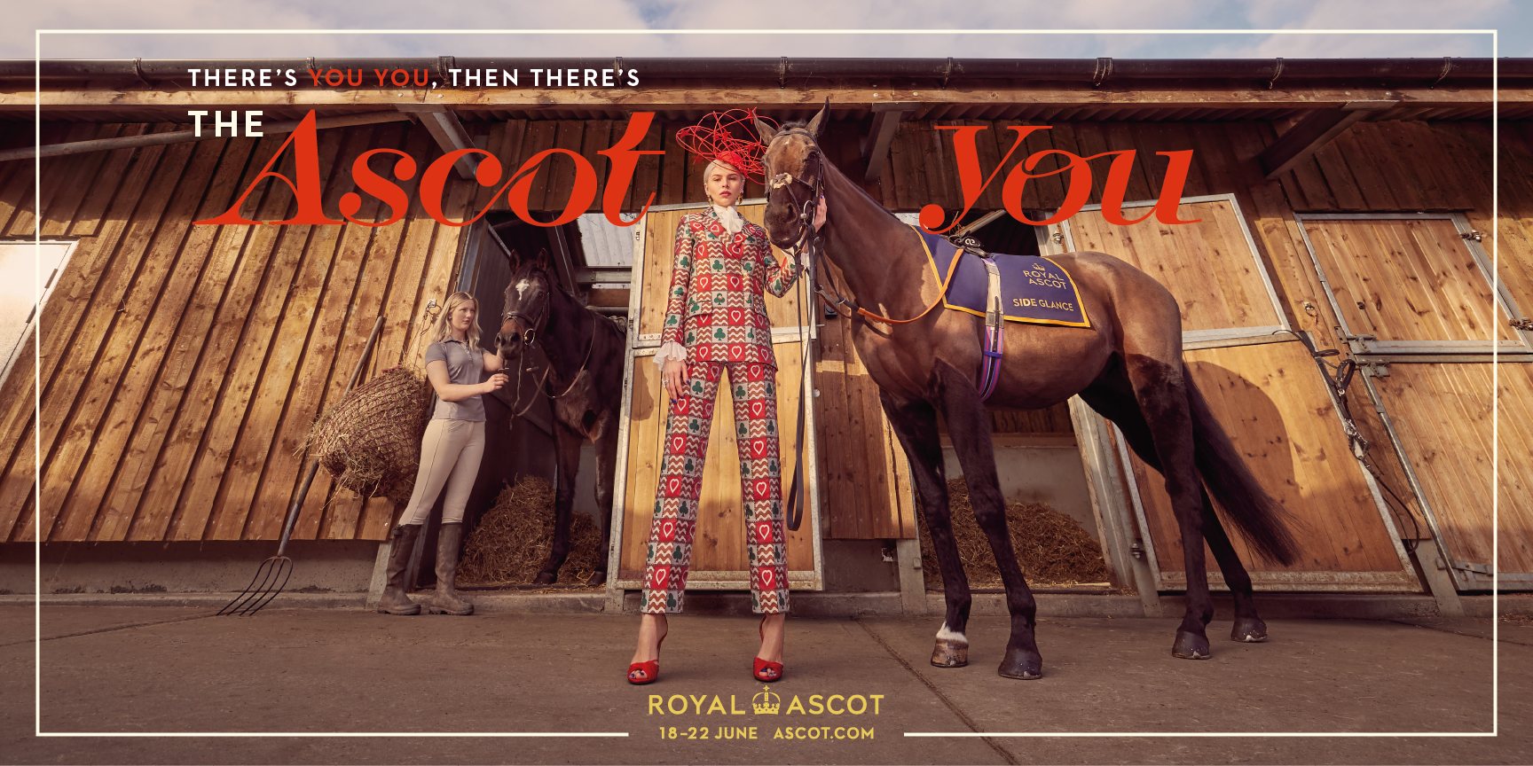

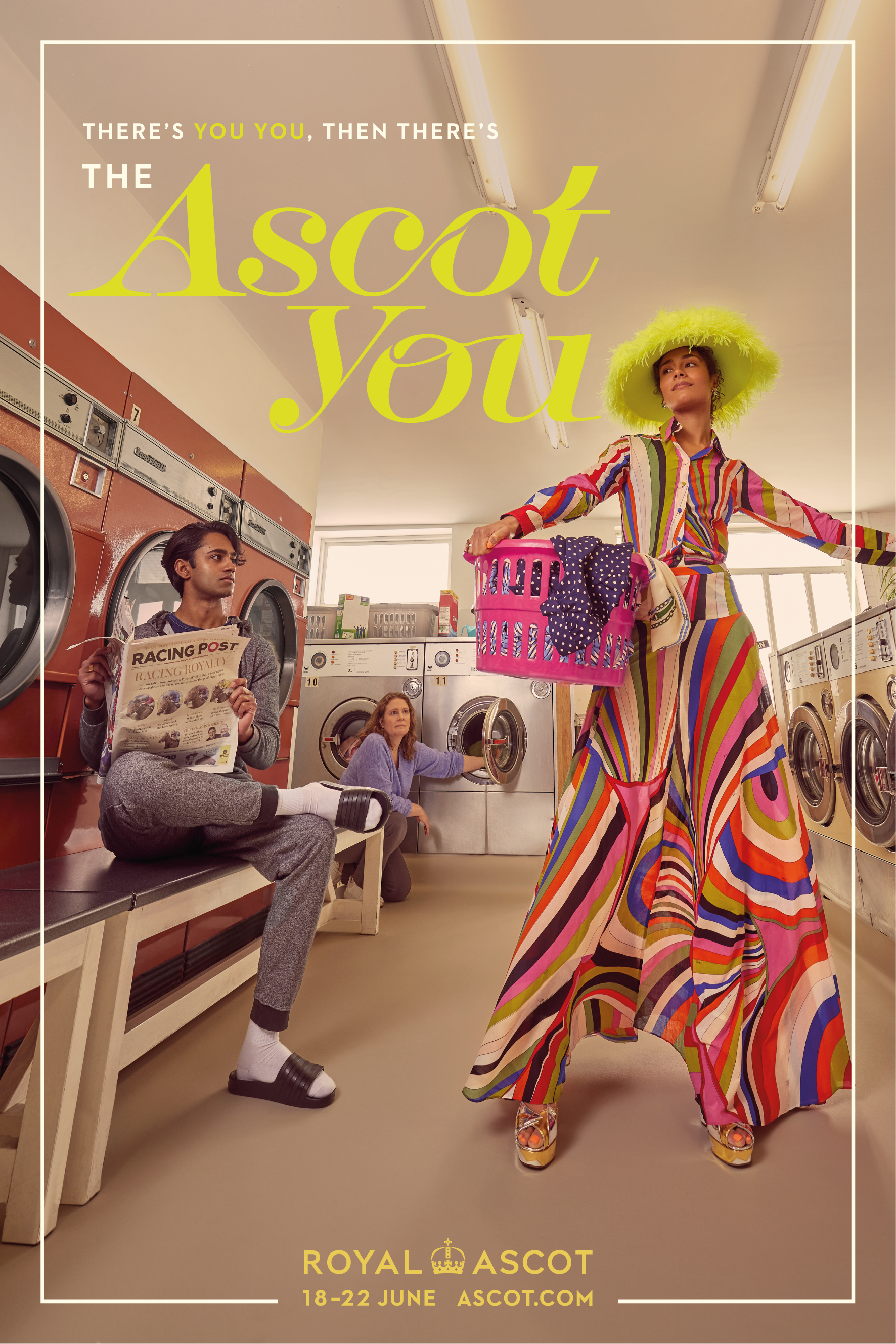
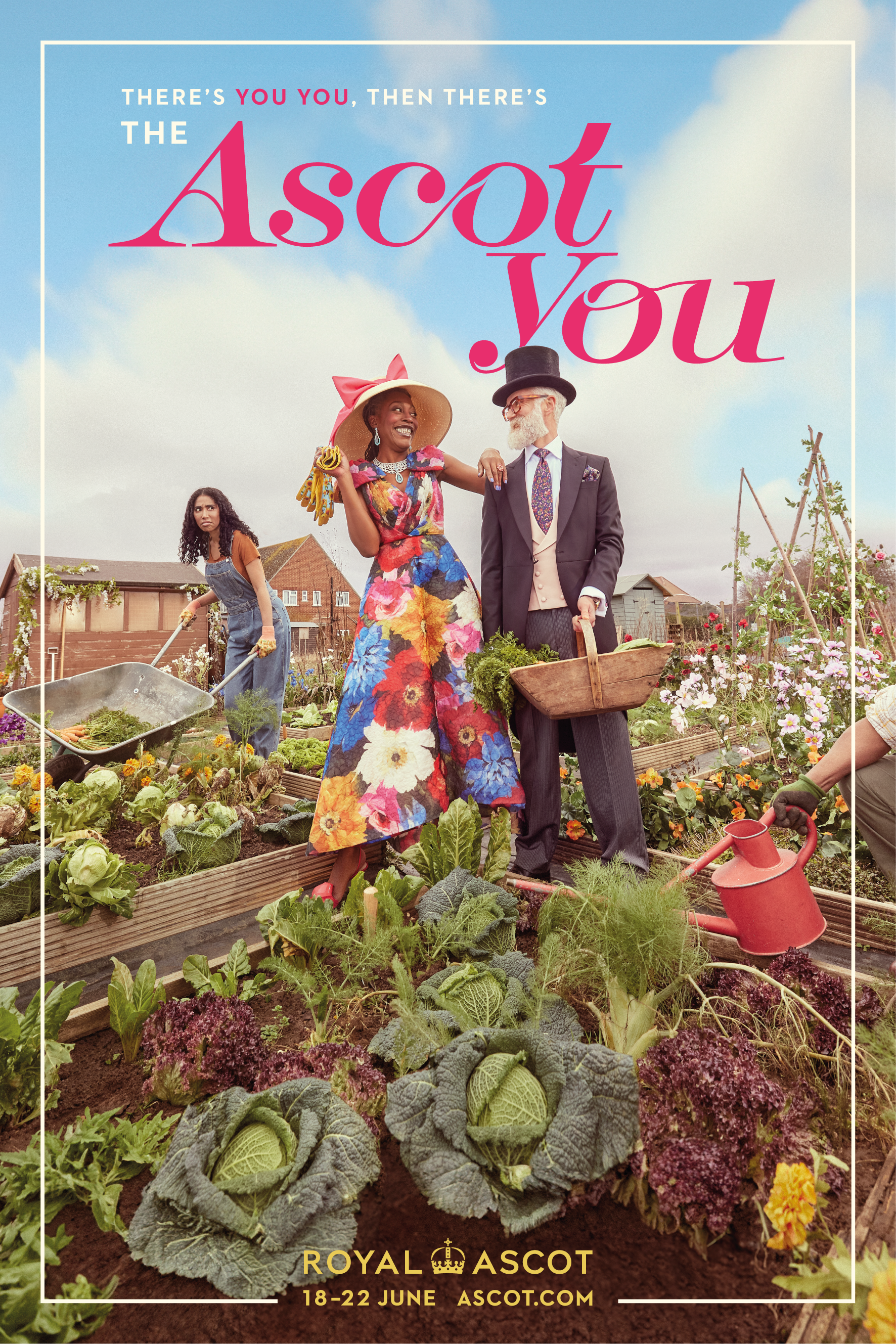
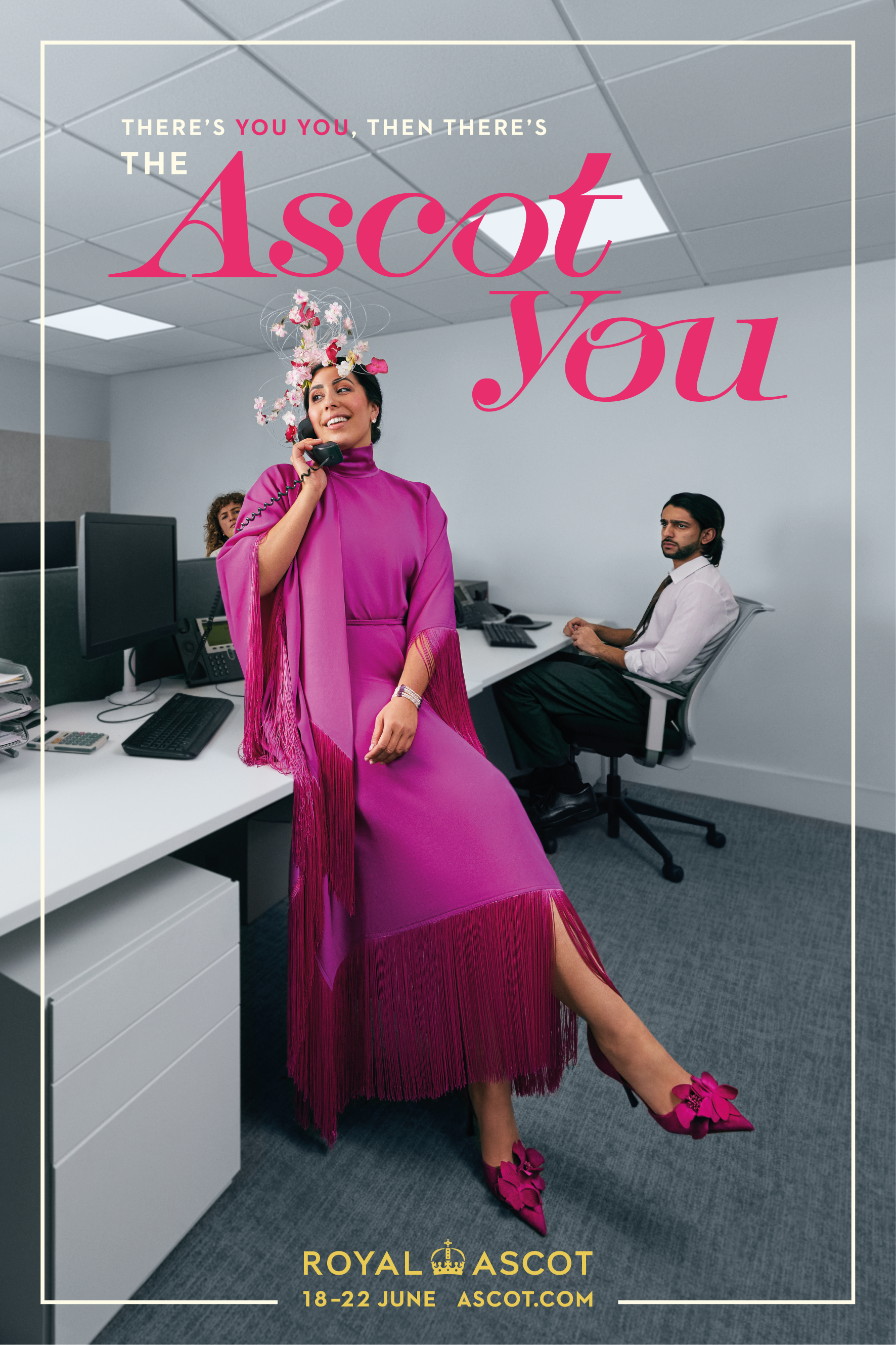
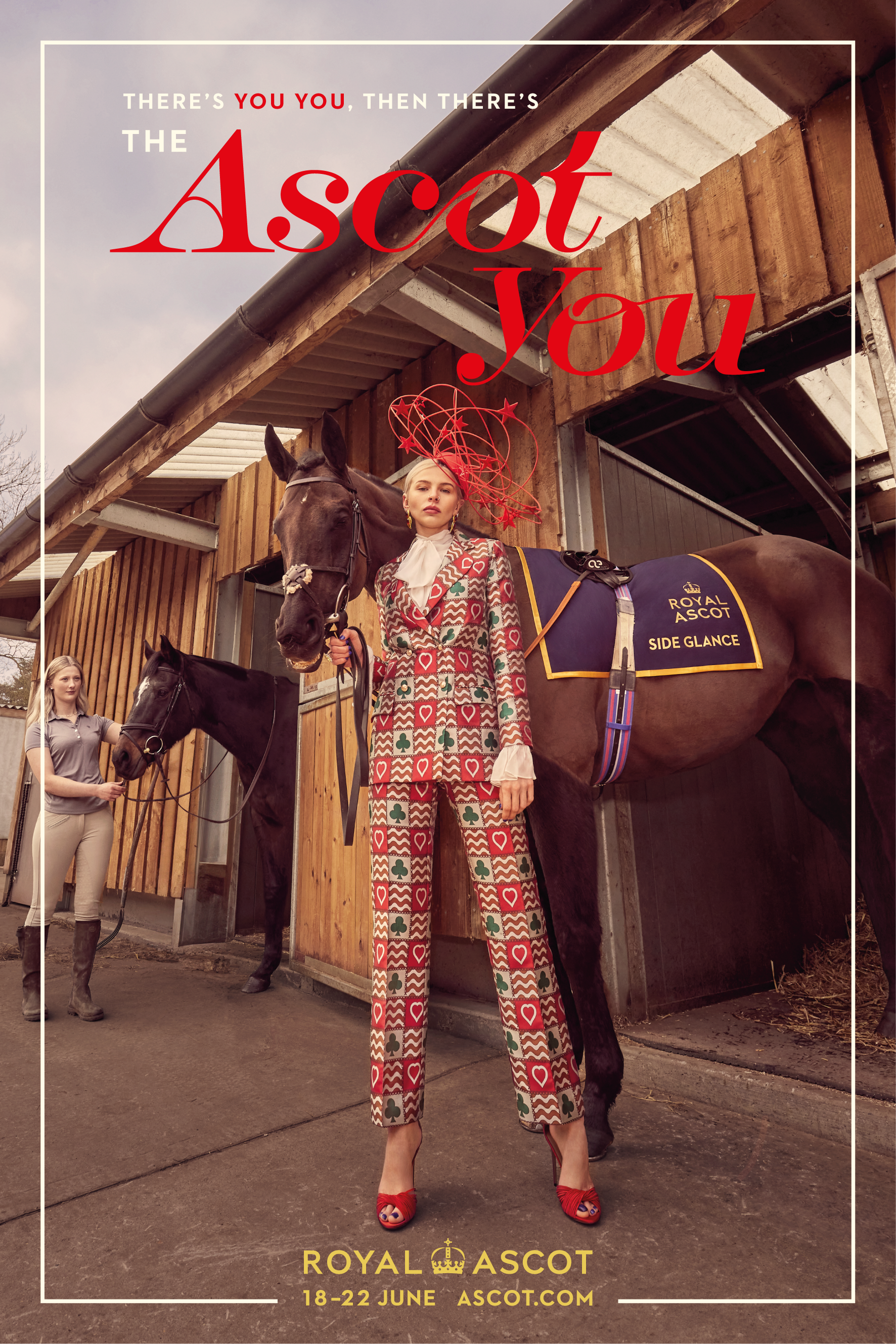
ROYAL ASCOT
-
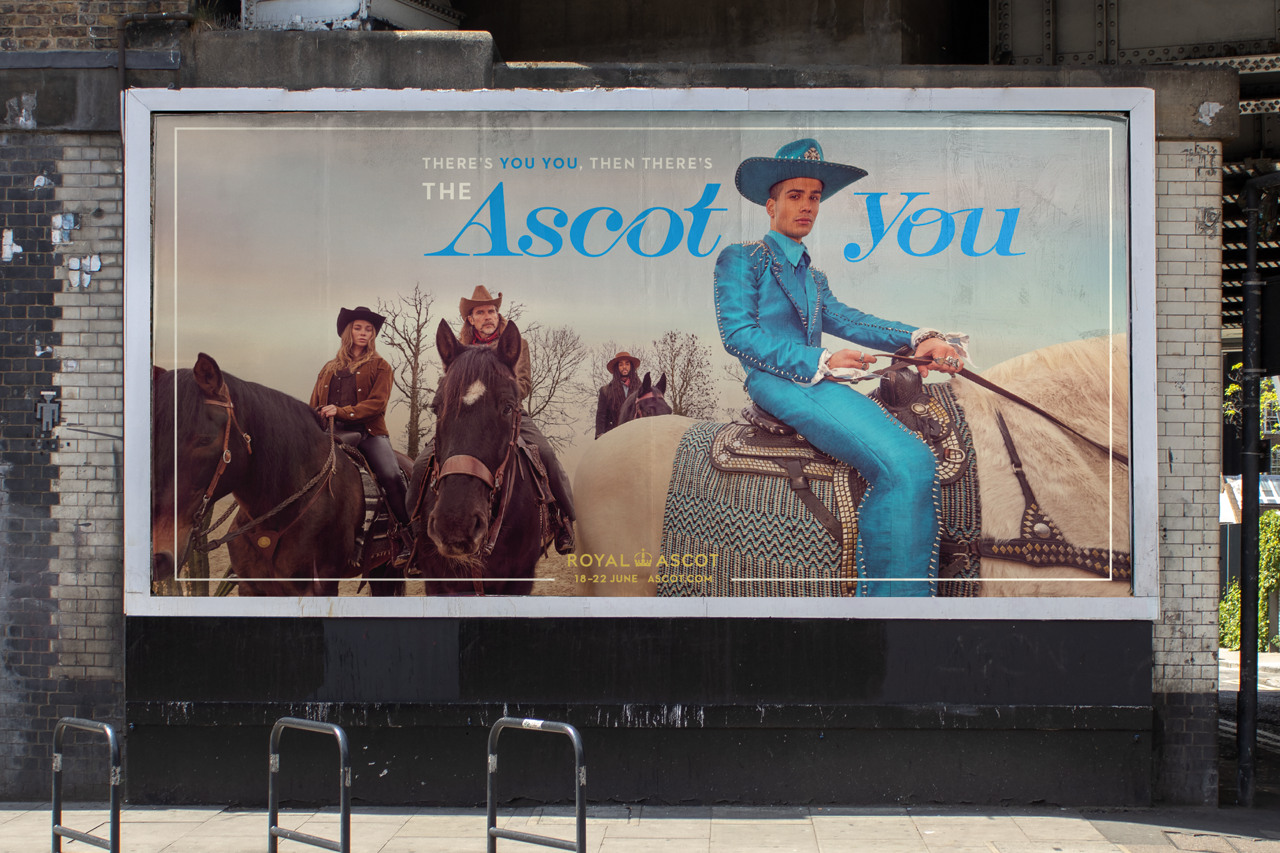
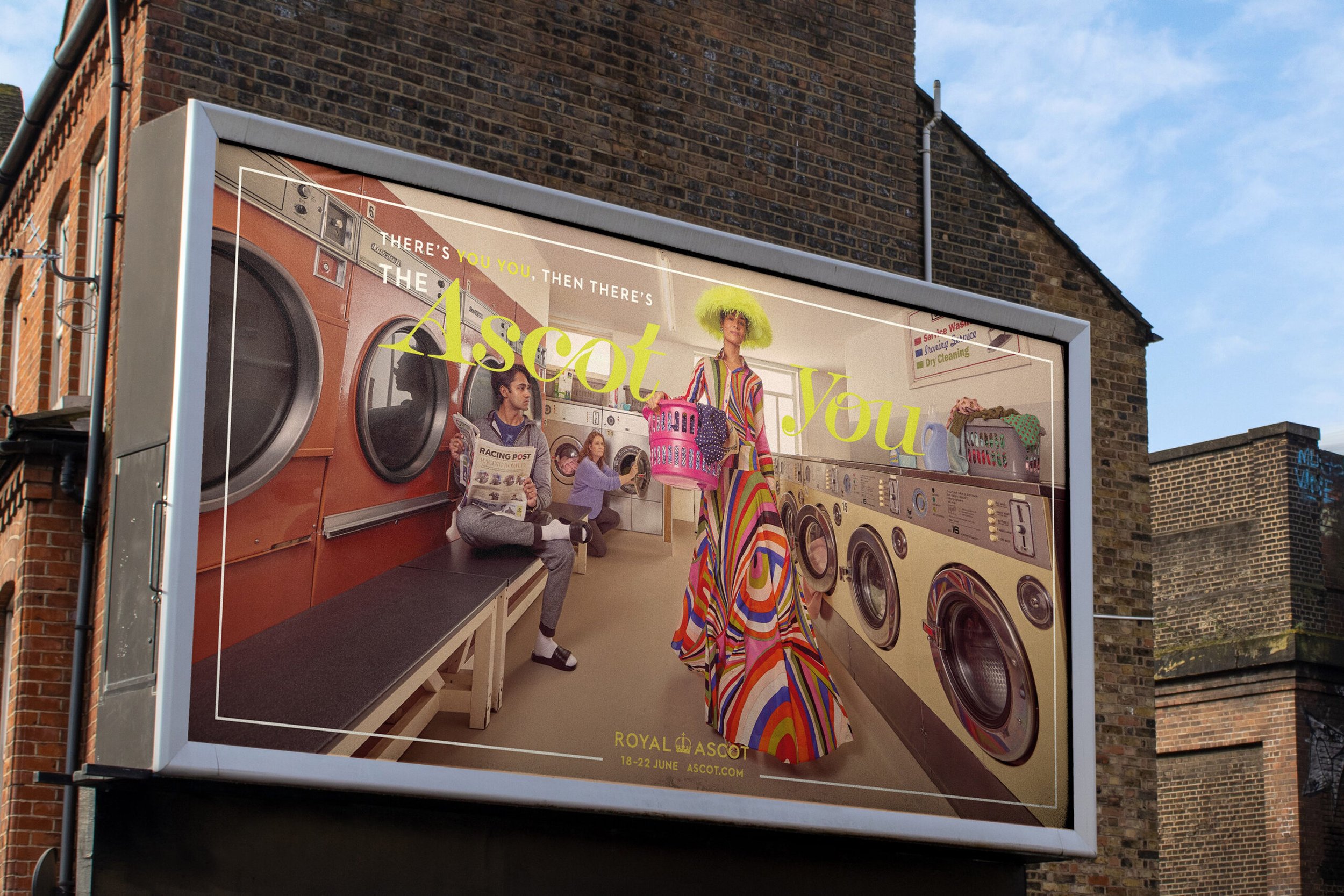
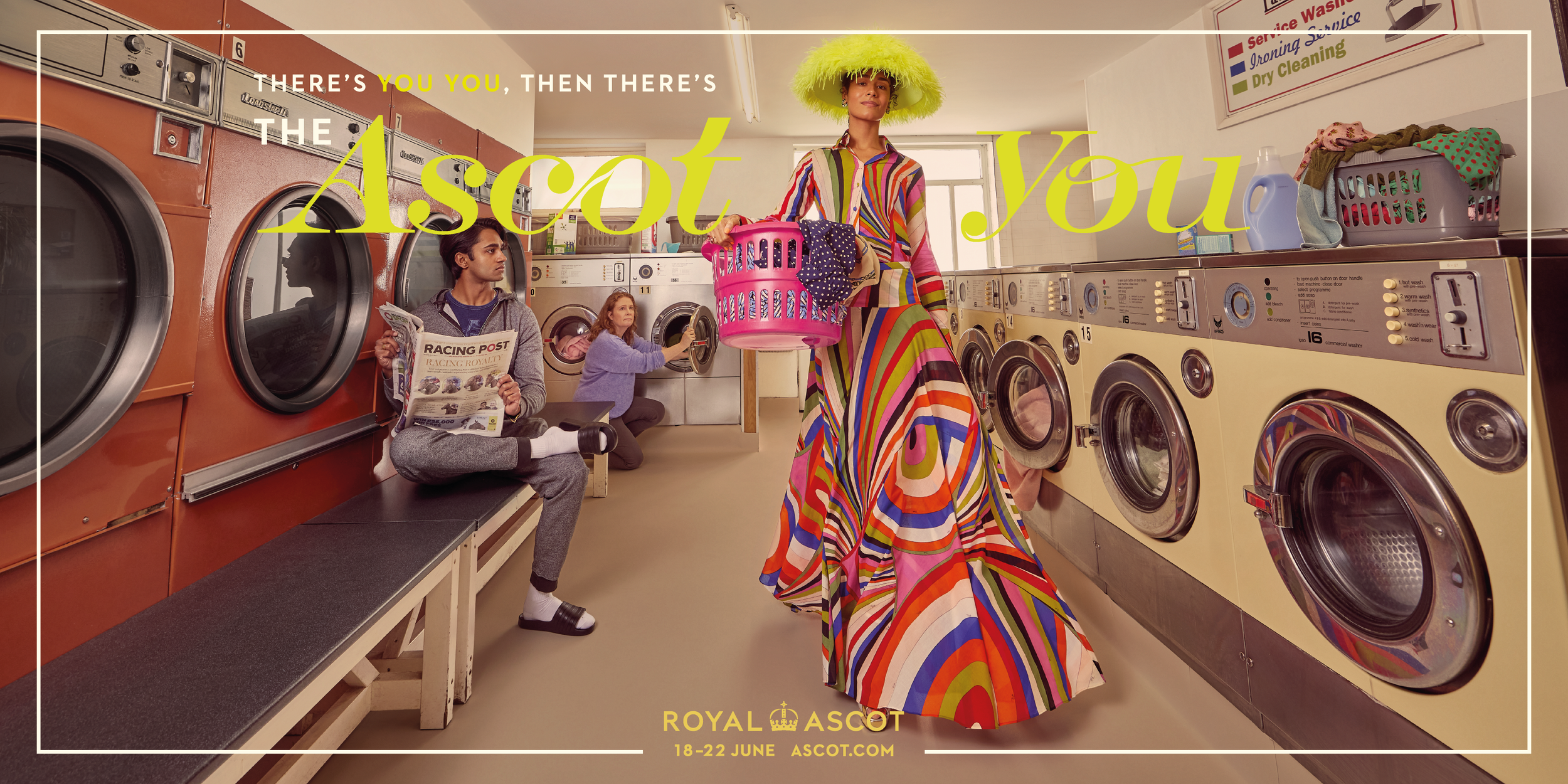
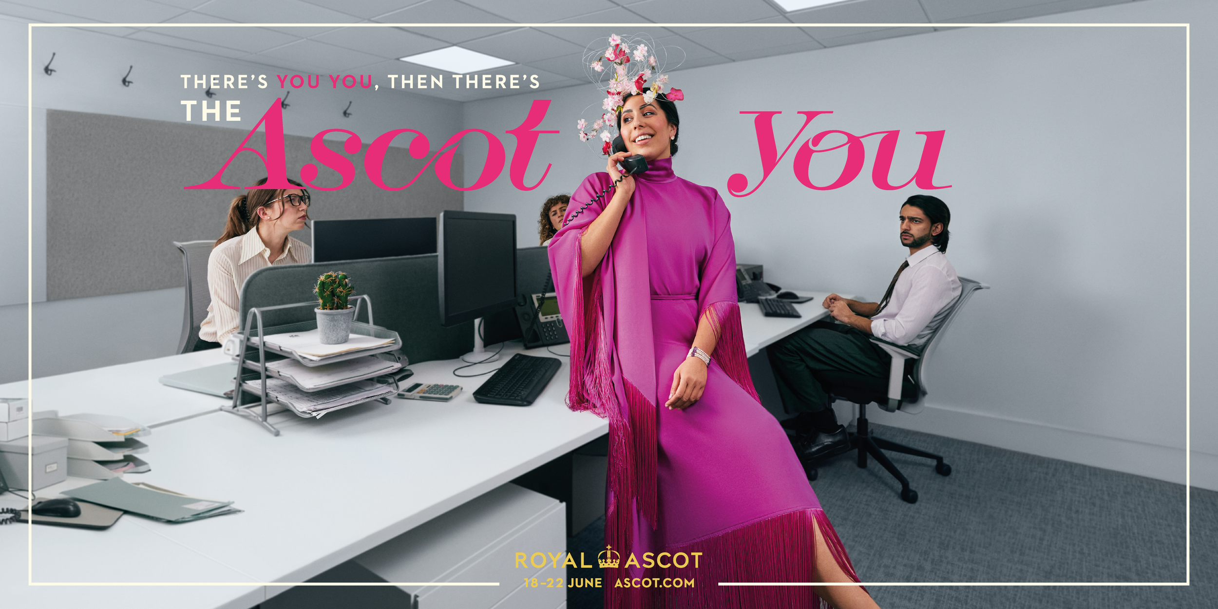
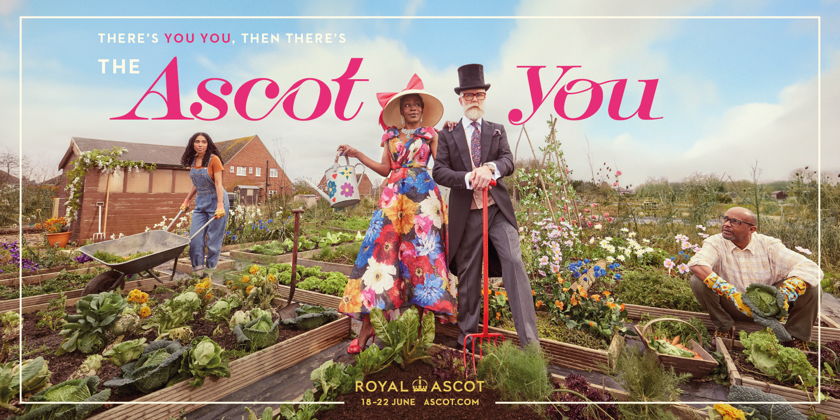
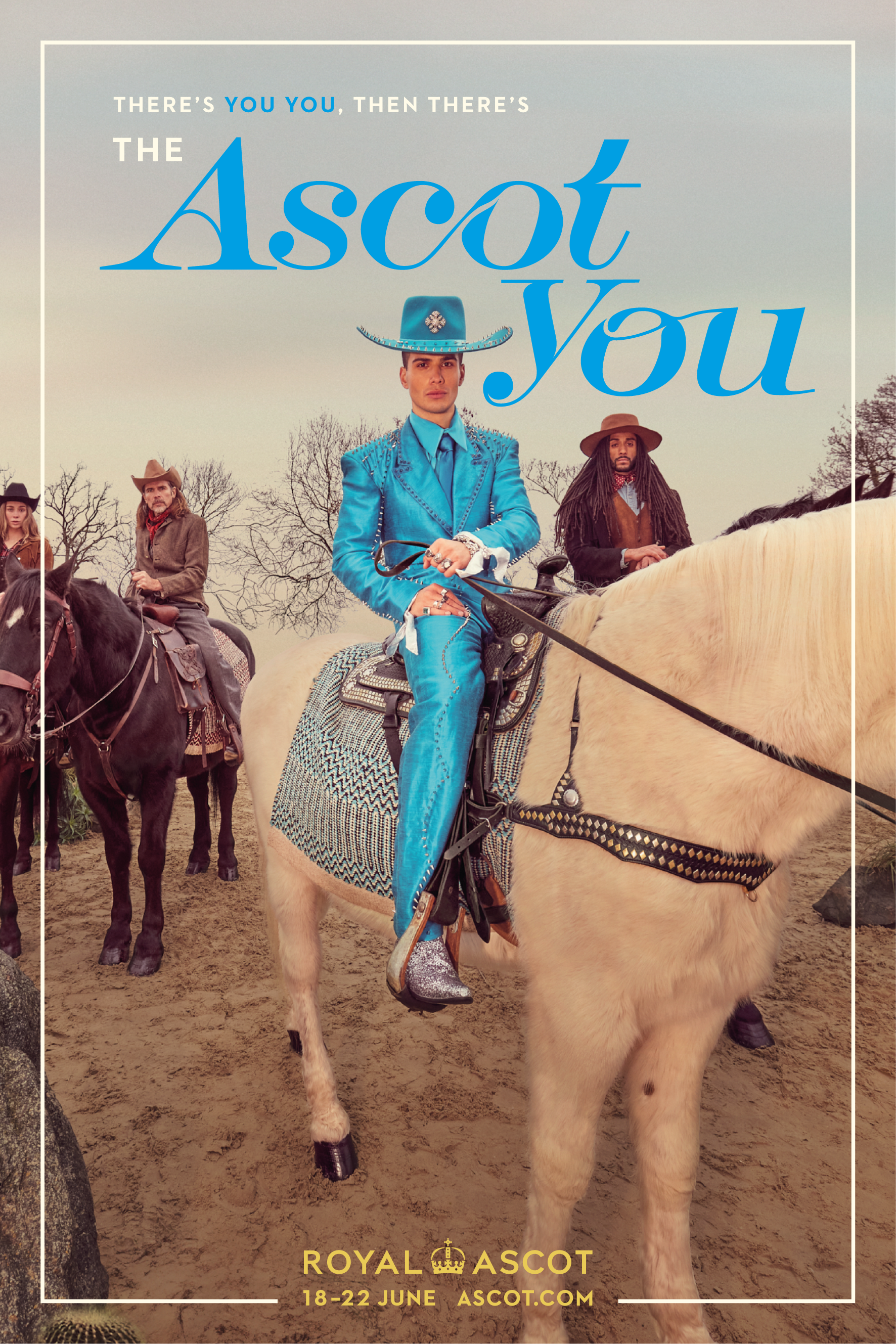
There’s YOU YOU, then there’s ASCOT YOU
“The Ascot You” campaign returns for a second year running, reminding audiences that everyone has an inner elegance which can be released at the world-renowned Ascot Racecourse.
For the 2024 Ascot You campaign, I focused on pushing the visual language to its most elegant extreme — especially through a custom typeface I created just for this project. Because if you're going to become Ascot You, even the typography needs to be dressed for the occasion.The idea was to reflect the transformation into your “Ascot self” not only through imagery, but in every detail of the design. The bespoke typography was inspired by the exaggerated glamour and playfulness of the campaign — not just dressing up, but becoming a heightened version of yourself.
The colour palette took cues from luxurious fabrics, and layouts borrowed the confidence of fashion editorials. Every element — from the curves of the letters to the negative space — was crafted to feel like it belonged in a world where glamour isn’t optional, it’s expected.Every frame, every curve of the letters, had to feel like it belonged in a world where elegance is turned all the way up. I wanted the visuals to speak before the words did.
Client: ROYAL ASCOT
Role: Lead Designer
Year: 2024


HSBC World Rugby SVNS
-
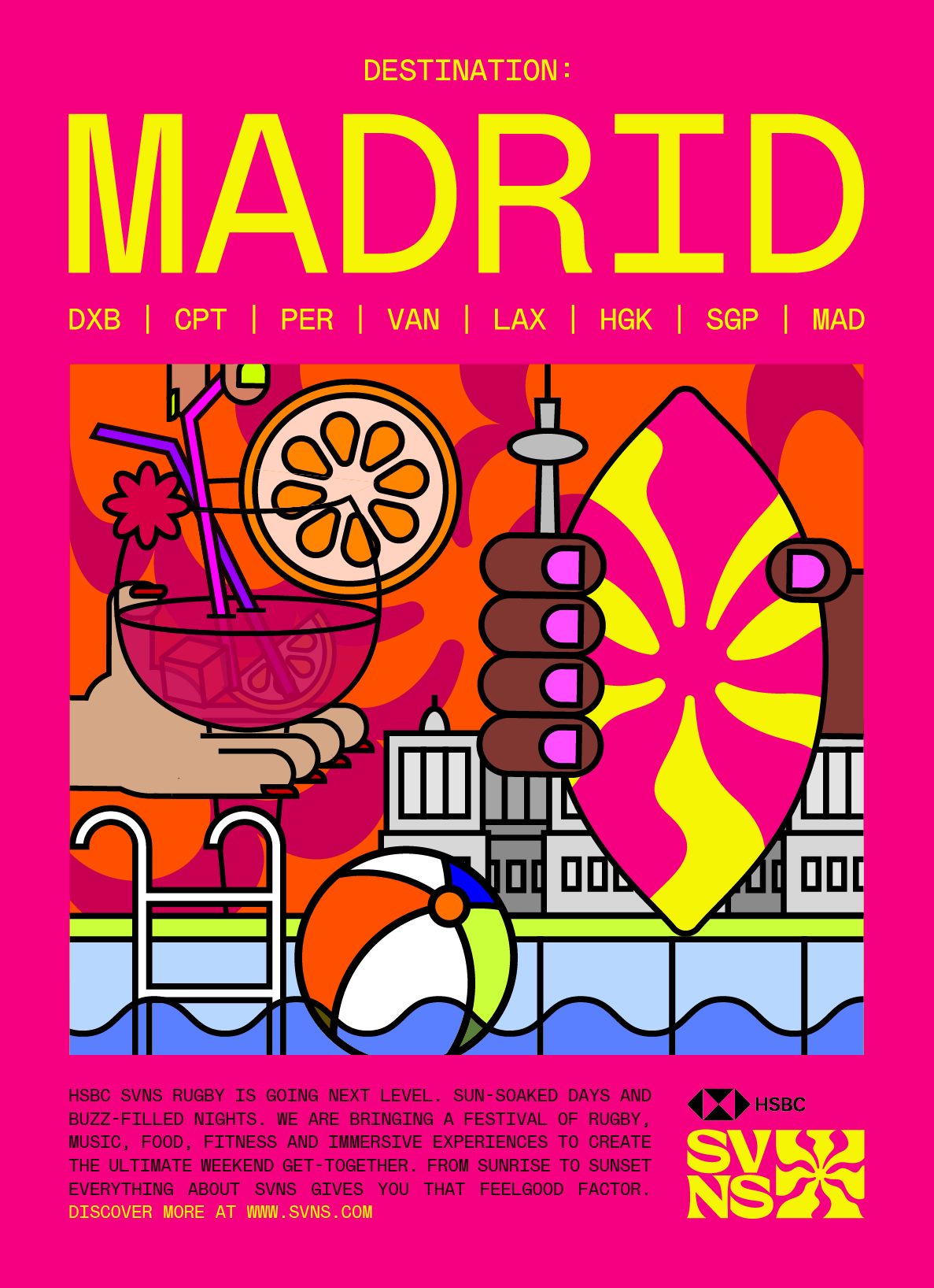
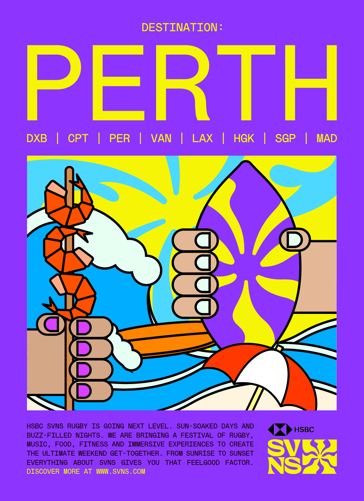
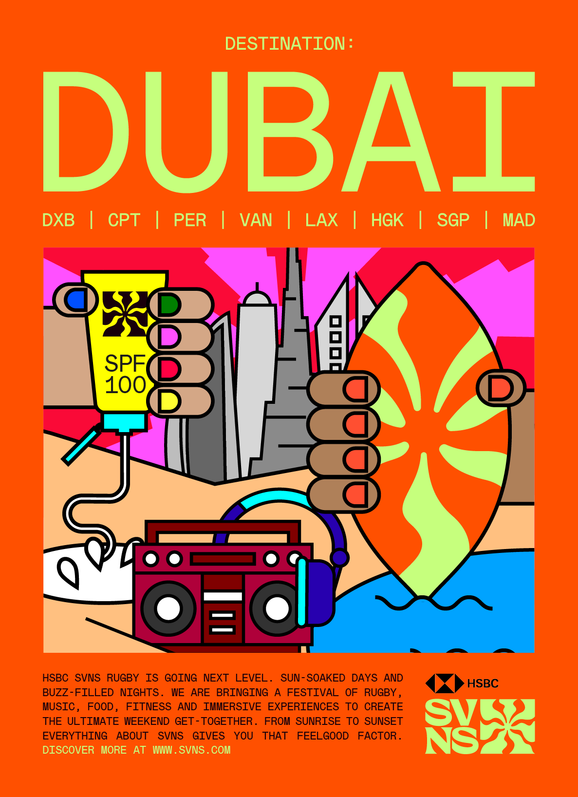
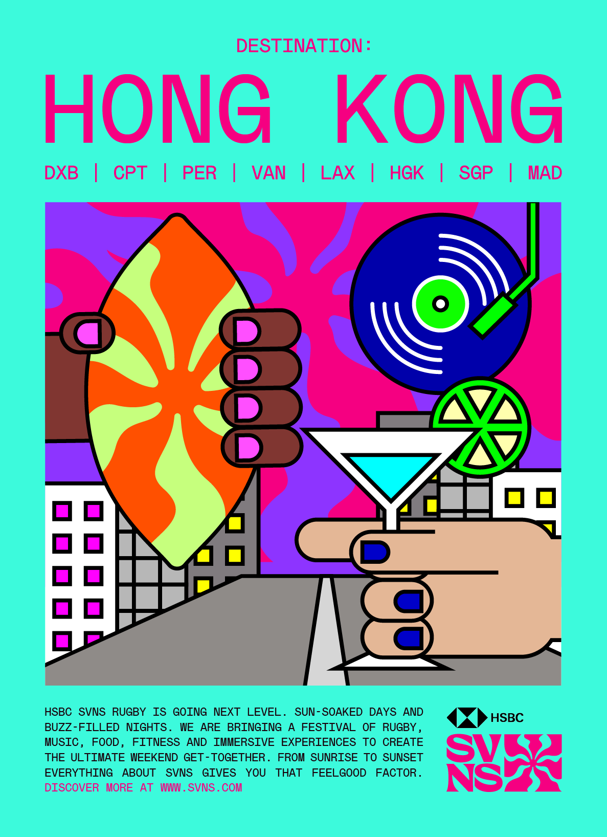
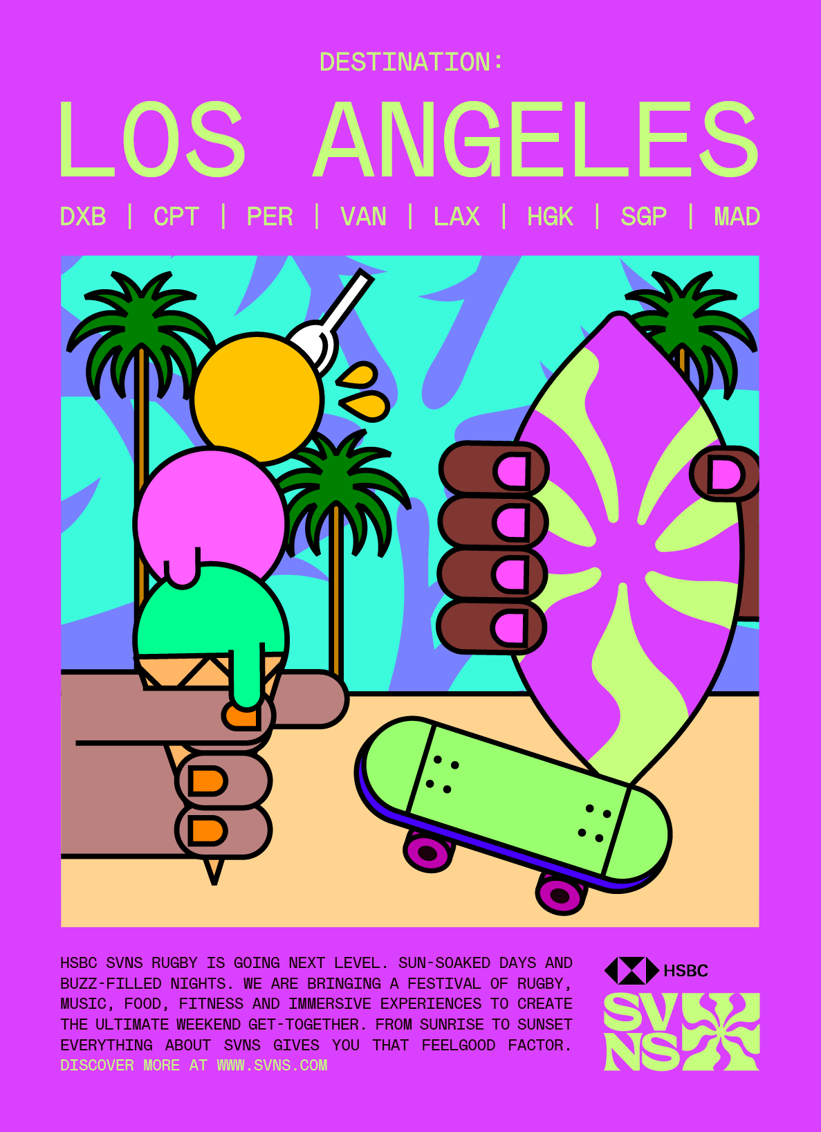
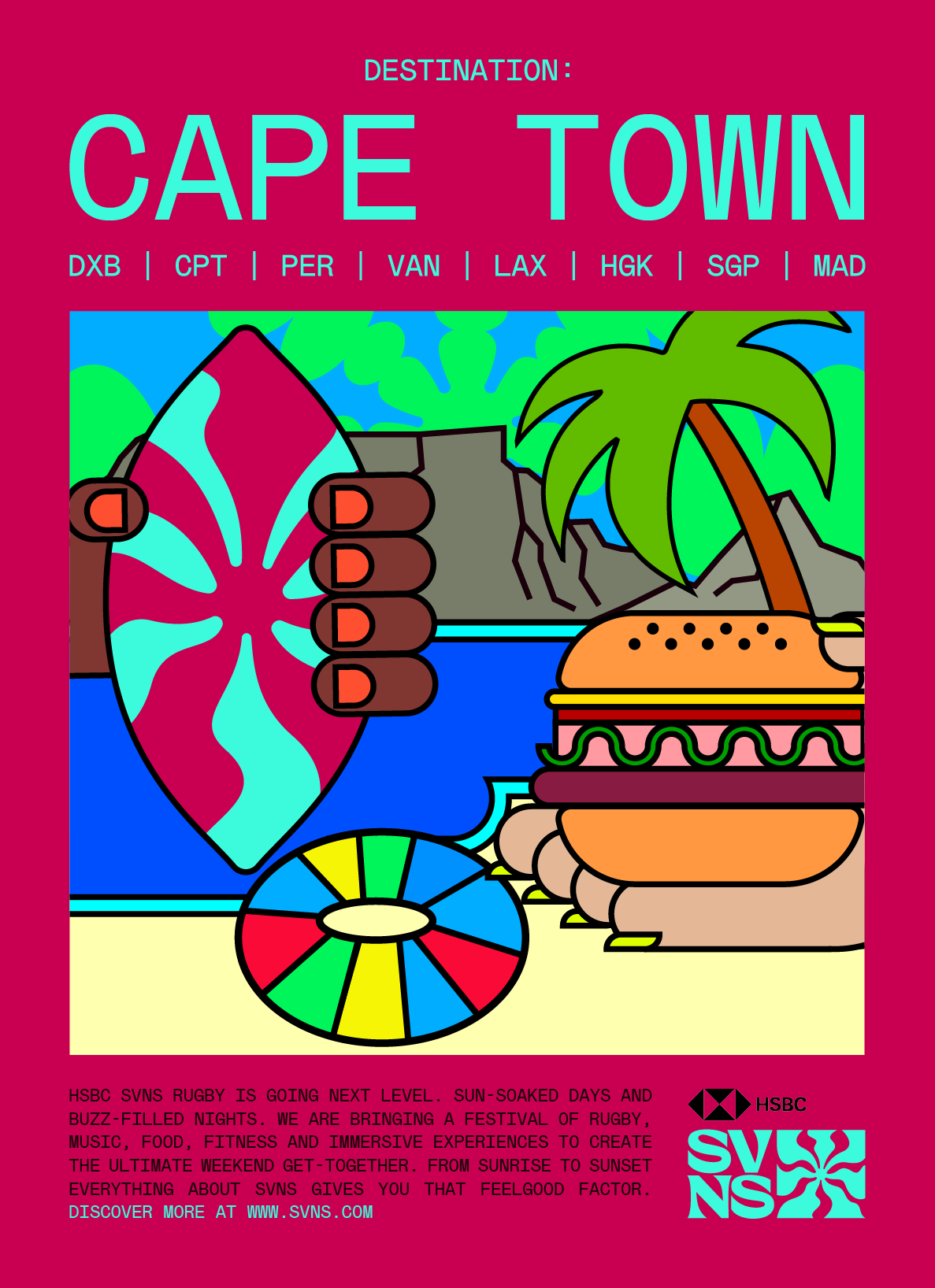
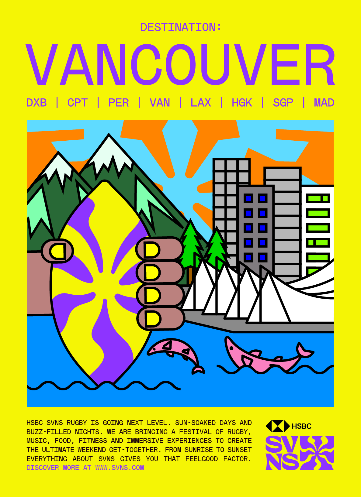
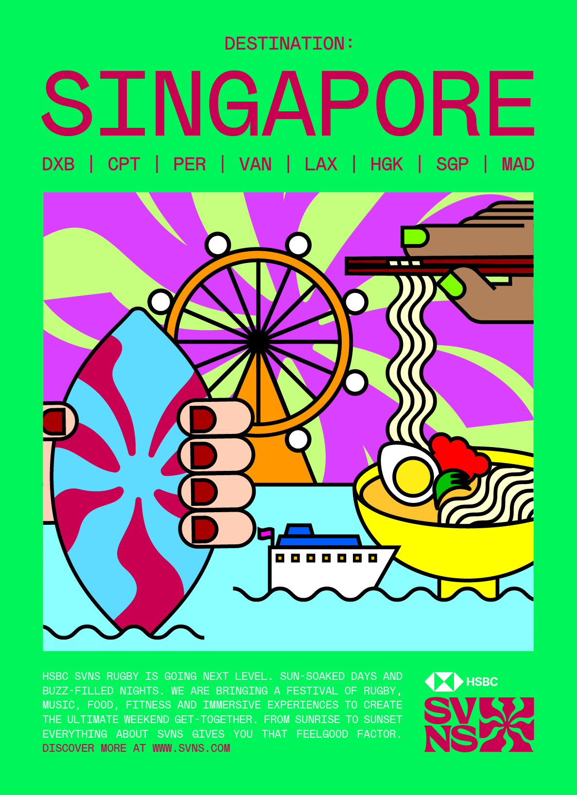
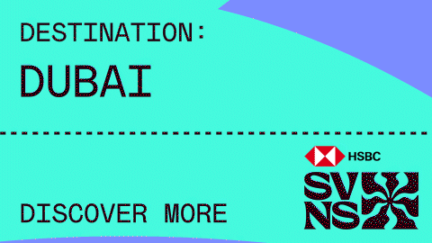
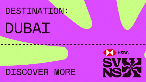
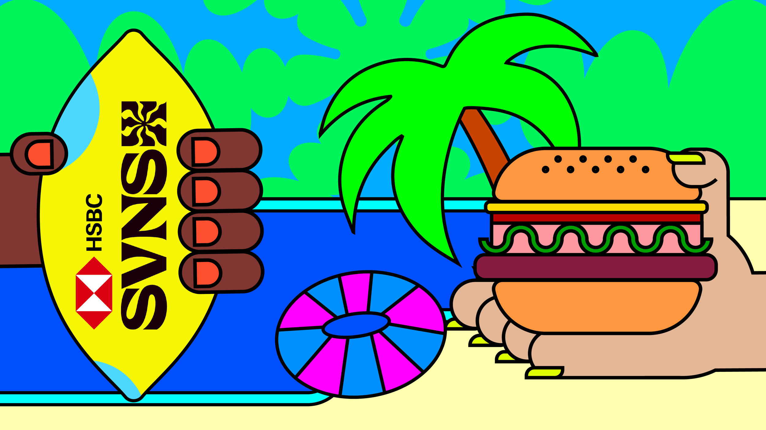
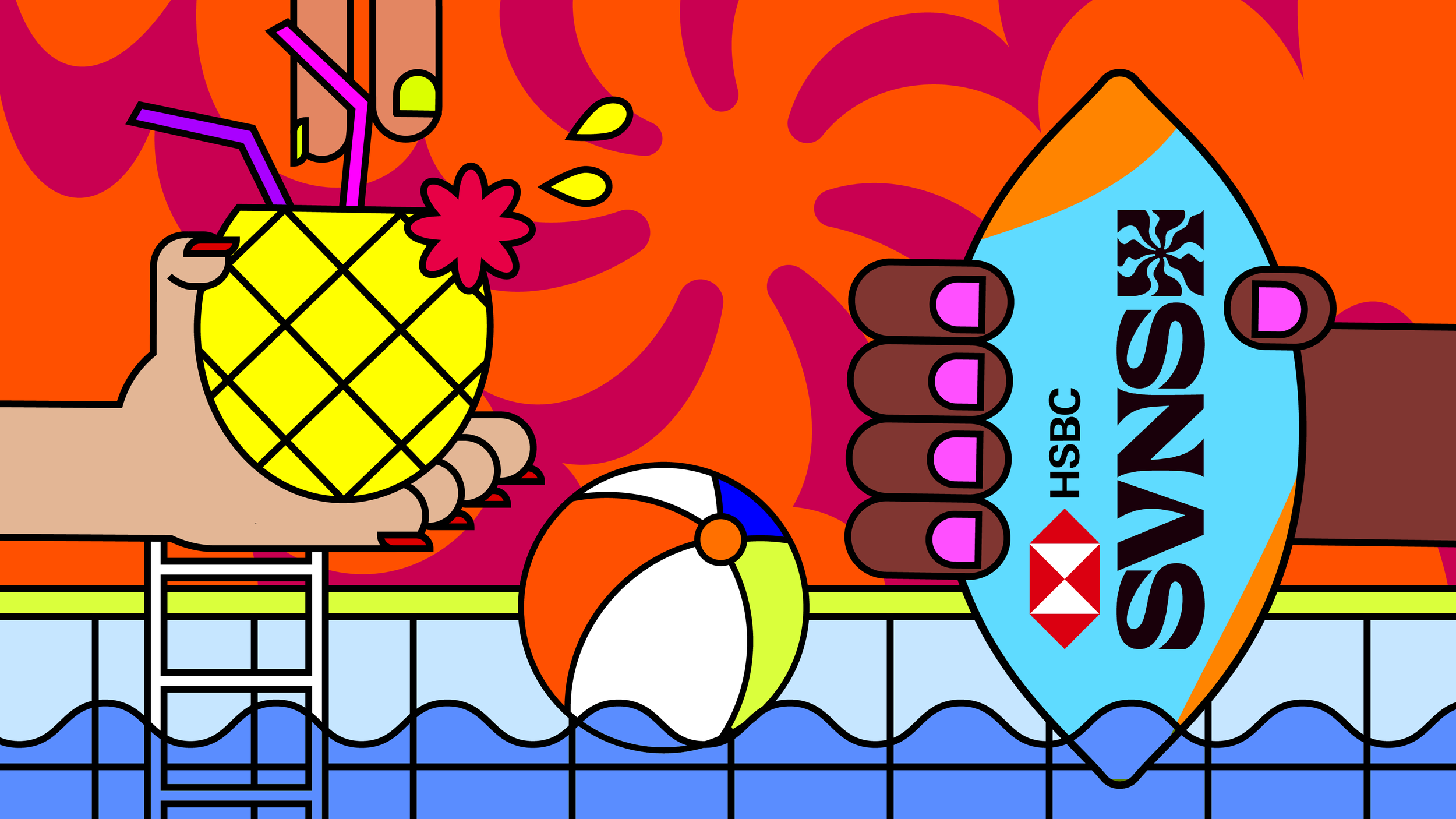
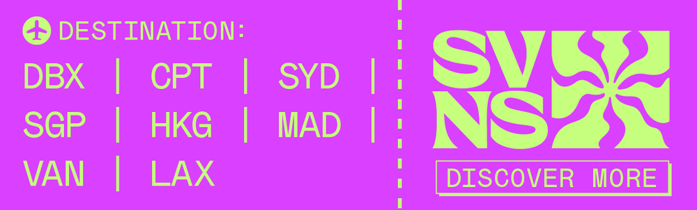
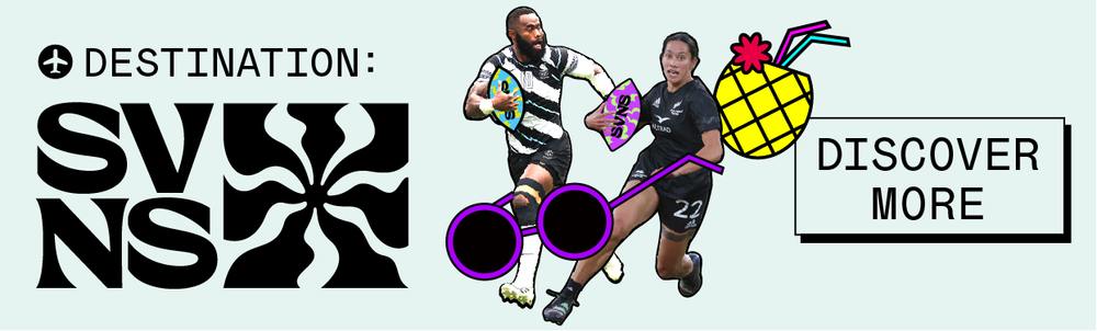
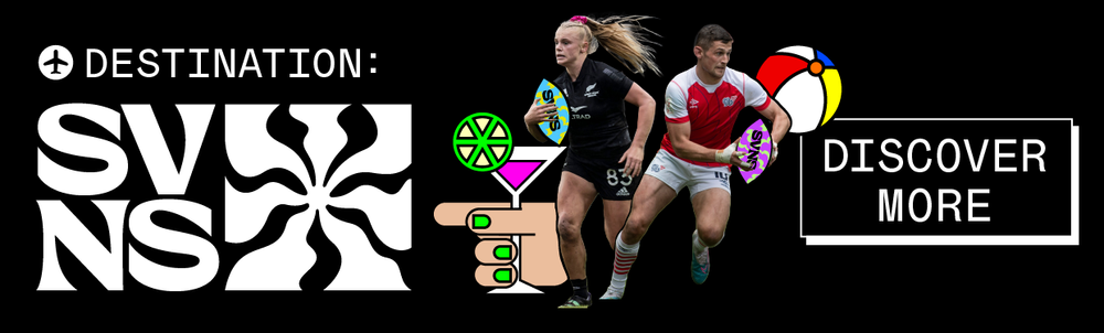
Forget Ibiza, the Caribbean, or the Canary Islands , there’s a new hot destination this year. HSBC SVNS, World Rugby’s reimagined and rebranded global celebration of rugby sevens, isn’t just a tournament, it’s a full-throttle festival across eight iconic cities.
For the “Destination: SVNS” campaign, I wanted to bring a fresh, unexpected lens to the world of rugby, something vibrant, inclusive, and graphically bold. I created a series of playful illustrations that leaned into the wild, festival-like energy of the events: palm trees clashing with rugby ball, ramen after watching game, and rugby player in dancing beach-side.
Colour played a huge role, we ditched the muddy tones of traditional sports branding for a palette that screamed “vacation mode.” Everything was designed to make rugby feel like a summer you didn’t want to miss, even if you’d never watched a match before.
Campaign Design
Client: HSBC World Rugby Sevens
Role: Lead Designer
Produced in 2023 at Dark Horses


Barclays WSL
-
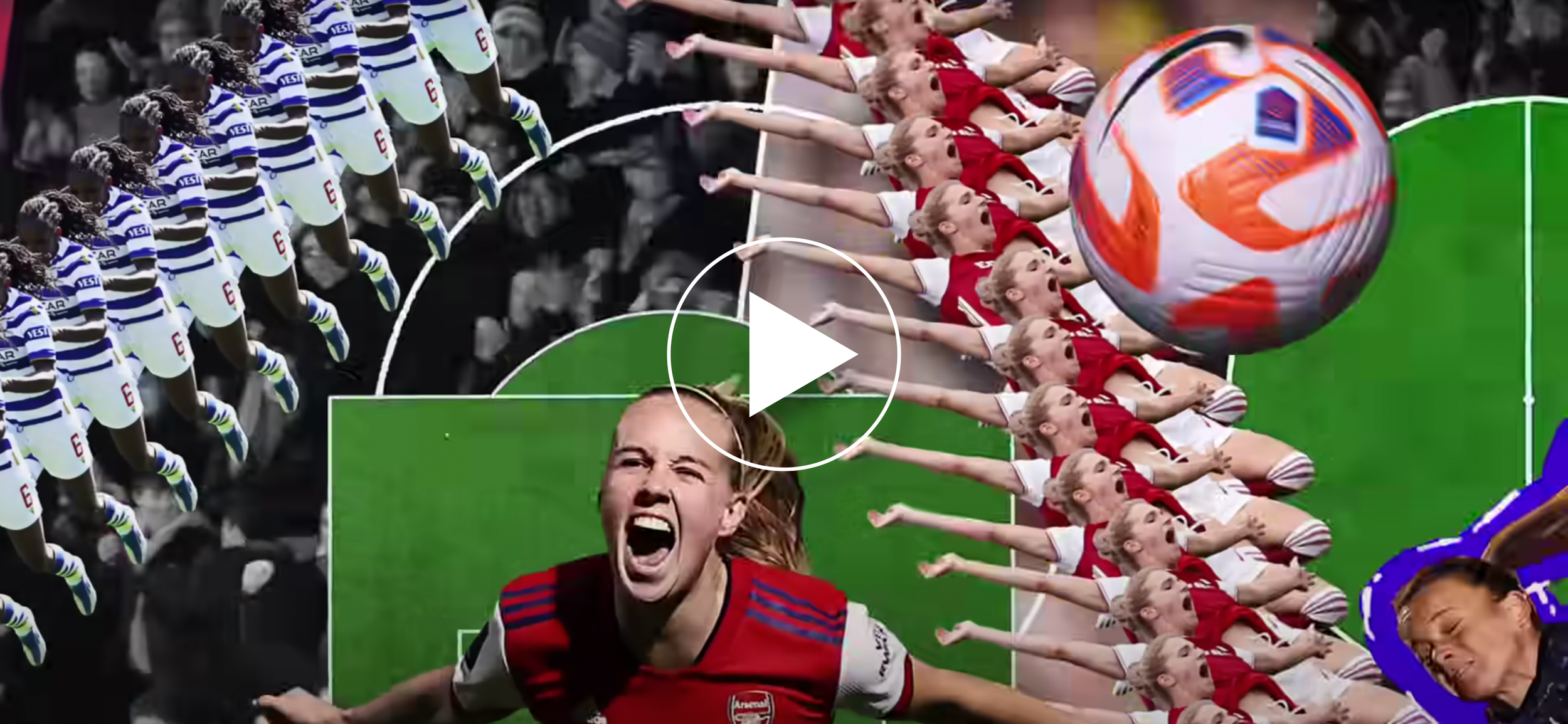
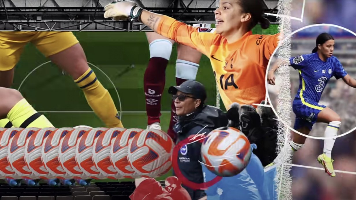
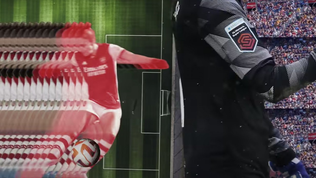
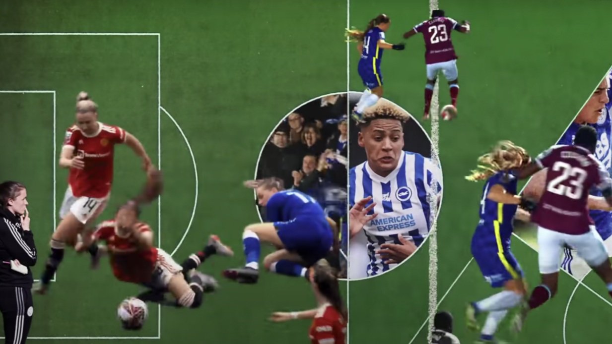
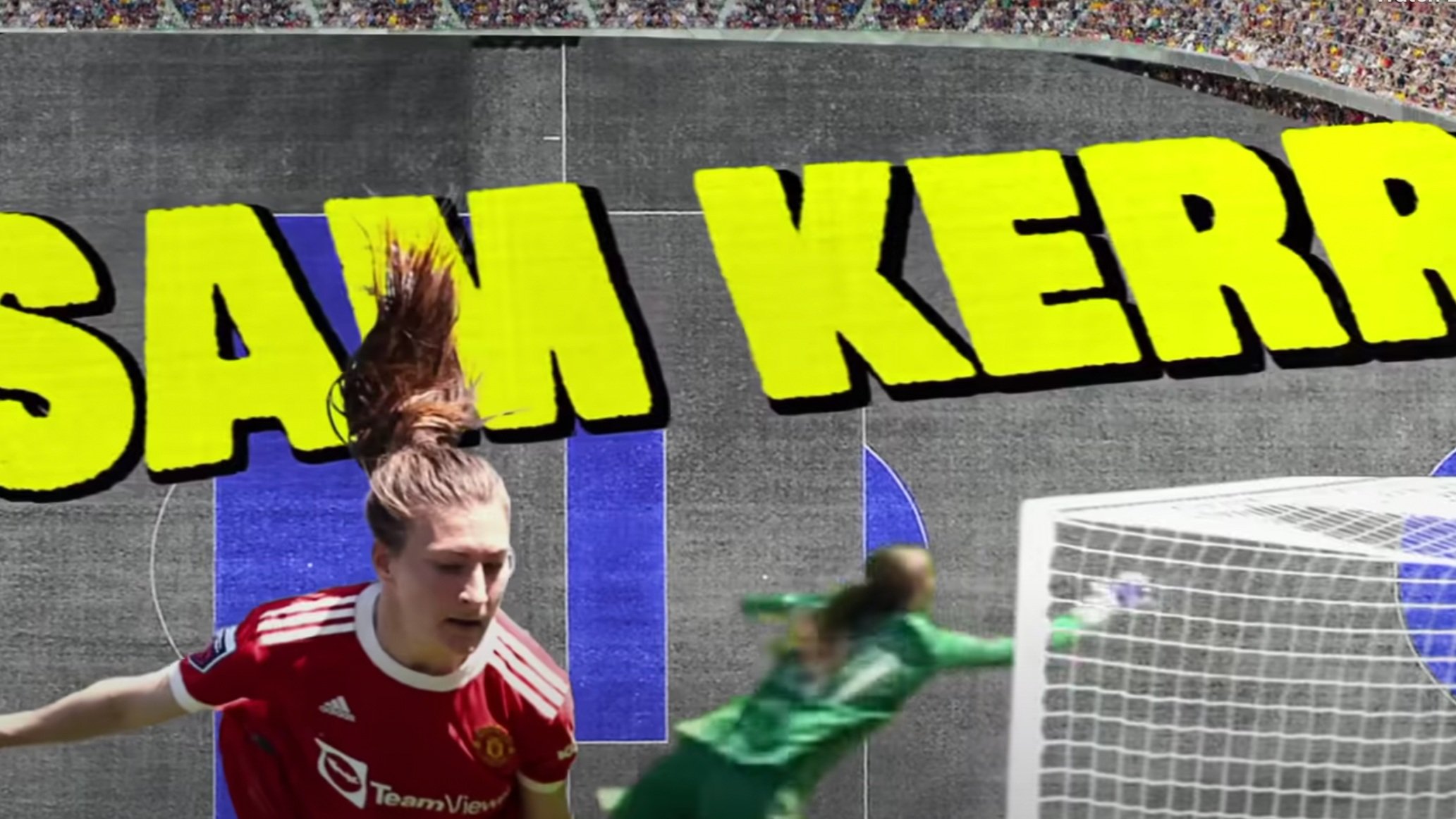
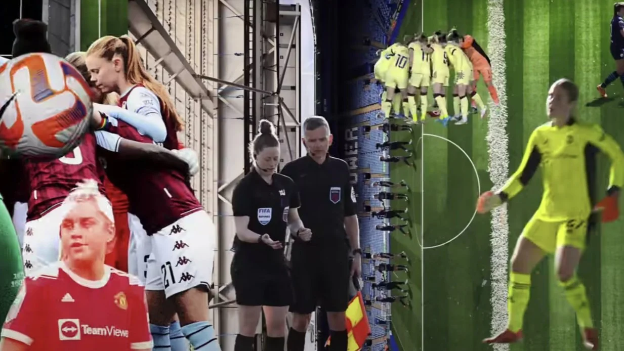
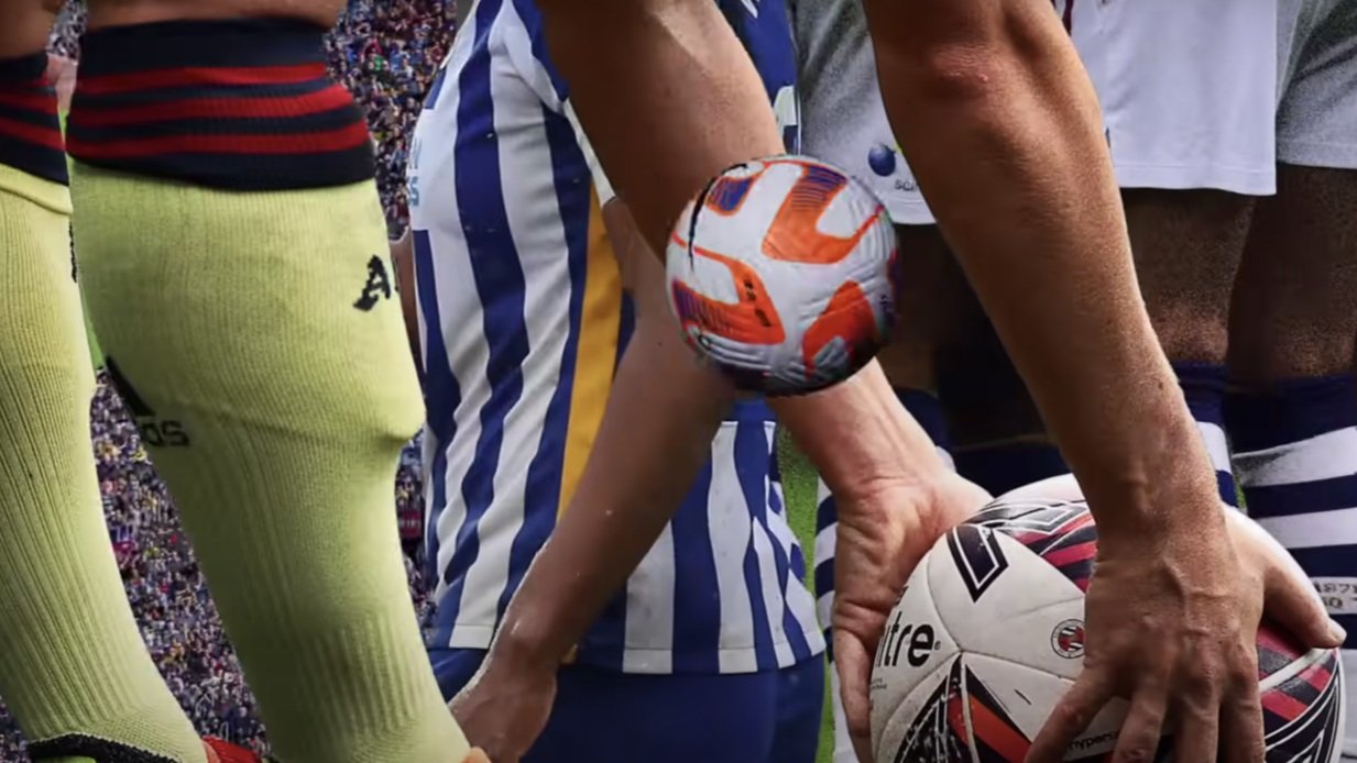
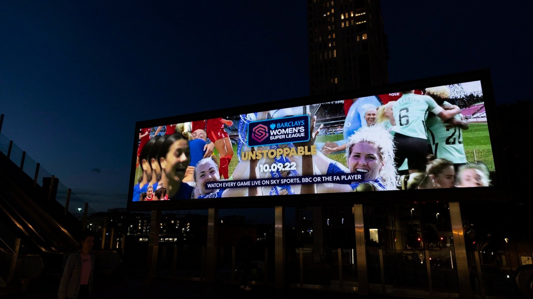
The campaign built off the success of the Euros whilst launching the FA Barclays Women’s Super League’s new brand platform UNSTOPPABLE’. It was designed to demonstrate that women’s football is no longer on a journey. Packed full of the biggest names, moments, stories and rivalries in the game, visually energetic, living breathing collage. From goals and saves, to ferocious tackles, the film is all set to a bespoke track created using match day commentary.
Client: Barclays Womens Super League
Agency: Dark Horses
Year: 2022
Role: Visual Designer

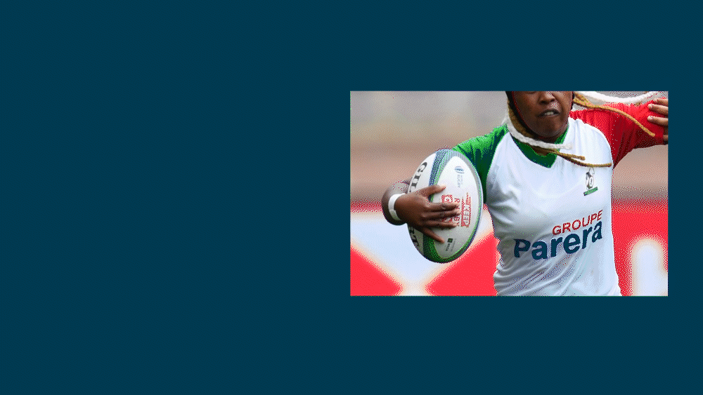
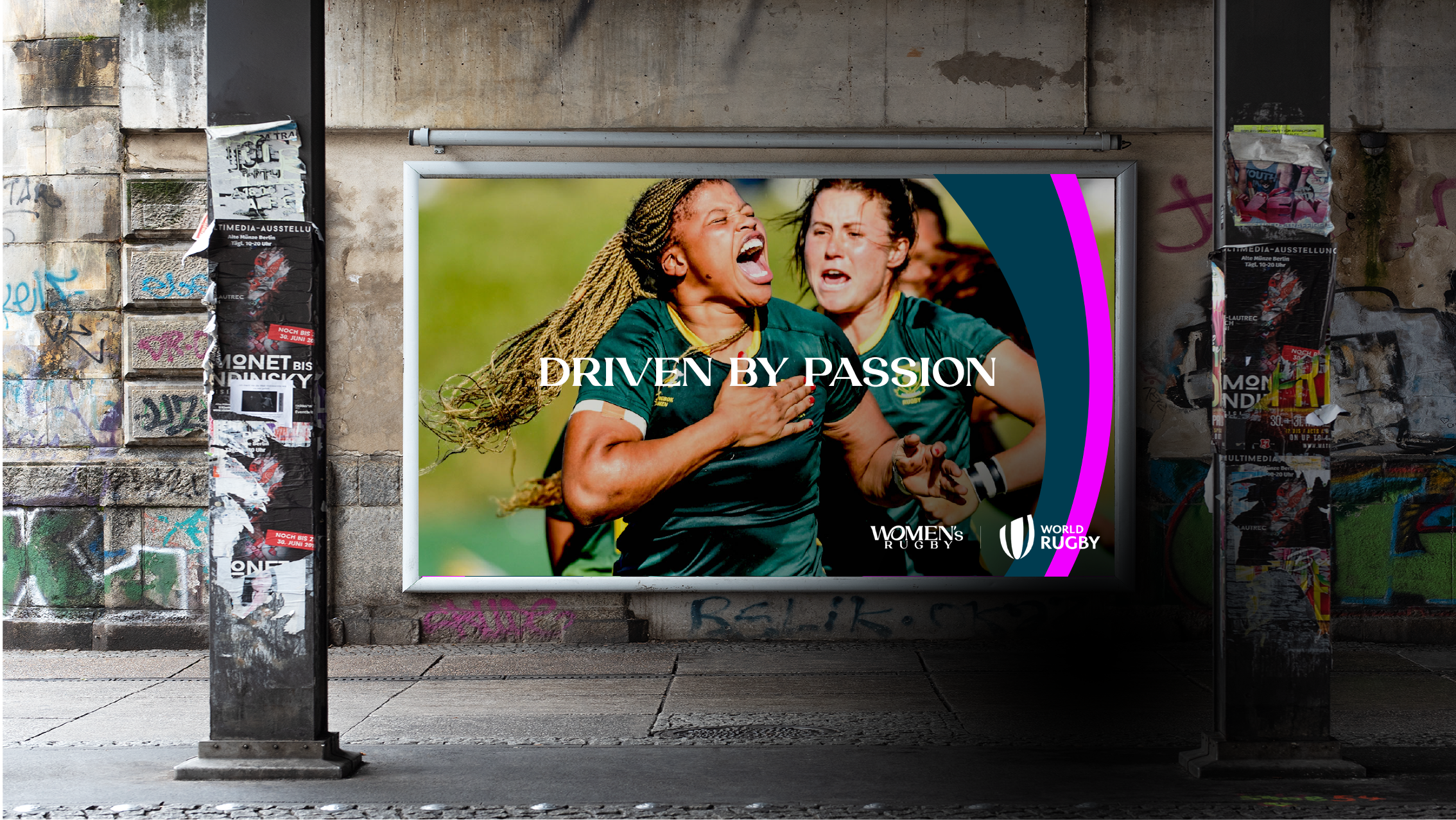
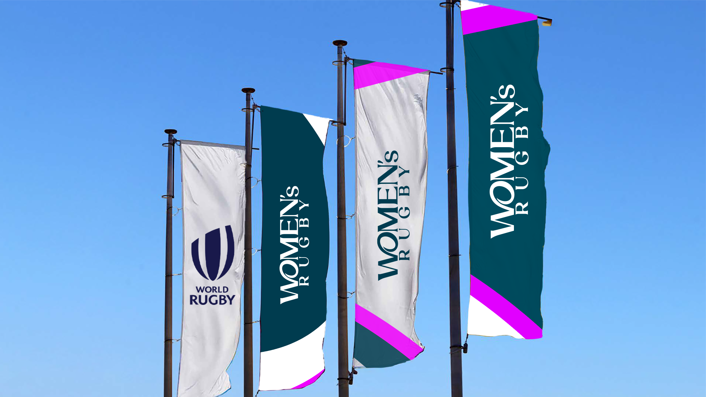
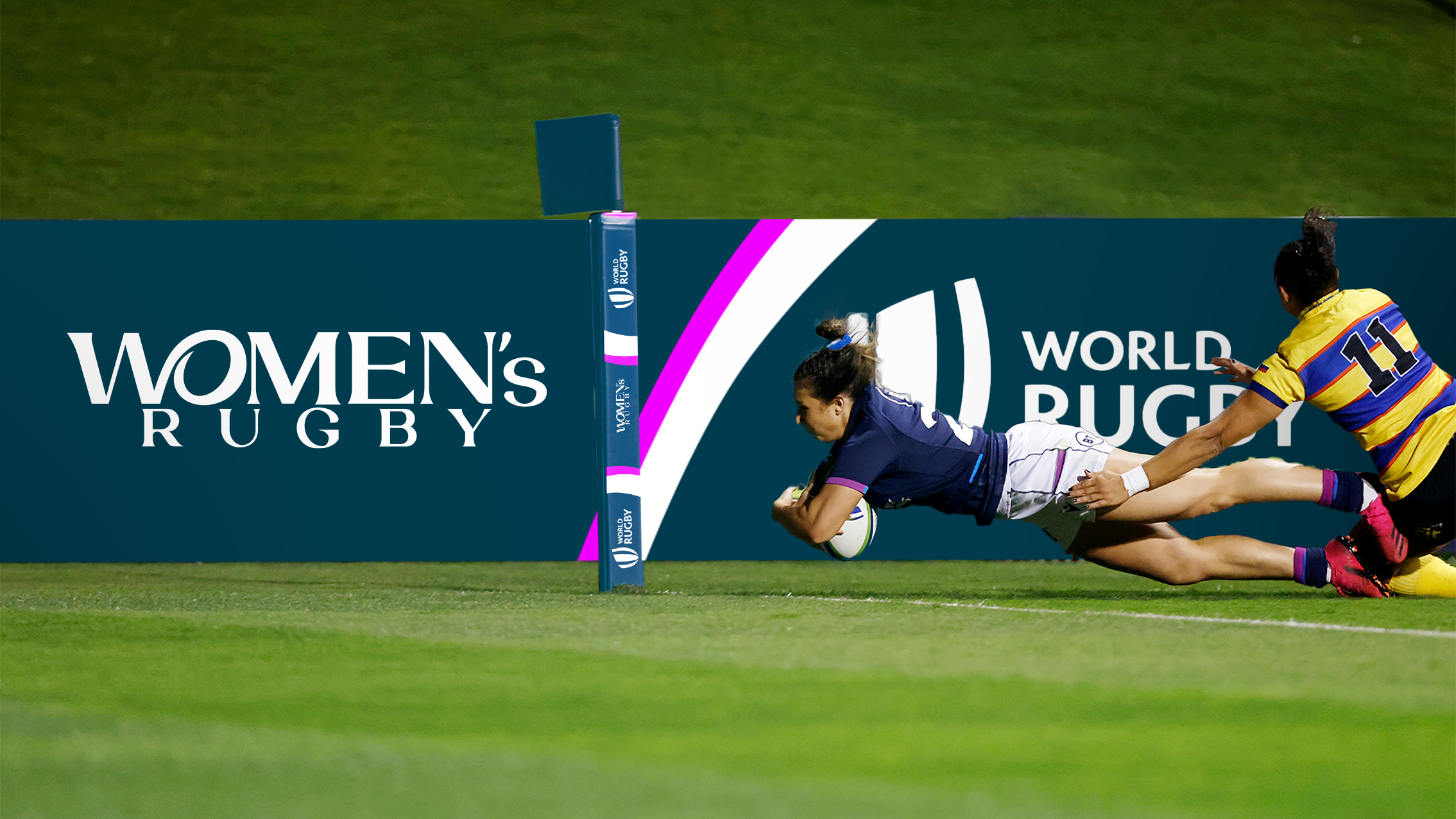
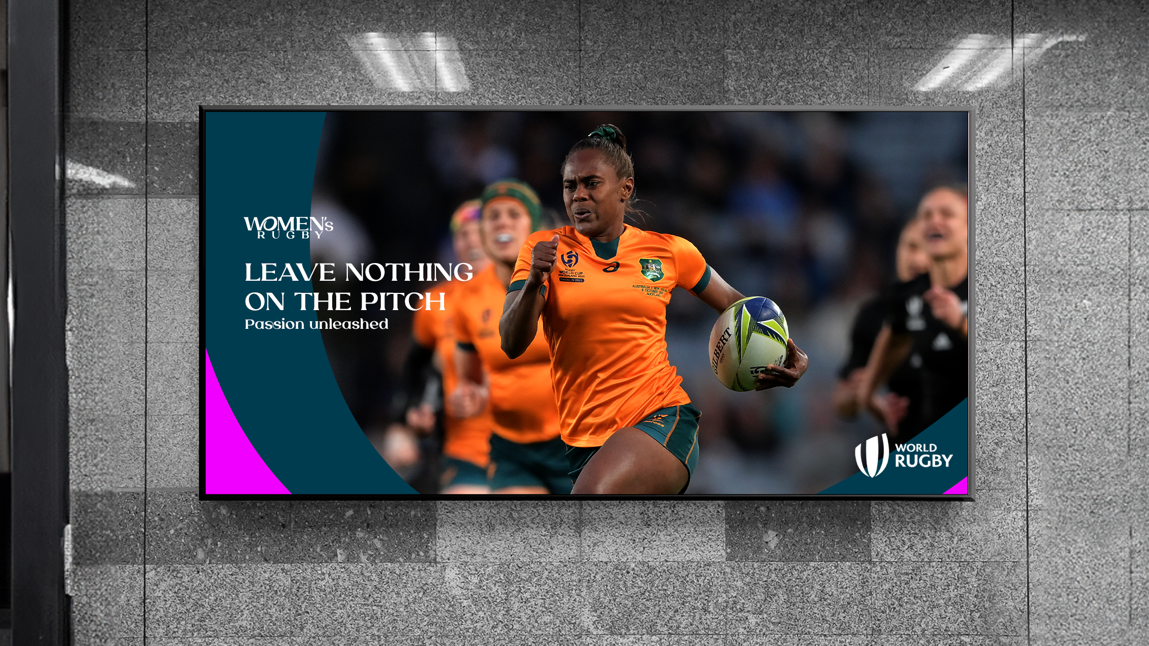
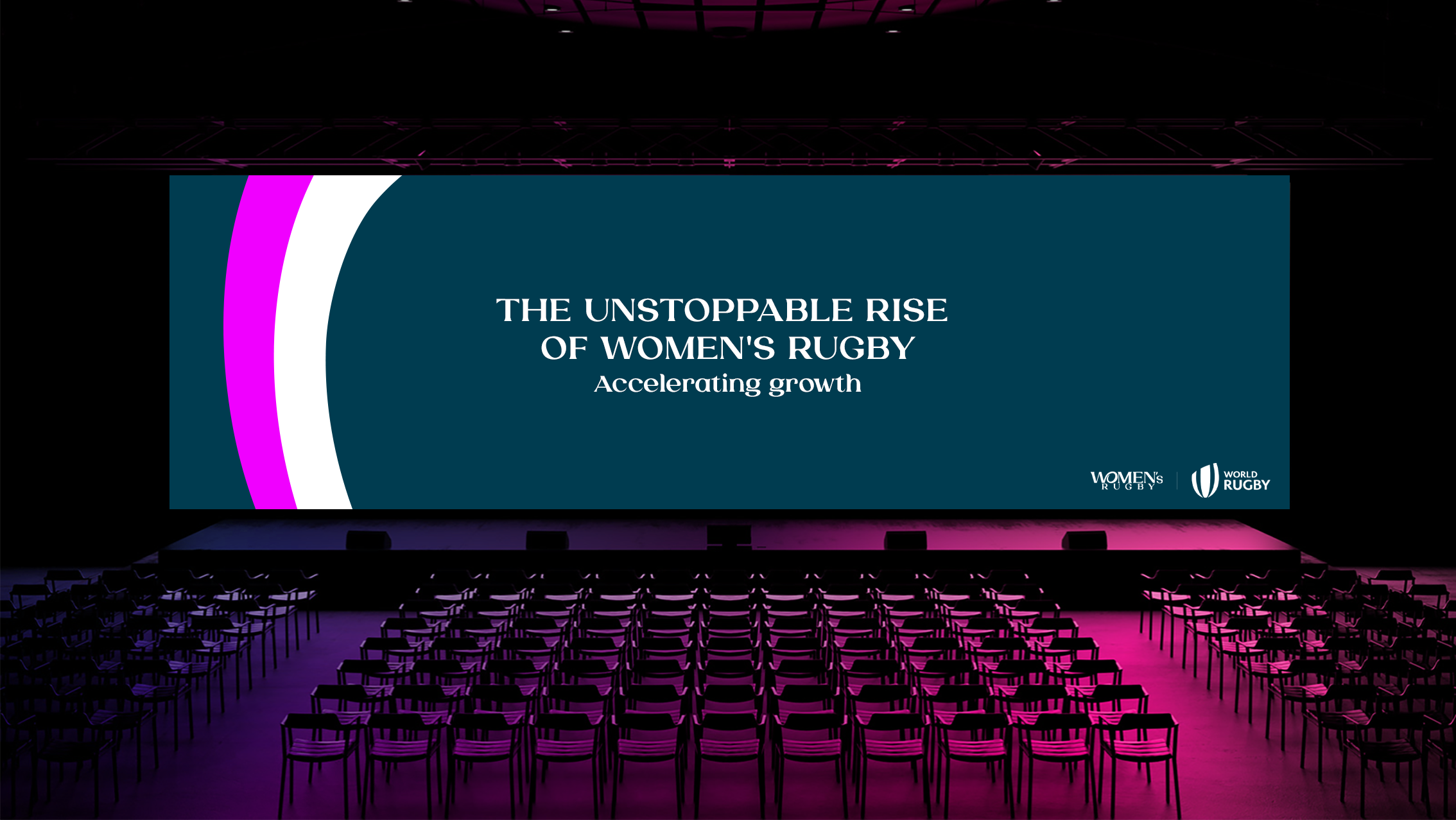
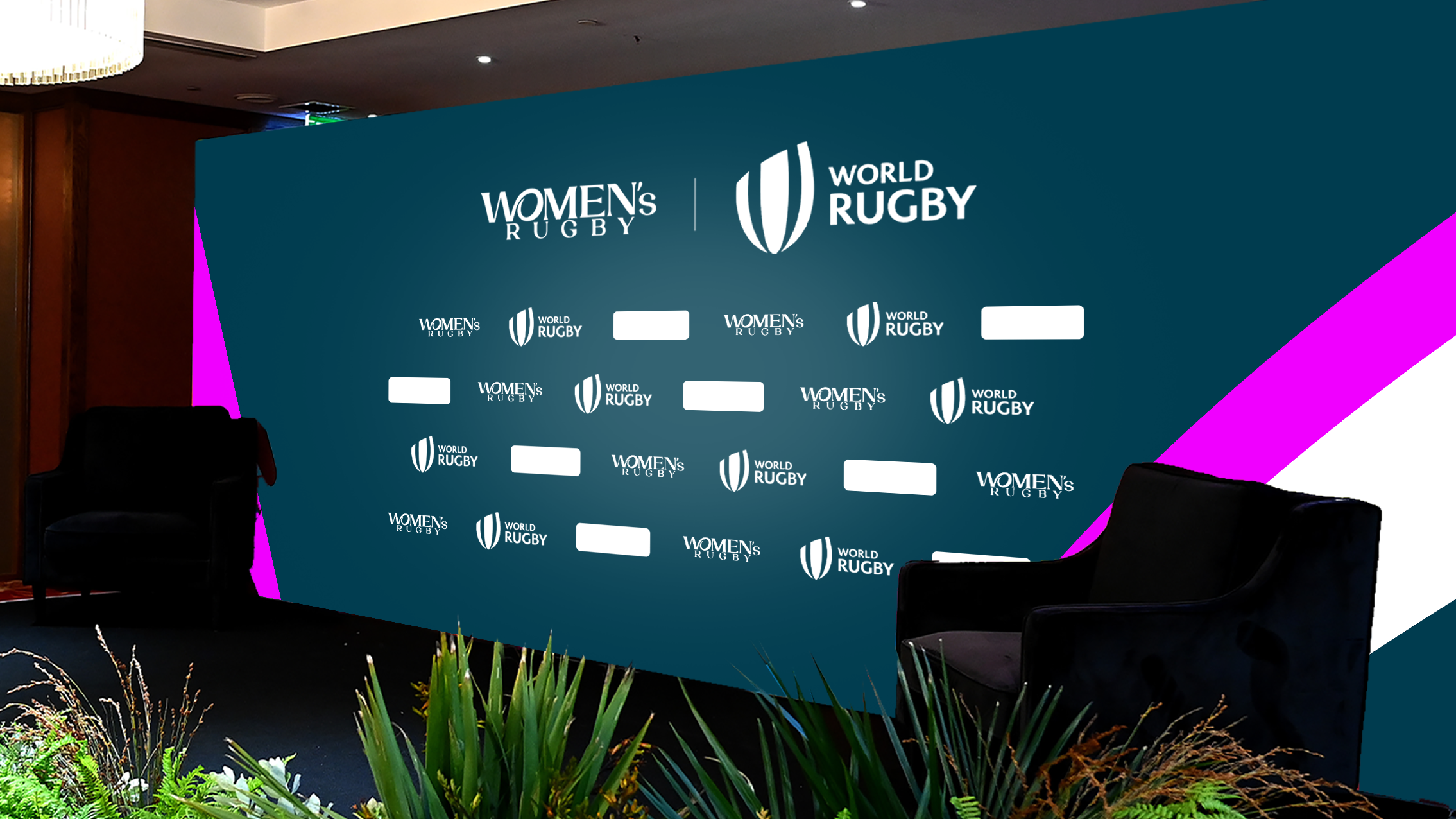

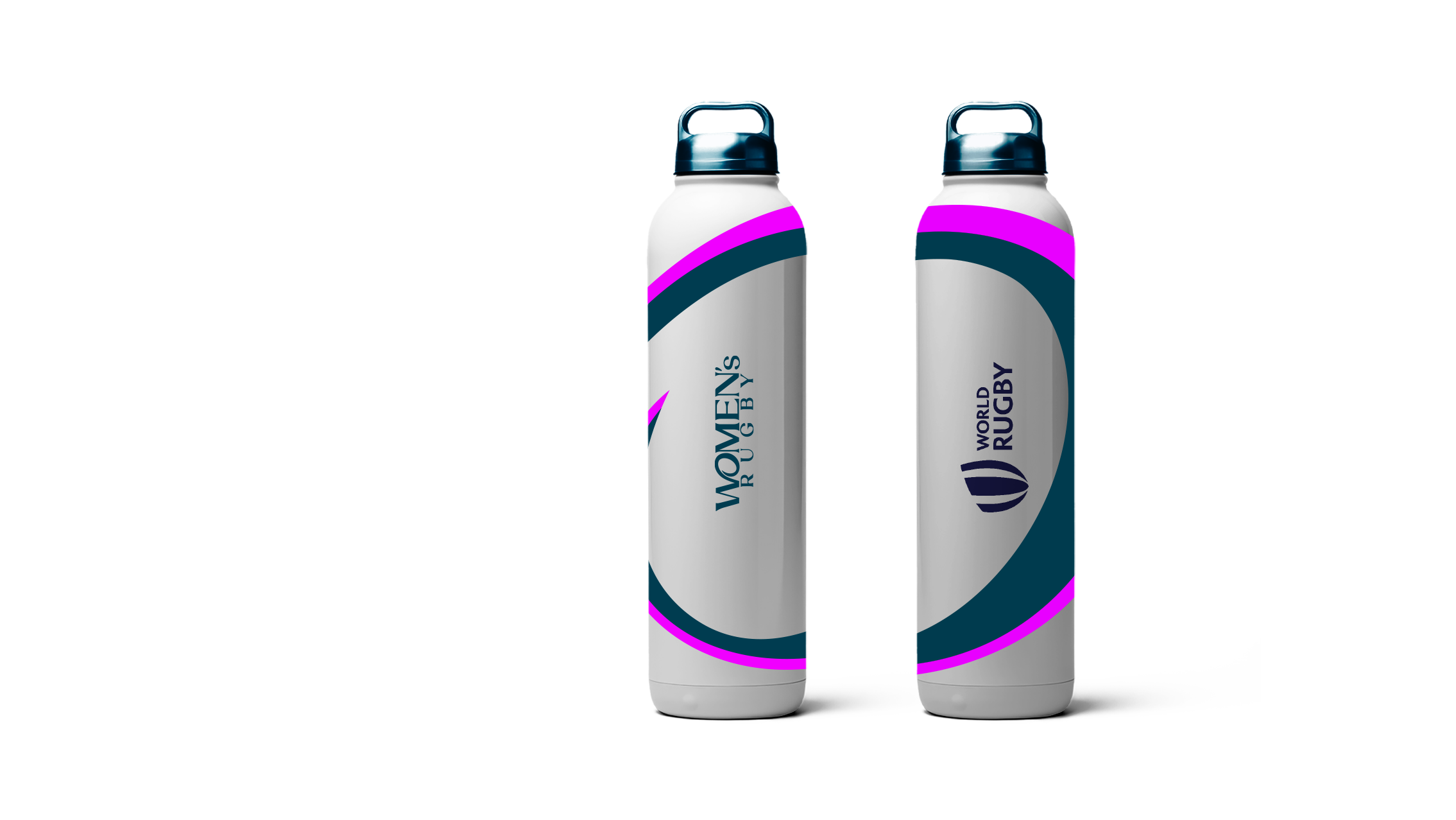
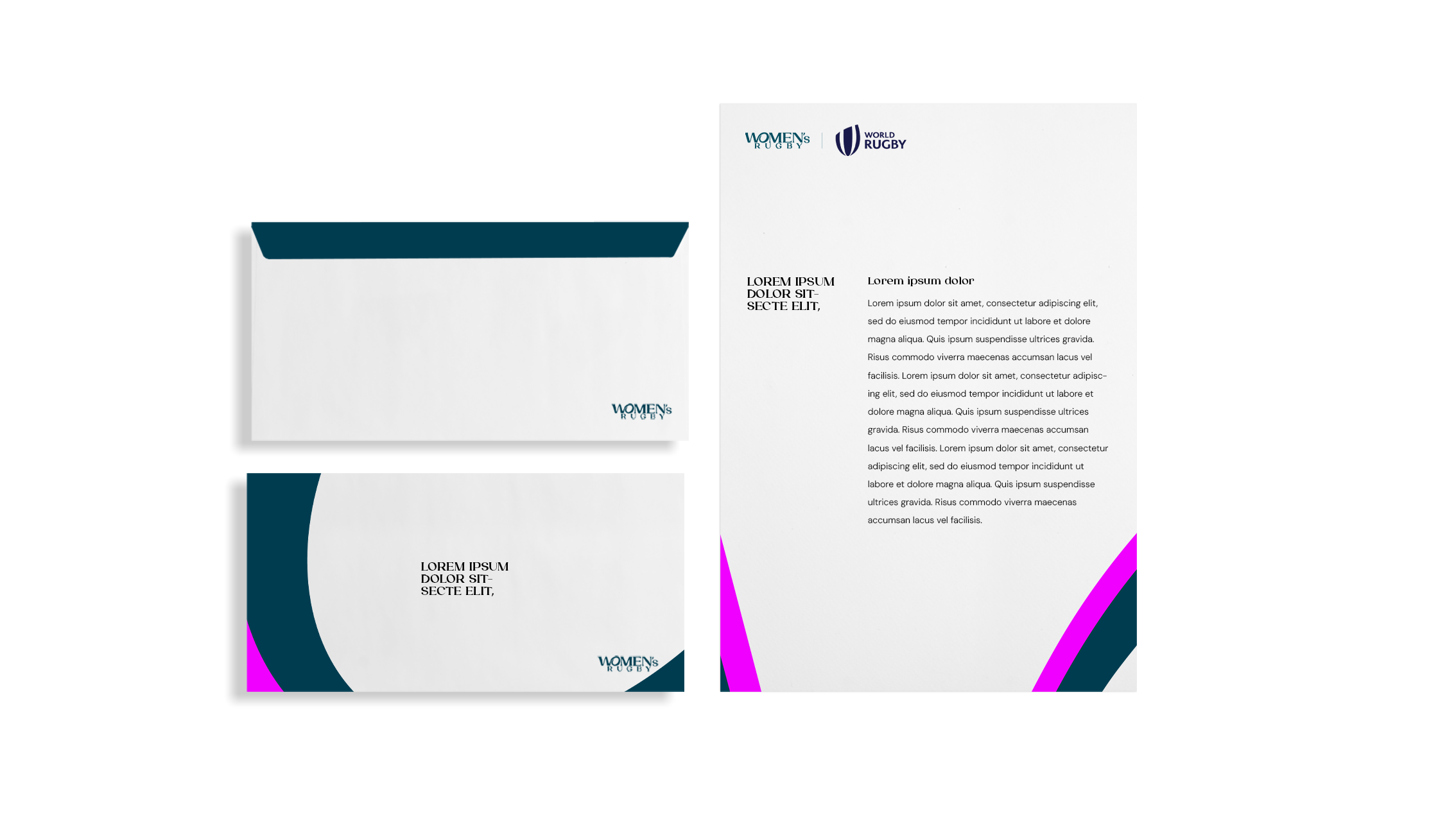
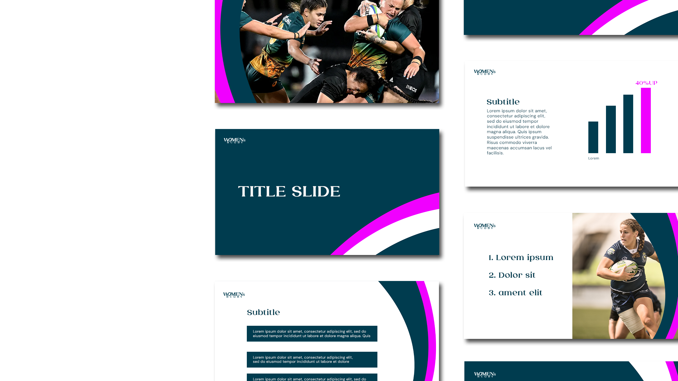
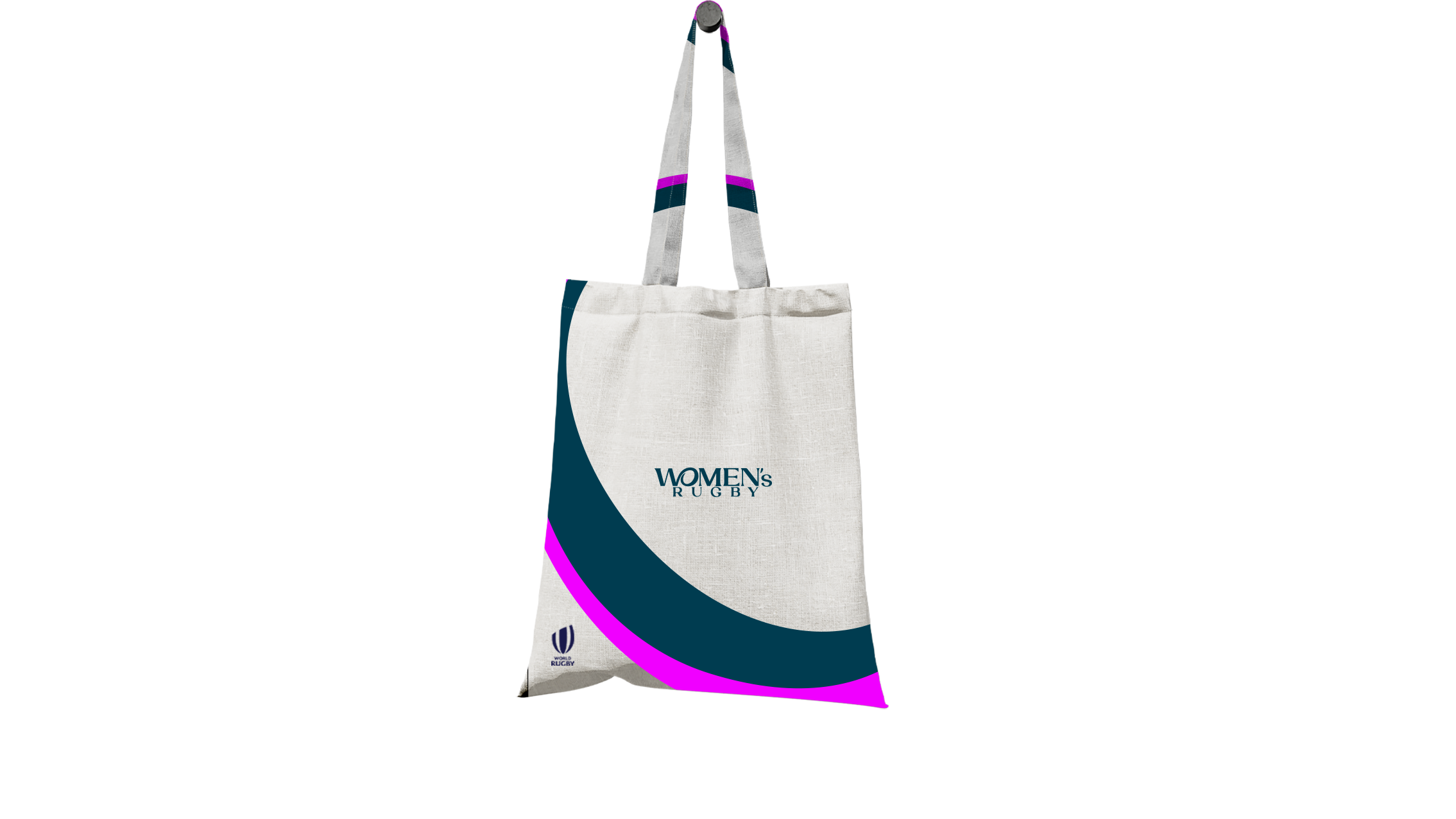
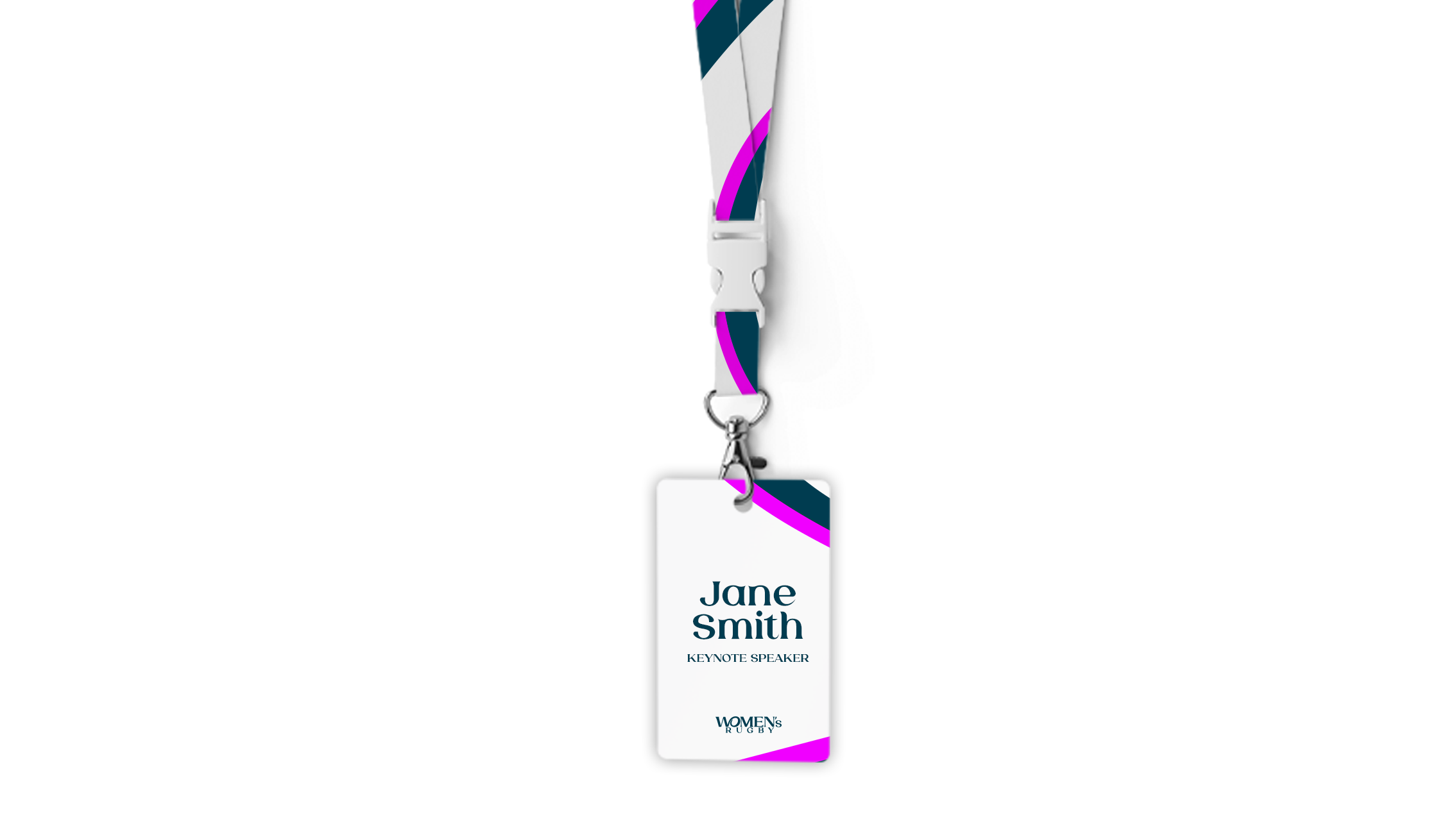
WOMEN’S RUGBY
-
Ahead of the biggest ever Women’s Rugby World Cup in 2025, World Rugby asked us to create a refreshed brand — one that reflects not just the scale of the moment, but the future of the women’s game itself.
The new identity connects the ‘W’ and ‘O’ to form a symbol of a woman with her arm around a rugby ball — a small gesture that carries a big message: women belong in this game, at every level.
Visually, we leaned into a rich teal palette paired with energetic pink accents — a combination that feels both bold and celebratory. By extracting and enlarging parts of the logo, we created dynamic graphic patterns that capture the energy and movement of the women’s game, almost like the rhythm of a match frozen mid-motion.
For me, this wasn’t just about sport branding, it was about expressing a belief: that rugby belongs to everyone. I wanted the design to feel open, modern, and unapologetically confident, something that resonates across generations, cultures, and identities.
Client: World Rugby
Agency: Dark Horses
Year: 2024
Role: Concept, Lead Designer


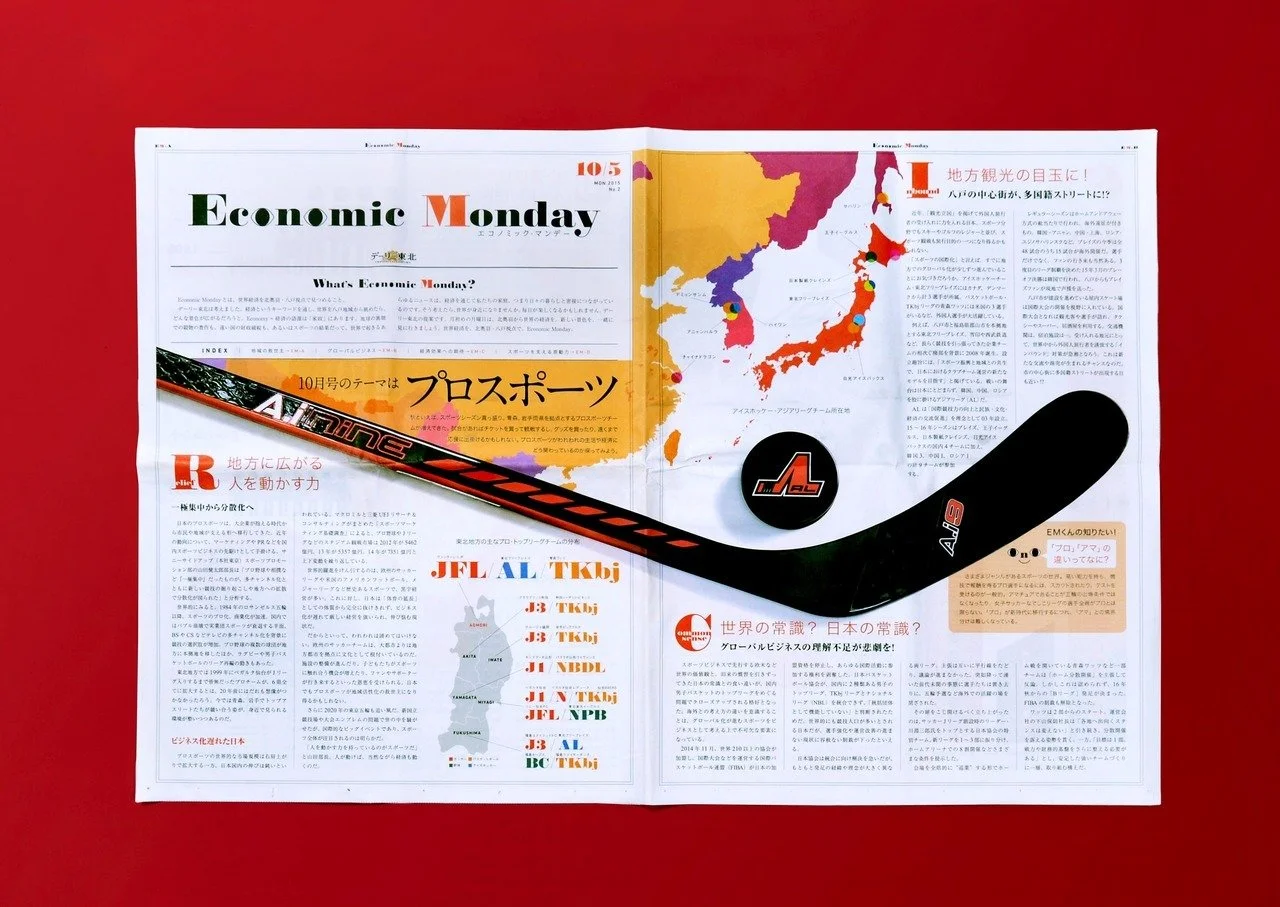

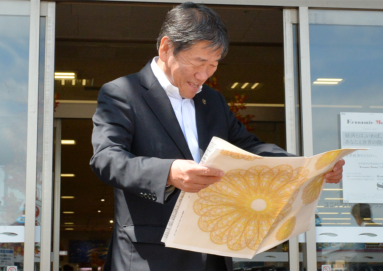
Economic Monday
-
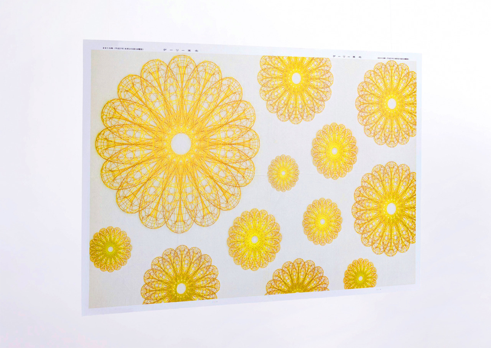
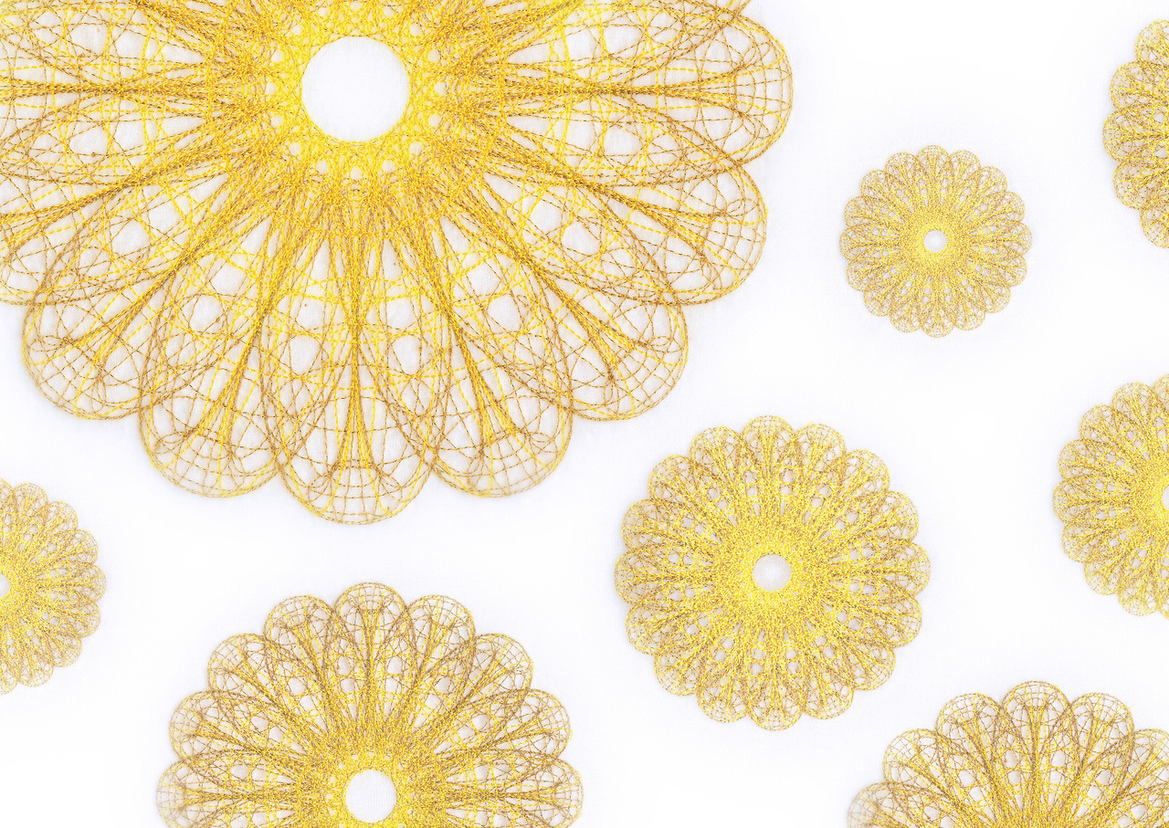
TDaily Tohoku Newspaper carries a unique identity in its very name, combining the English word Daily and the Japanese Tohoku, it reflects both global awareness and a strong local voice. Based in Hachinohe, a city that plays a key role in Japan’s economy, the paper wanted to reclaim economic narratives that often feel distant, dominated by Tokyo or Wall Street, and bring them back to individuals.
I worked on site with the team to create a bold new editorial concept: Economic Monday. It was more than a redesign, it was a rethinking. From logo and typography to layout and campaign strategy, every element was designed to visualise economic stories through a local, human lens.
The logo features a pair of stylised eyes, a symbol of perspective and alertness, while the layout uses a custom grid and colour system that adapts flexibly to different topics. Each issue combines graphic storytelling, infographics, and editorial clarity to make complex information accessible and engaging.
To reach wider audiences, we launched an advertising campaign that brought the newspaper into unexpected spaces, wrapping local supermarket walls, windows, and even floors with reimagined economic headlines, linking personal life to global shifts.
The project was honoured with a Good Design Award, recognised for its unique blend of social relevance, local empowerment, and strong graphic thinking.
Client: Daily Tohoku Newspaper
Agency: Hochkiss
Year: 2014-2017
Role: Art/Design Director
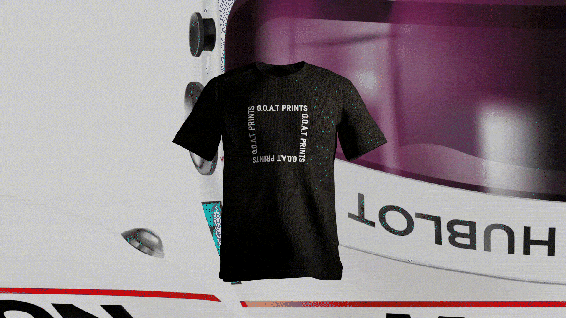

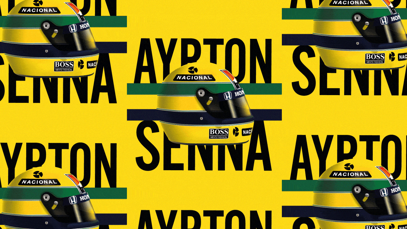
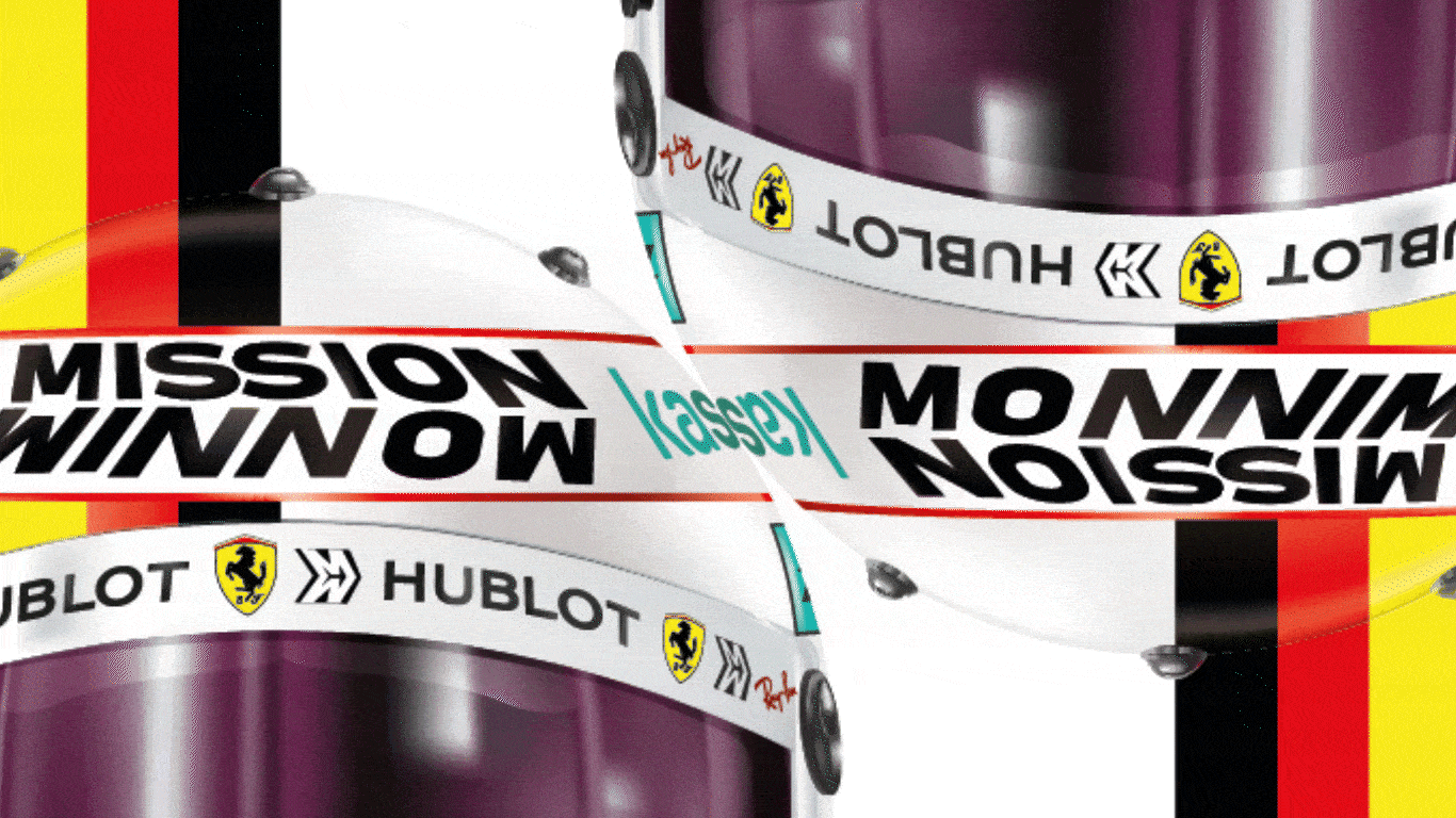
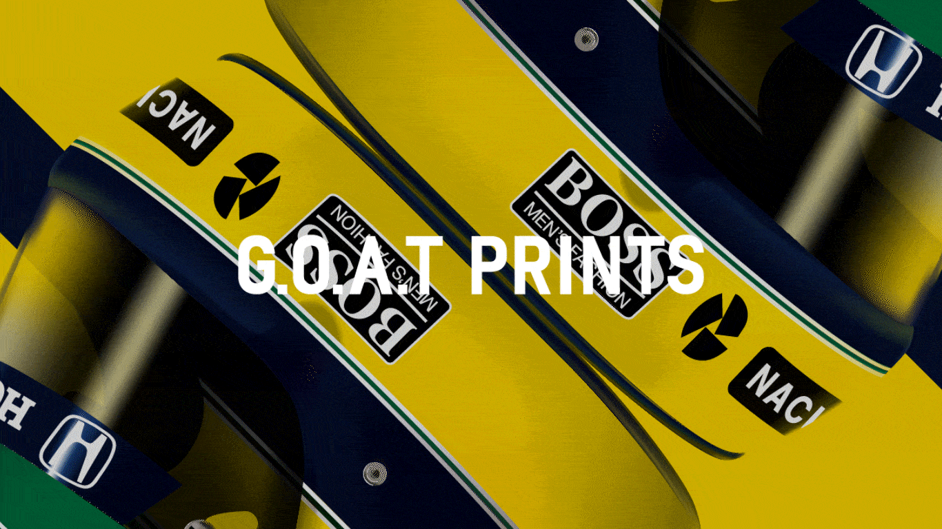


G.O.A.T PRINTS
-
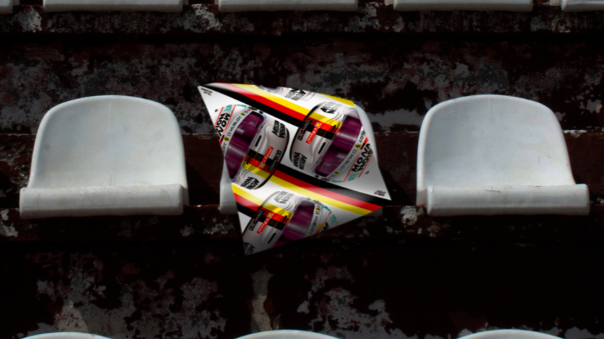
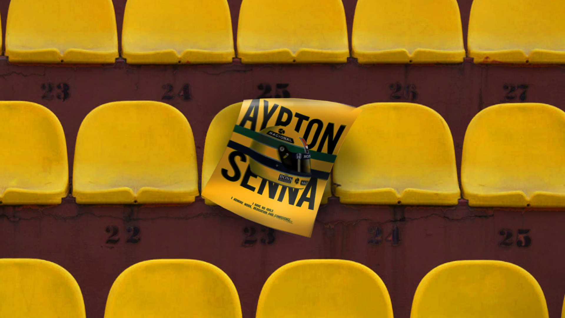
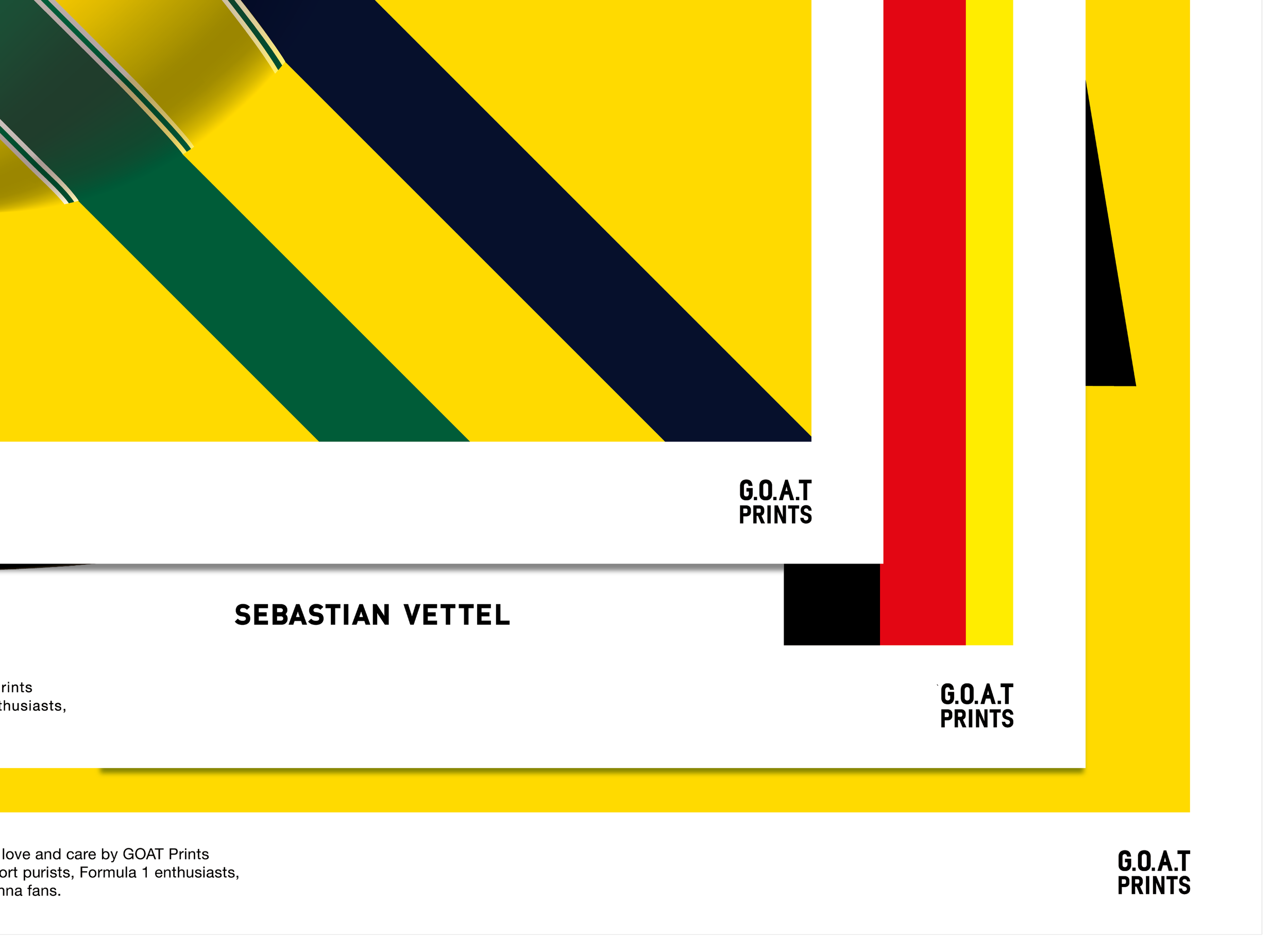
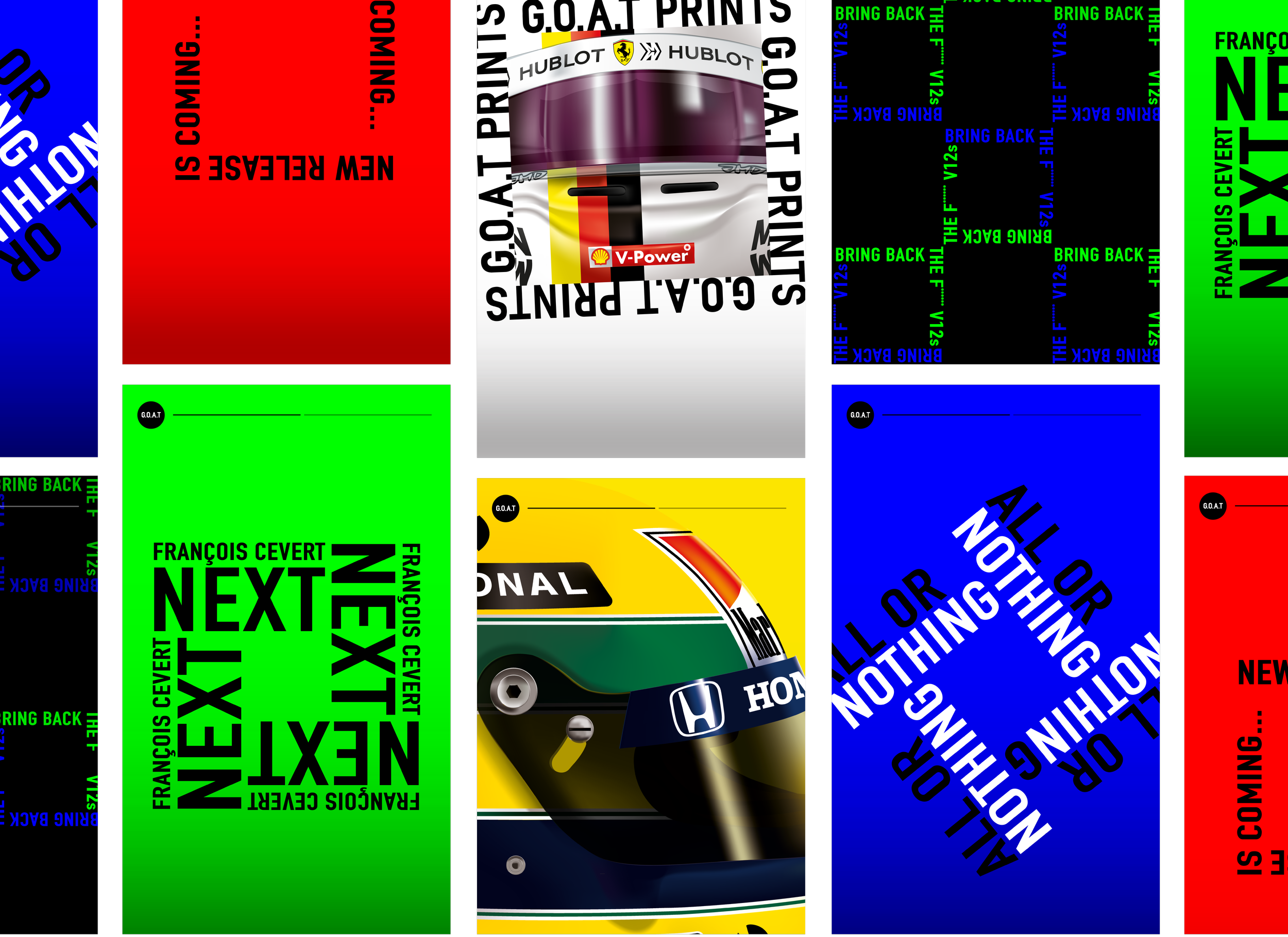
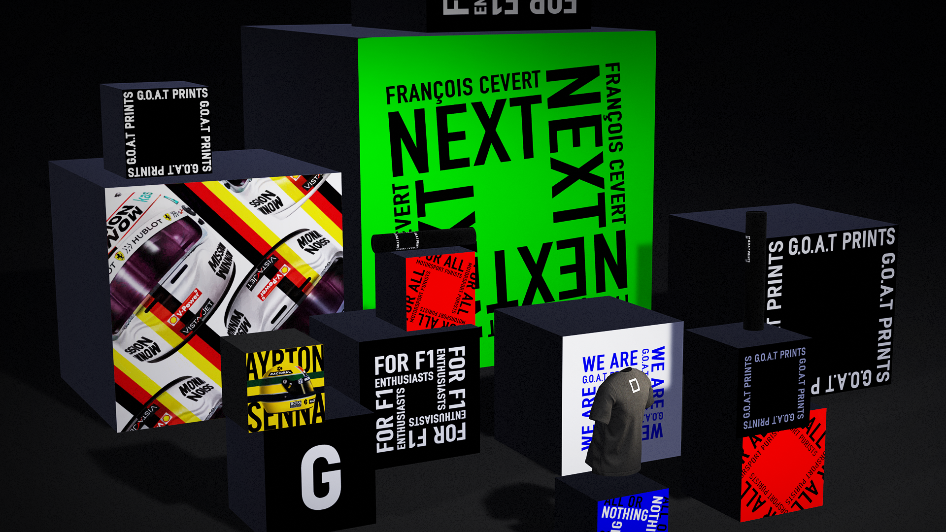
Minimum brings maximum motorsport world from square.
G.O.A.T PRINTS focuses on visual impact of motorsport. Using a minimum assets such as a trademark object or colour or voice from a driver to showcase the motorsport world to its maximum.
Iconic 3D graphics with graphical layouts and striking colour showcasing the pleasant sensation of the racing and maximise the motorsport world in the square. The logo is developed with the minimum elements to be based on the brand philosophy. Suitable in various layouts, the square communicates the story of what G.O.A.T brings to us.Sebastian Vettel announced that he was leaving Ferrari on the day we completed this project. It made these designs even more special for the team.
Client: G.O.A.T PRINTS
Role: Art Director/Lead Designer
Year: 2020
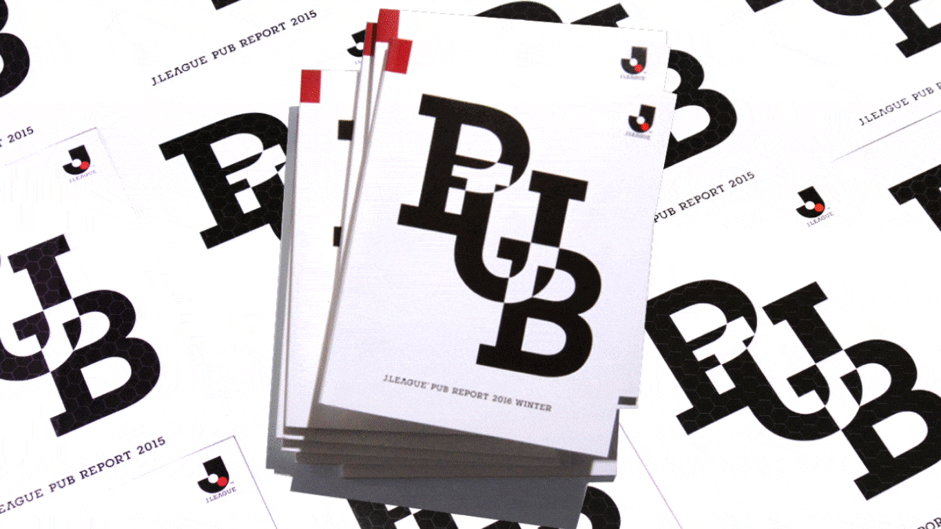
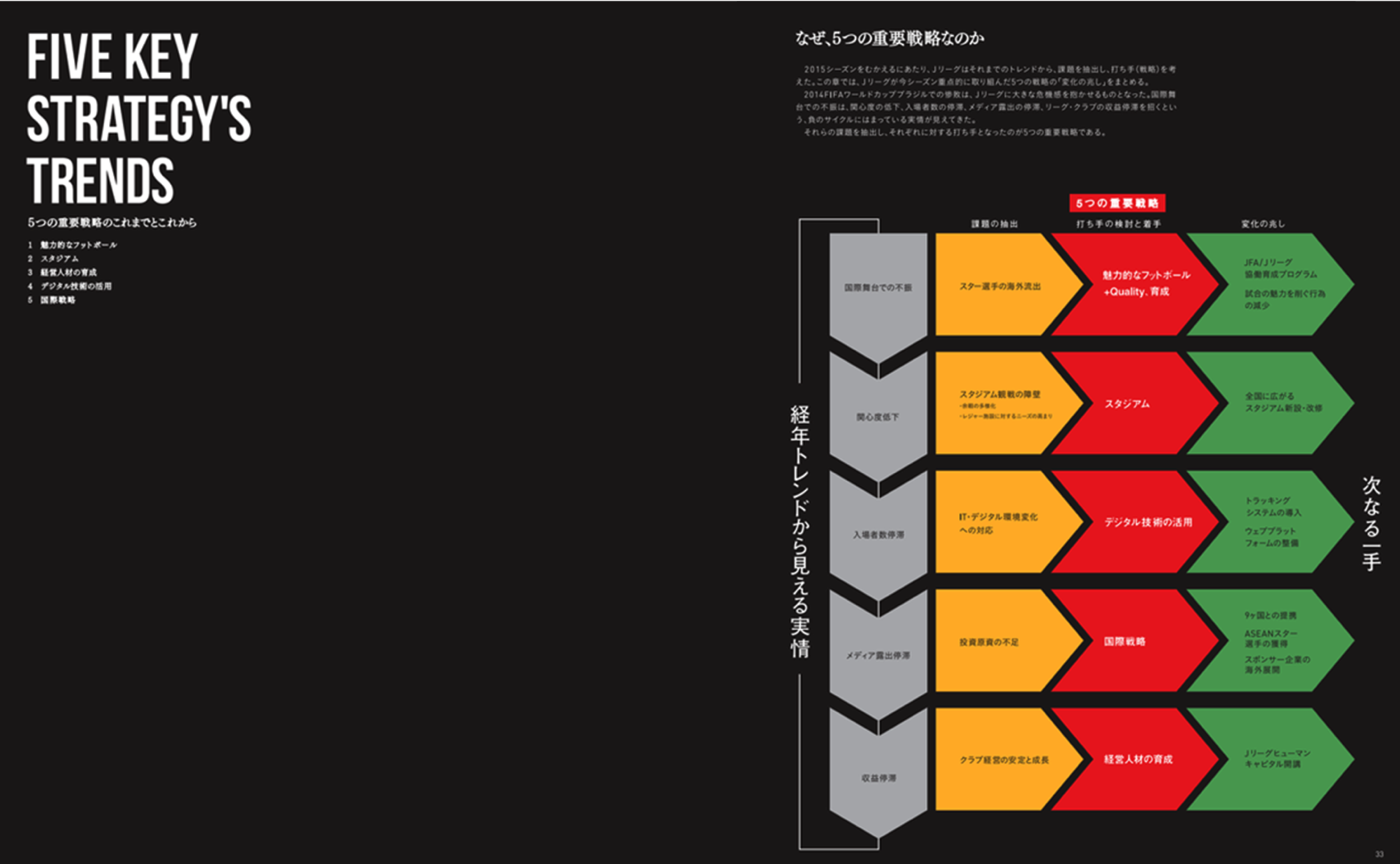
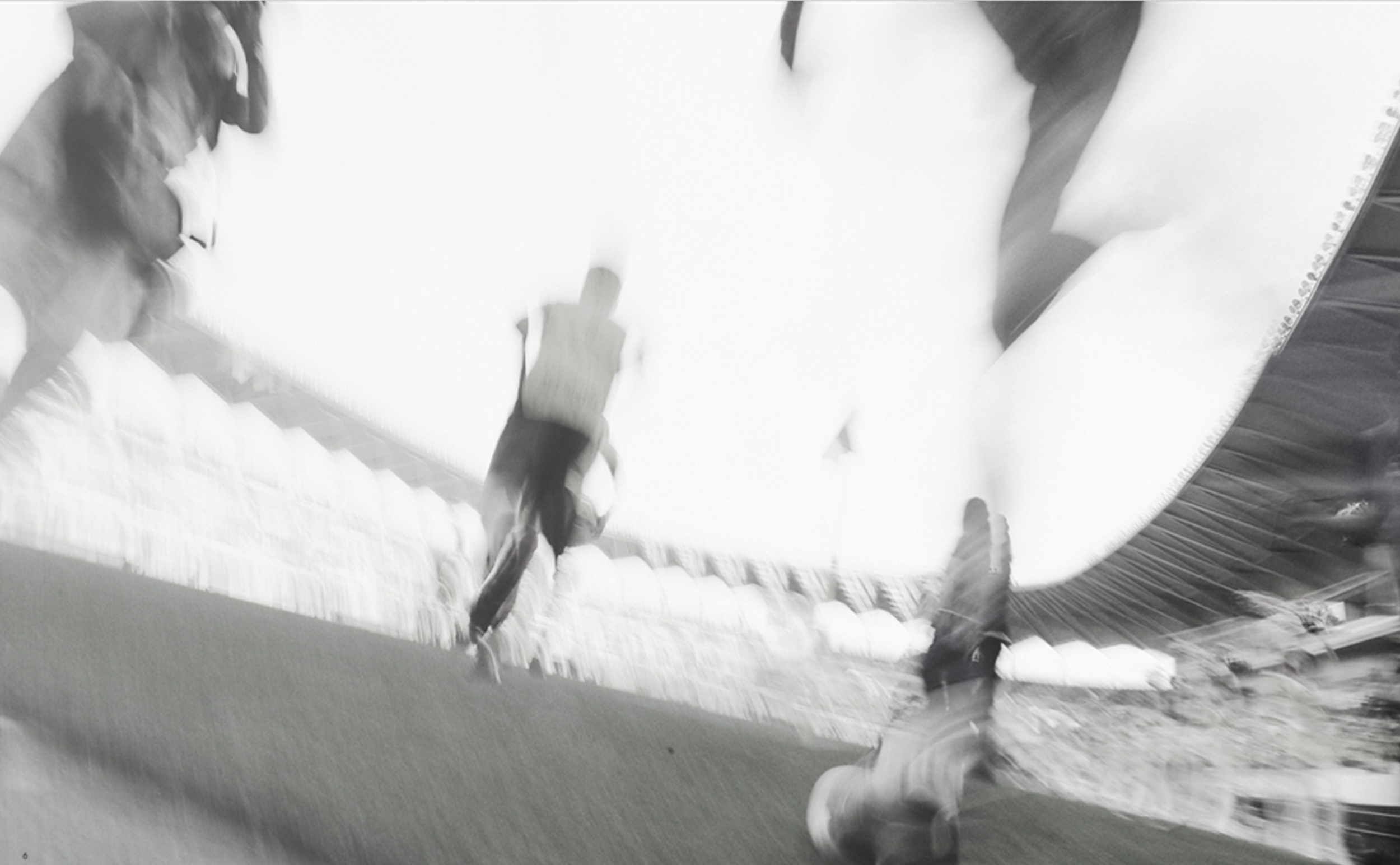
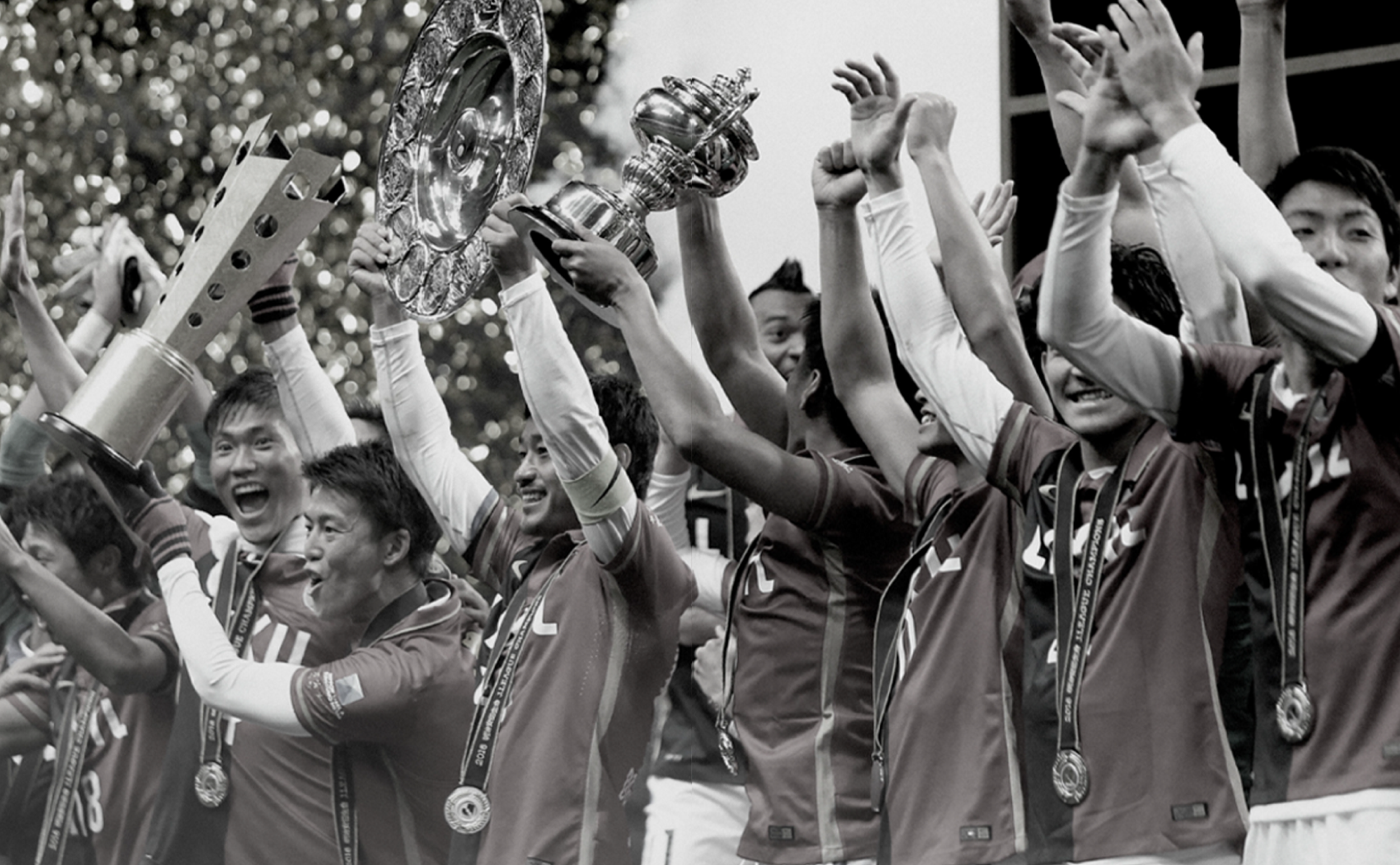
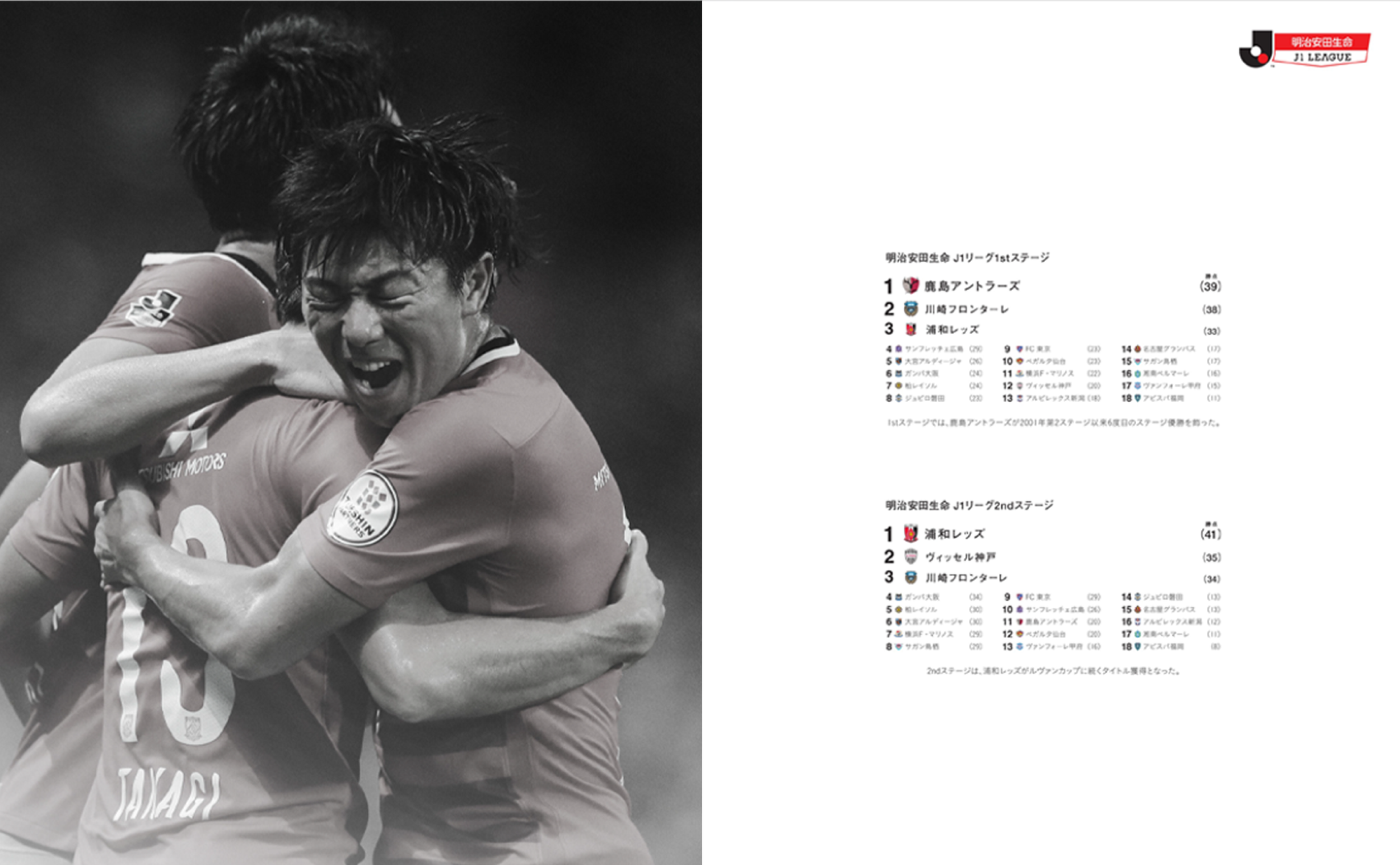
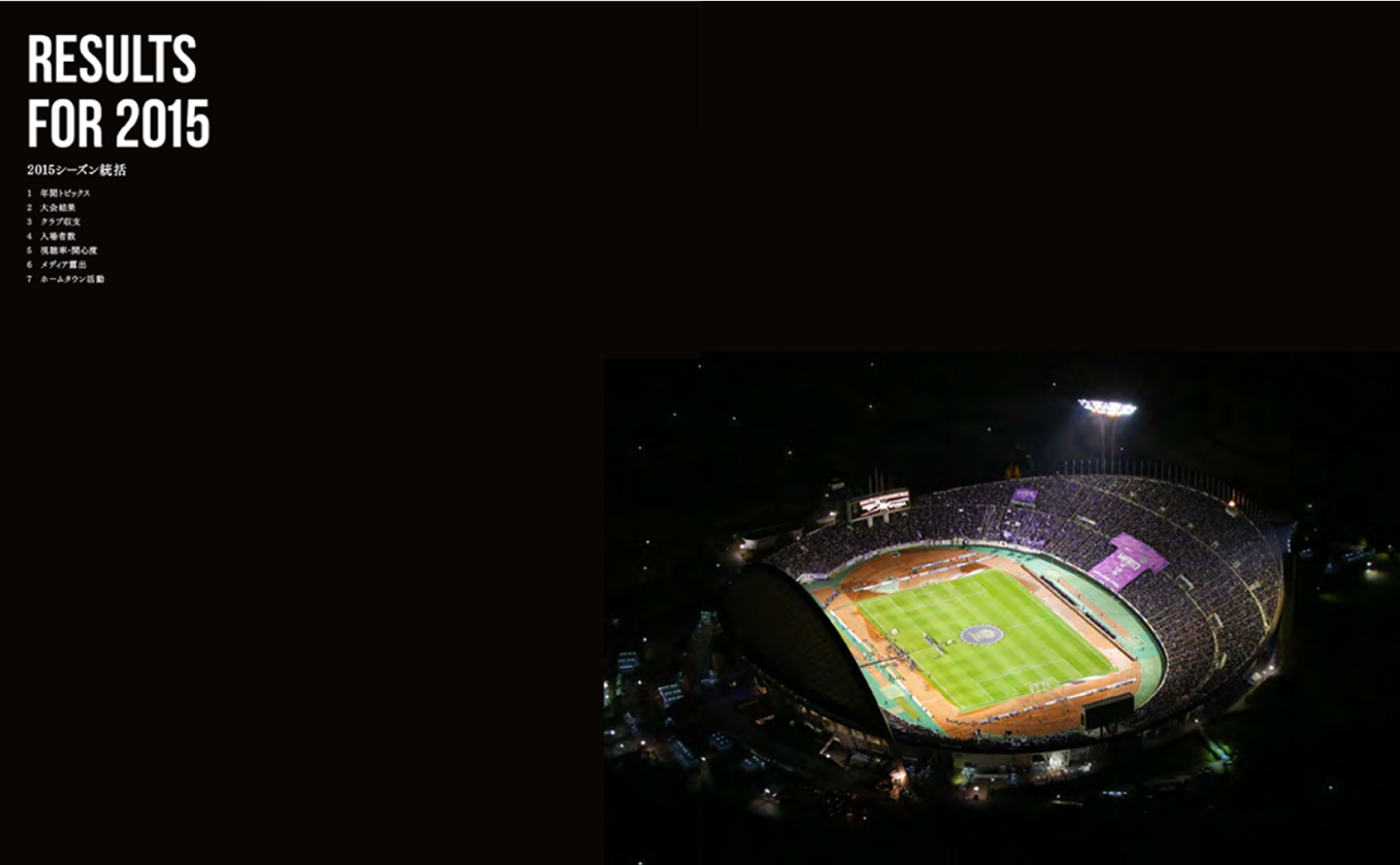
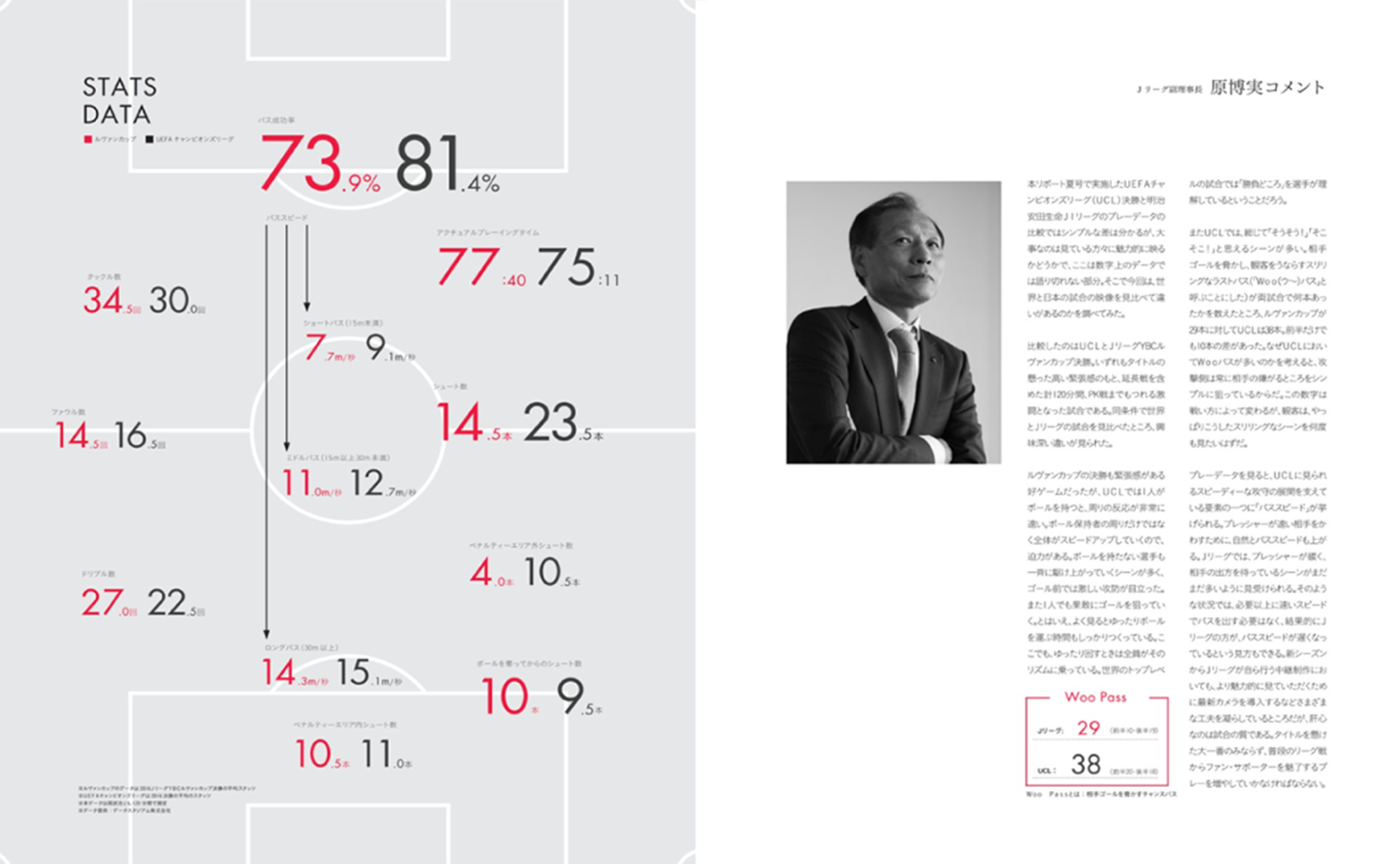
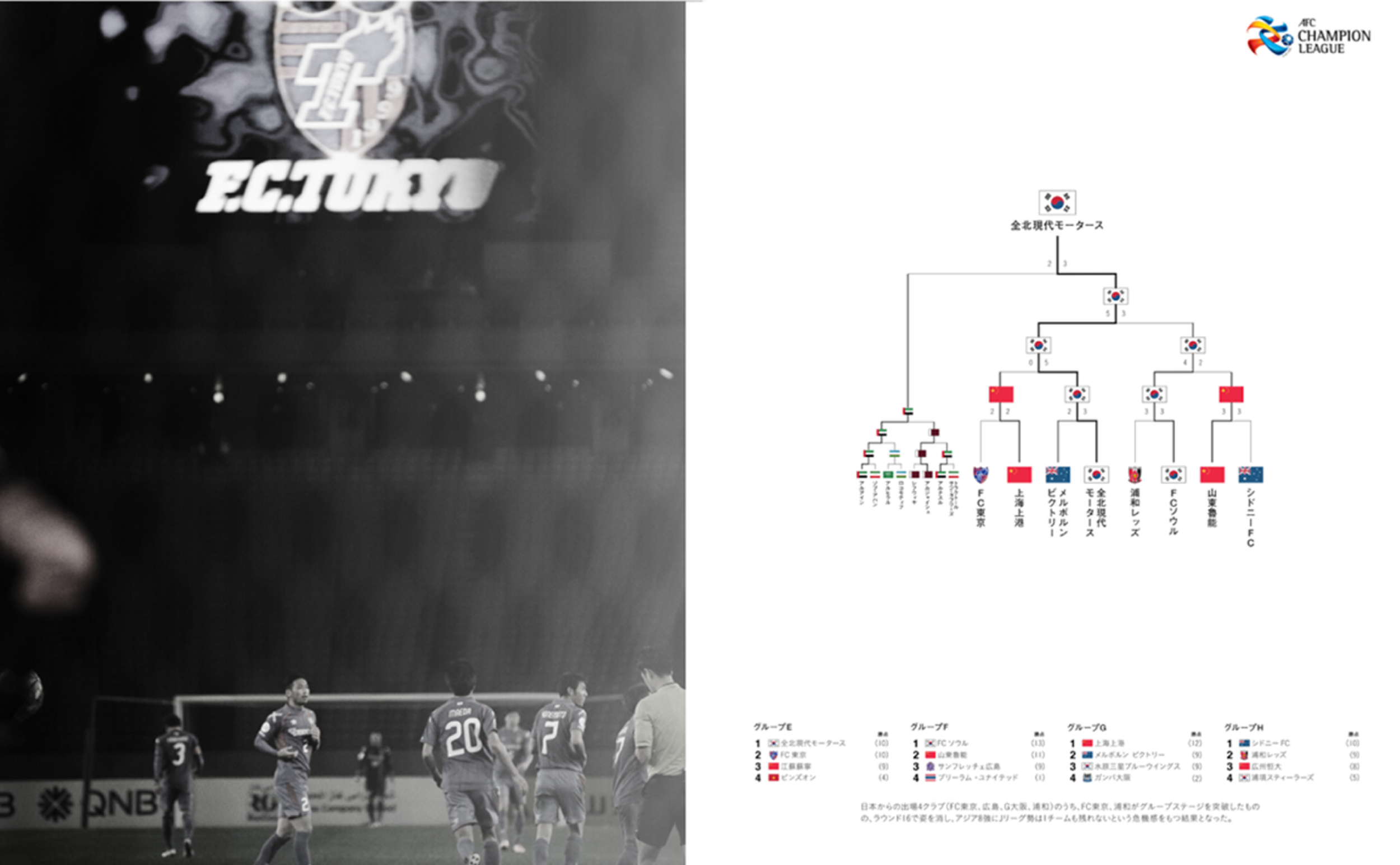
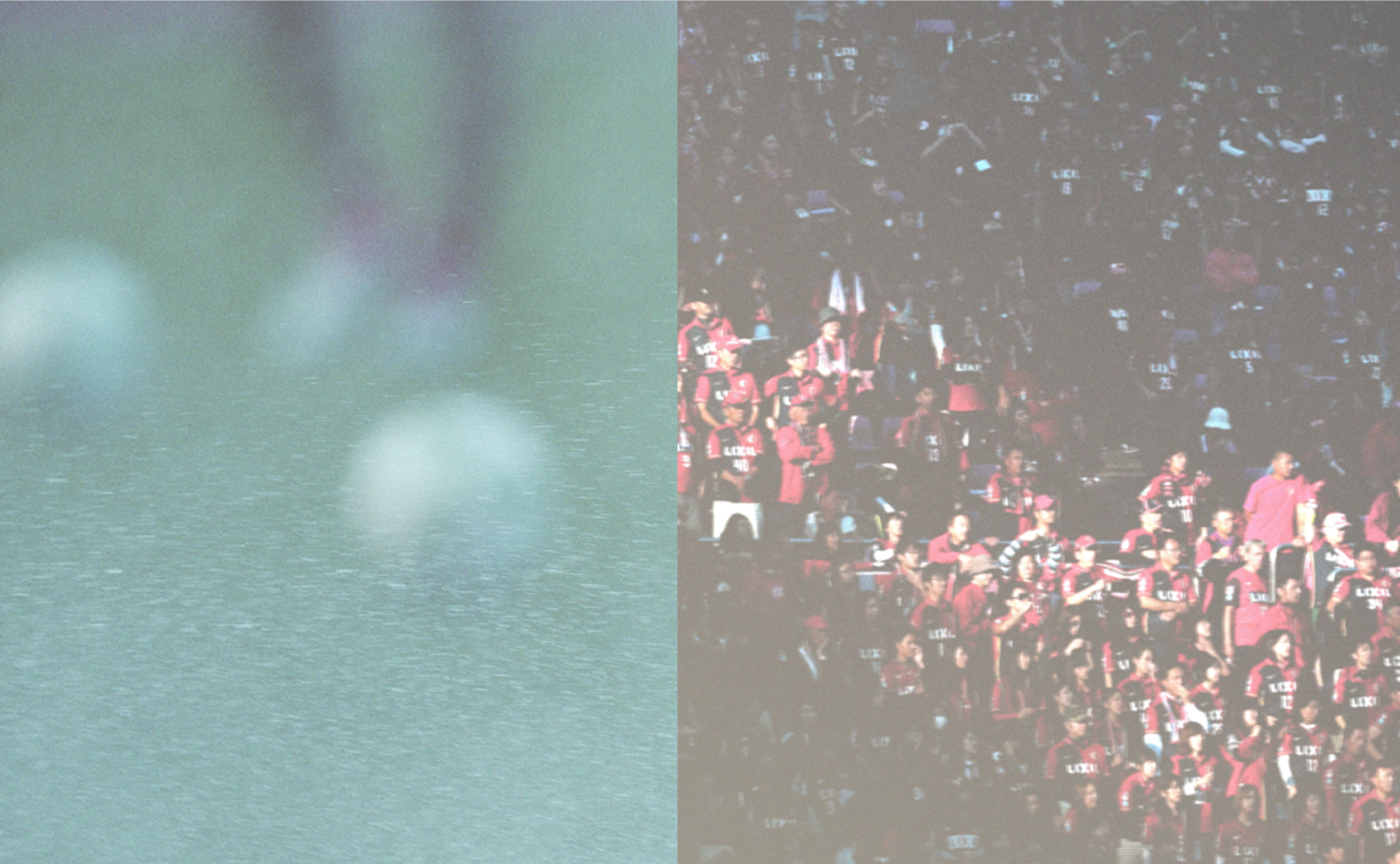
J.League
-
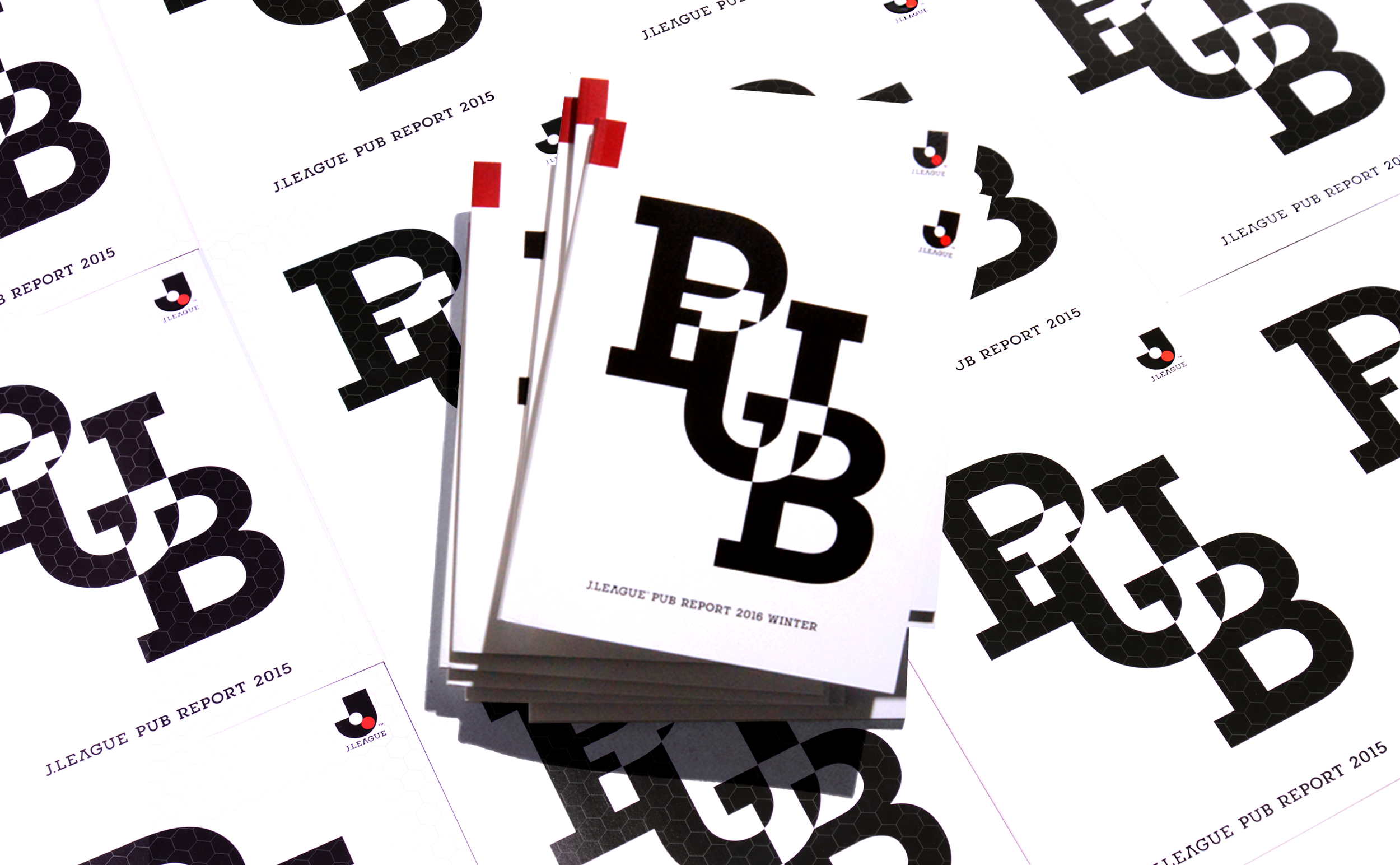
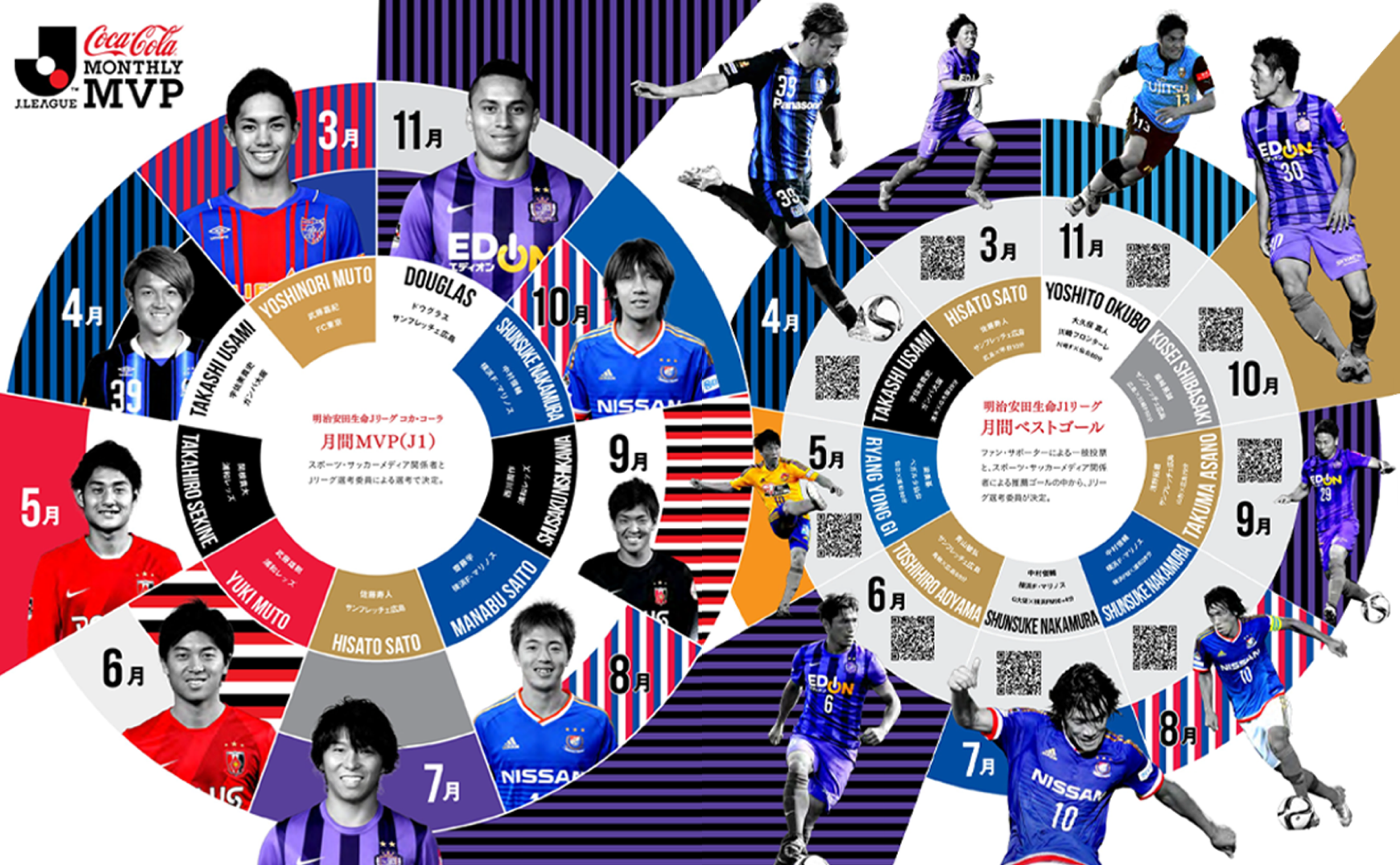
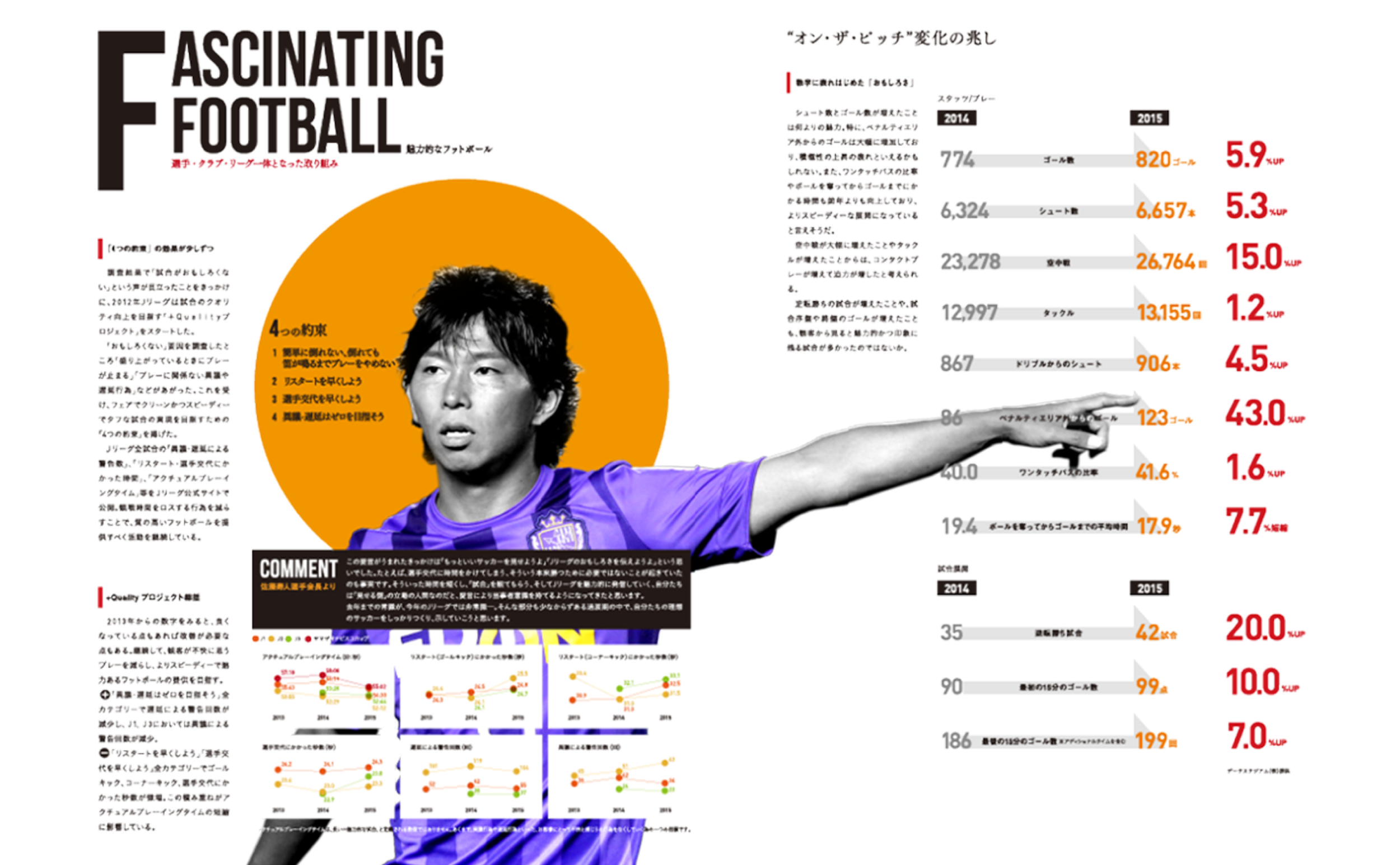
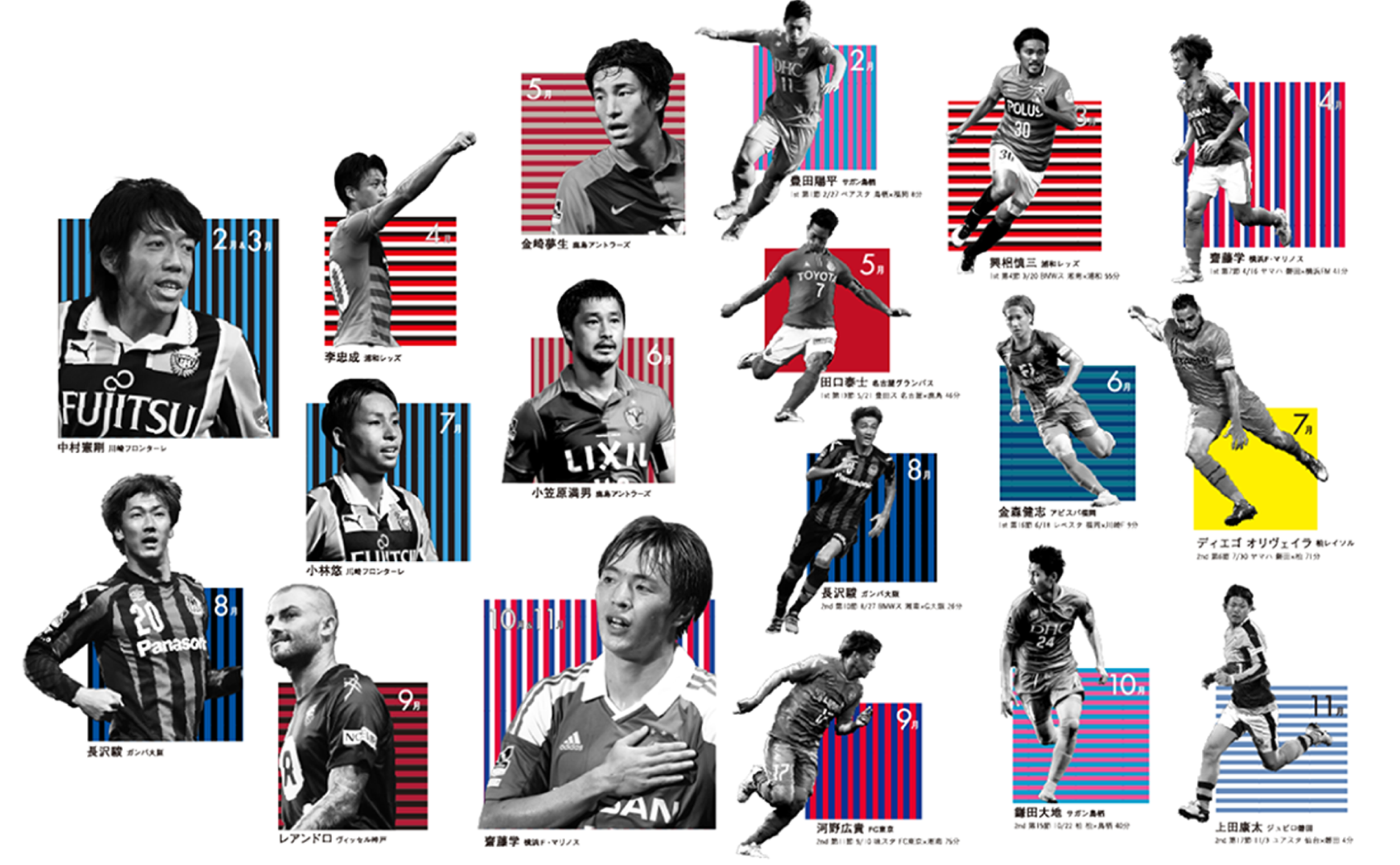
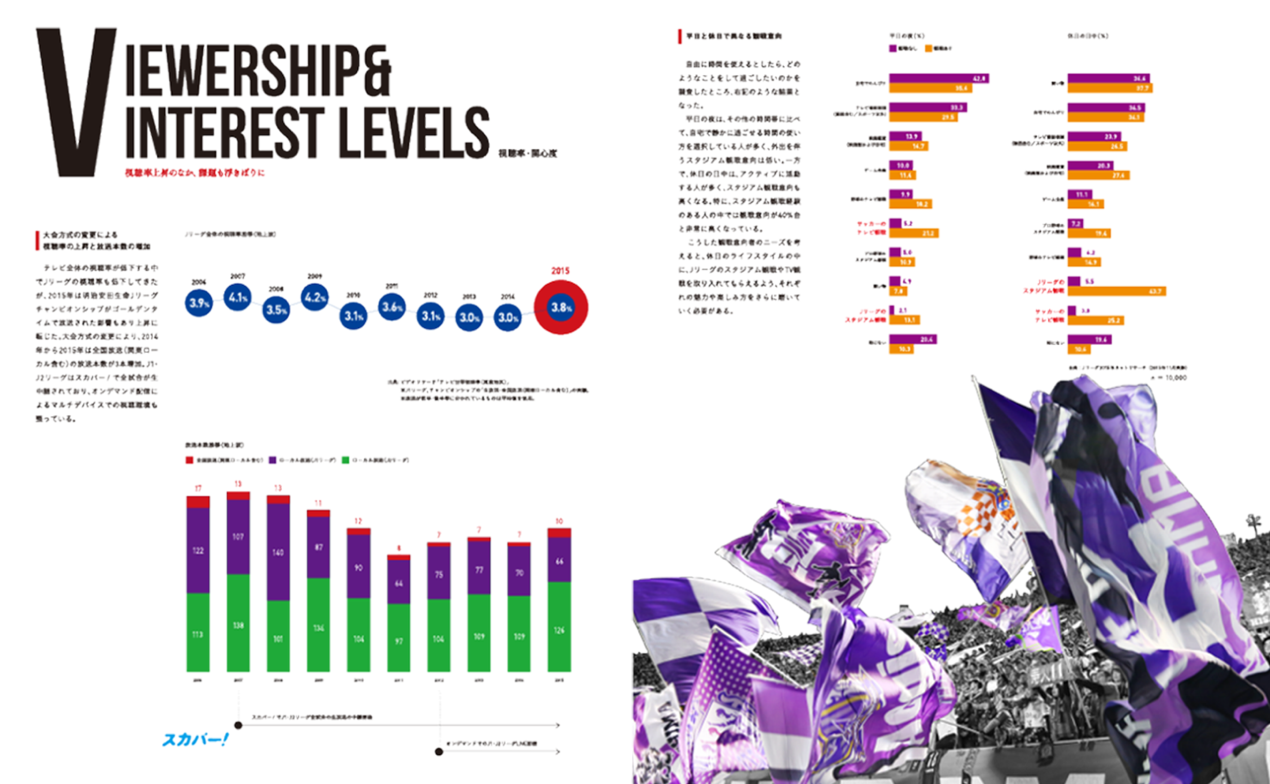
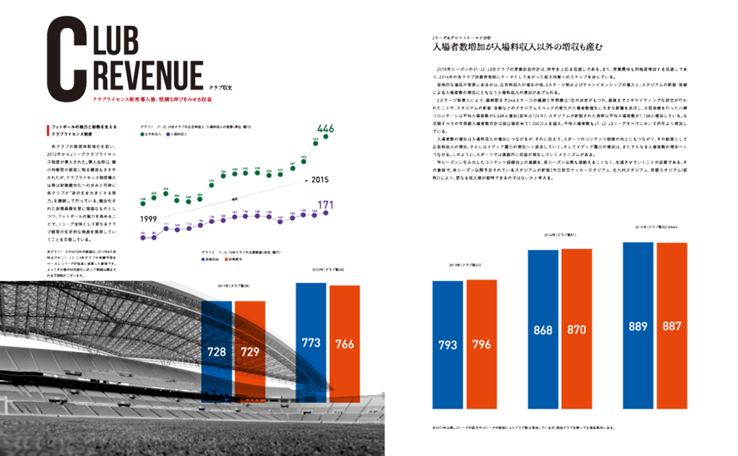
The game is not only in the field, a different game is playing off the field, which is the sports business strategy game. This is the e-book and the hard-copy book to tell J. League's business strategy. This should be showcased like an exciting football game. The energetic visuals speak sports enthusiasm along with colourful and punchy infographics to meet sports photography. It also supports the comprehension of the sports business side in an attractive manner.
Client: Japan Professional Football League
Agency: Hochkiss
Year: 2014-2017
Role: Art/Design Director
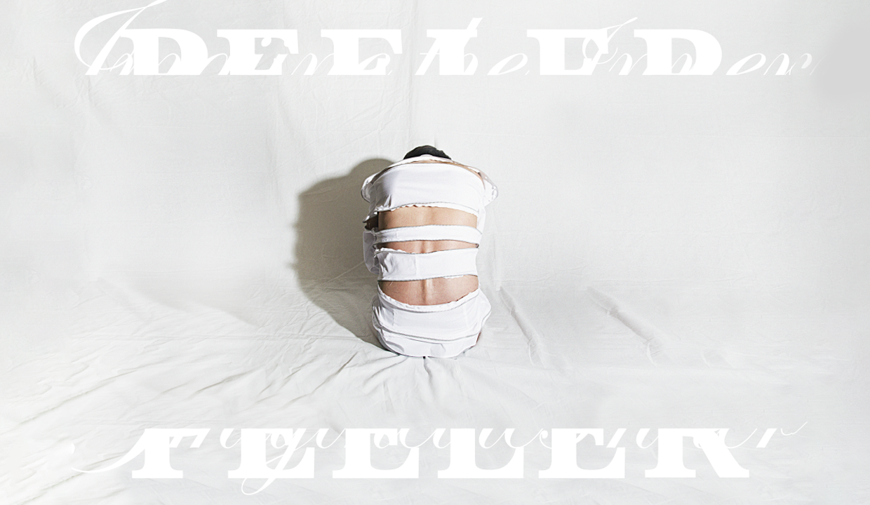

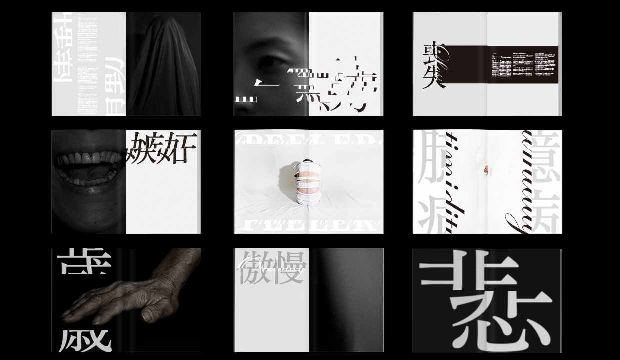
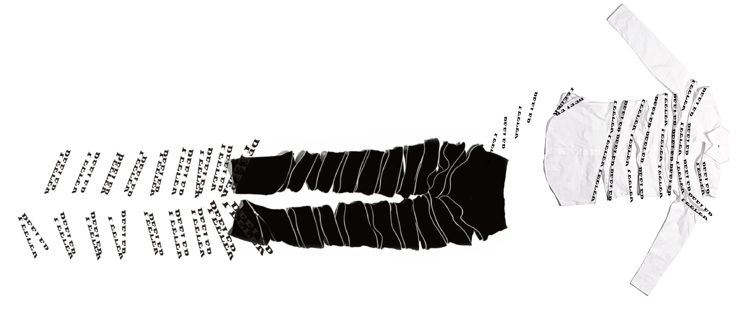
PEELER
-
Peeler has a philosophy of ‘imagining an inner being’. Its clothes have a long fastening open/closing style, much like peeling a banana or an apple. PEELER is against a current age that seems too instant and superficial.
The brand identity cutting the centre of the letter based on its fasteners. I took the photography that gives the feeling something inside, and its mixing with Japanese and English typography showcasing the message quietly but strongly.
Self initiated project
Year: 2015
Role: Art Director & Designer
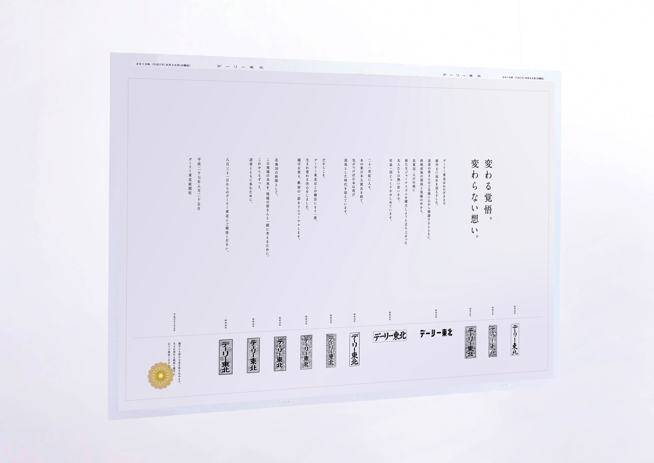
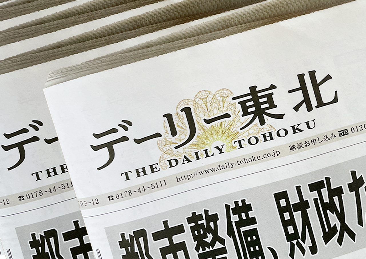
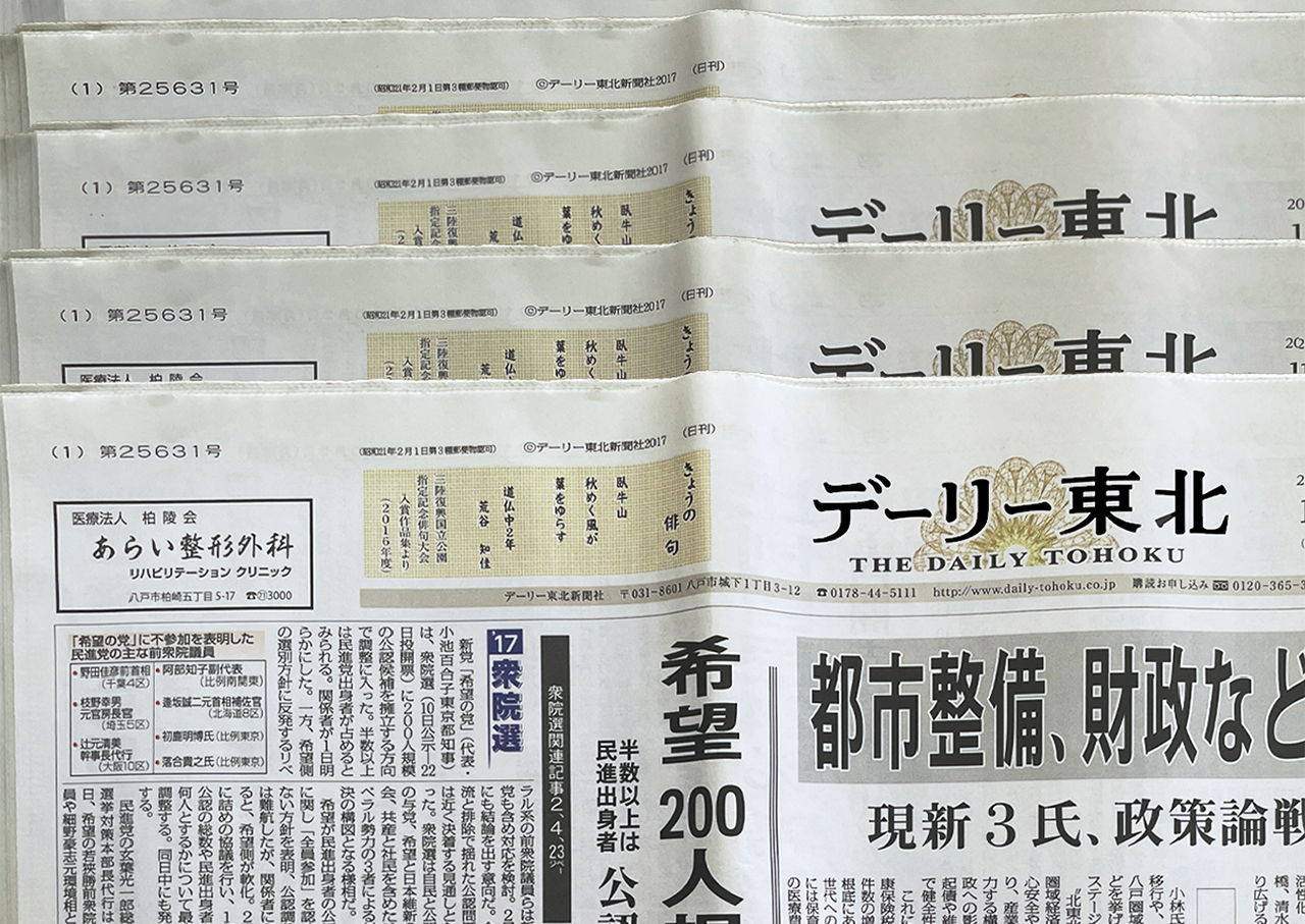
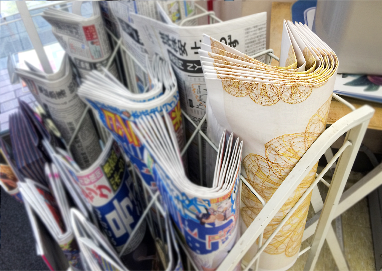
DAILY TOHOKU
-
Re-born.
The Daily Tohoku Newspaper asked us to design their corporate identity. It was their 70th anniversary and also 70 years since World War II had ended so changing the corporate identity was very important at that time. As it was announced to their customers to promise their commitment to trusted journalism, and to be re-born as the best local newspaper, once again.Bloom again.
The unique logotype combined English and Japanese typography symbolising both the global and local perspectives. Chrysanthemum logo was based on a globe design and the 3D appearance was to communicate their journalism from all angles. And it showing their determination to bloom again as the best local newspaper.A wrapping newspaper advertisement that inside is a written their history and passionate spirit for the 70th anniversary as a teaser.
Year: 2014
Agency: Hochkiss
Role: Art Director/Designer
KENNEDY
-
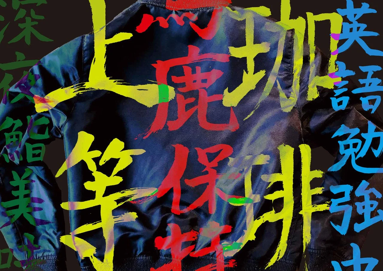
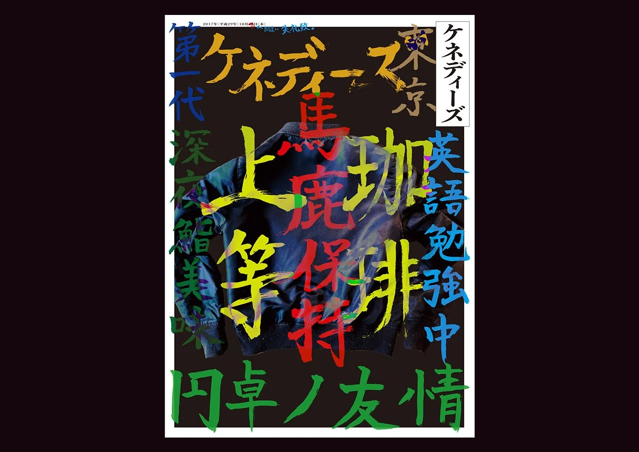
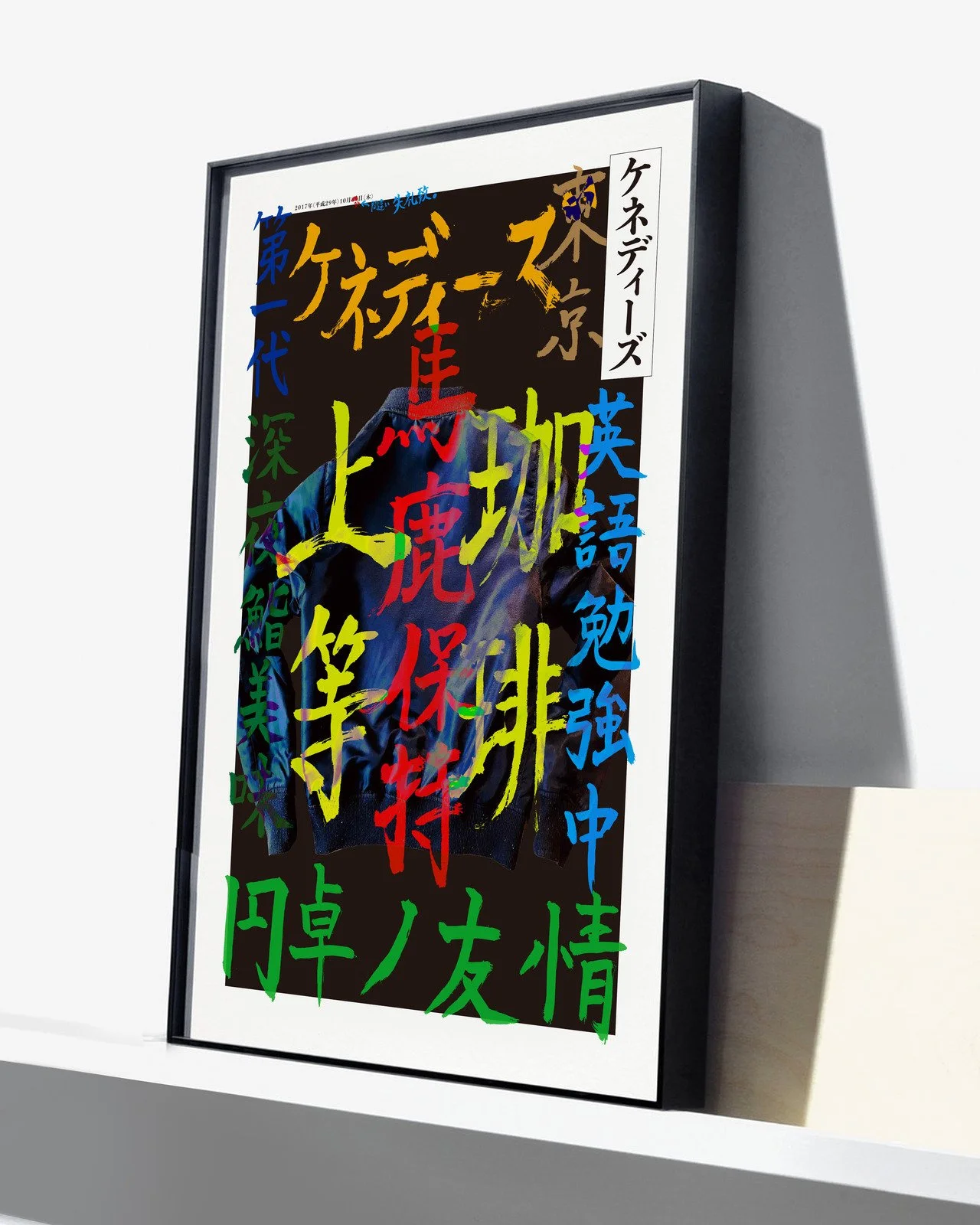
This is the printing trial that DAIICHI Printing Plc asked me to create the print design using a new printing machine that is high quality and fast speed On-Demand Printing. Designed with colourful Kanjis that are inspired from the equivalent Japanese ruff riders.
If you can’t read Japanese, that is great for me!!
Client: DAIICHI PRINTING Inc
Agency: Wieden + Kennedy
Year: 2018
Role: Art/Design Director
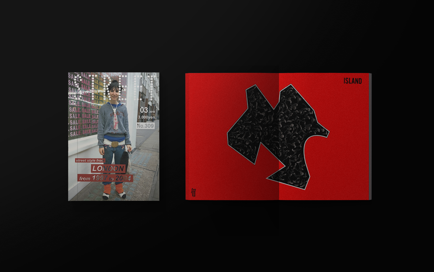

STREET Magazine
-
Client: STREET Magazine Tokyo
Agency: Freelance
Year: 2018
Role: Designer