Yuriko is a London based Japanese Designer. Currently learning British humor & its weather.
About yurikoui.london@gmail.com
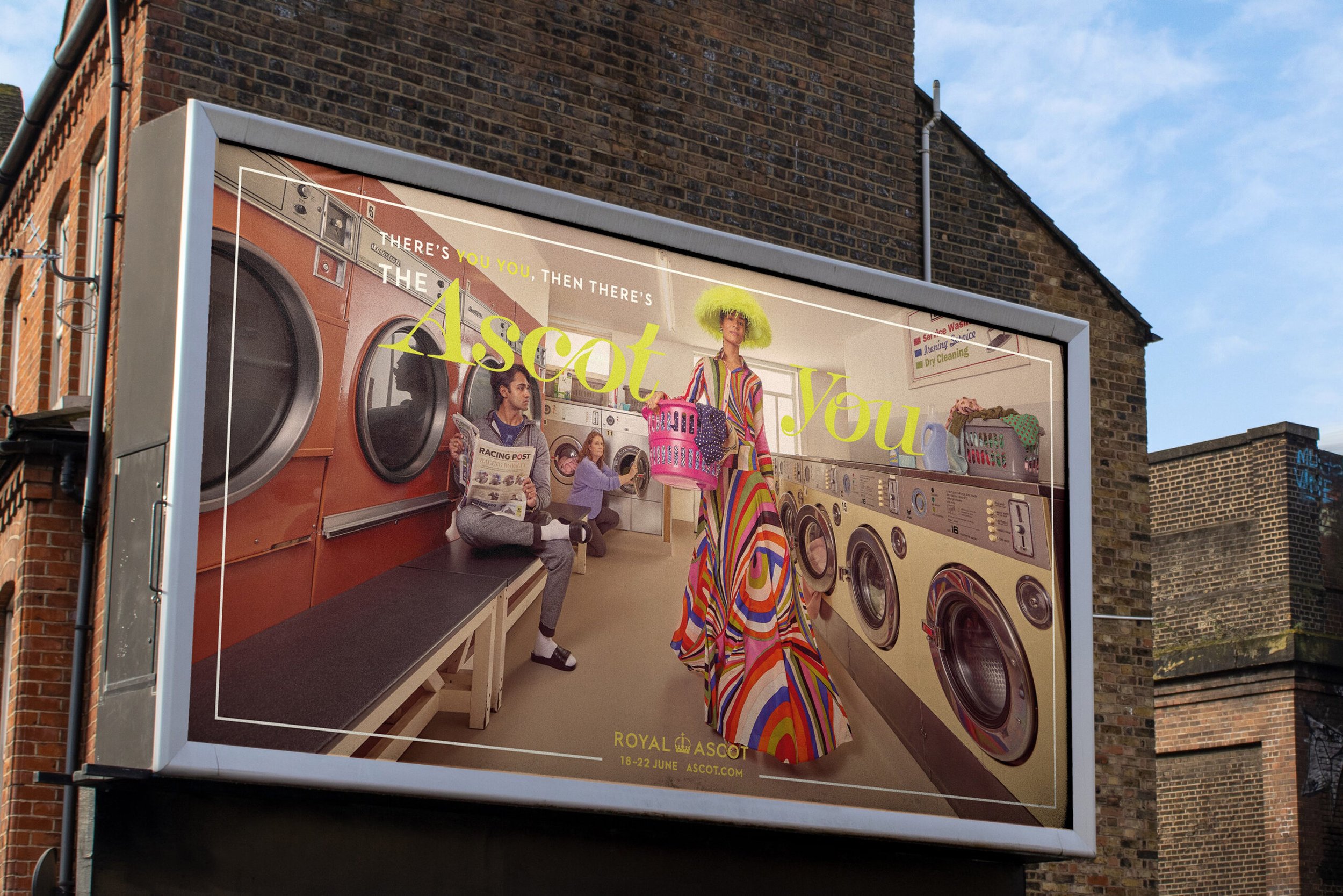
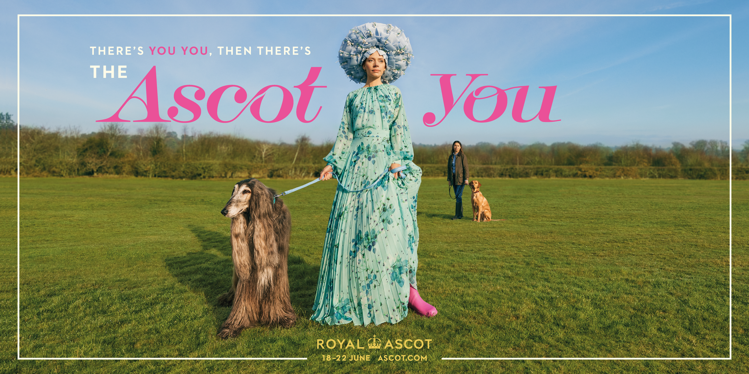

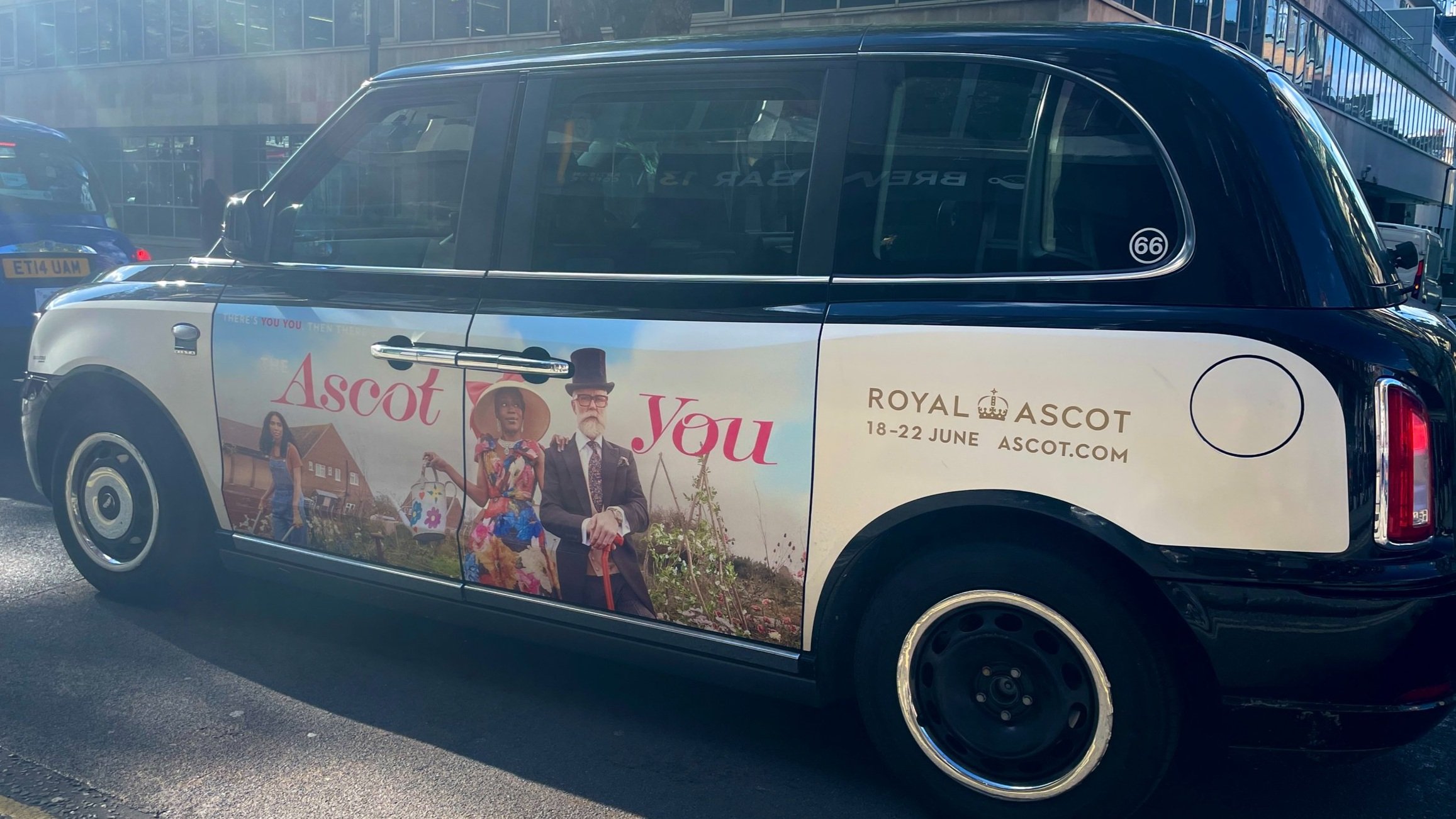
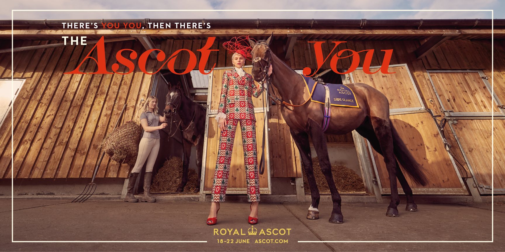



ROYAL ASCOT
-
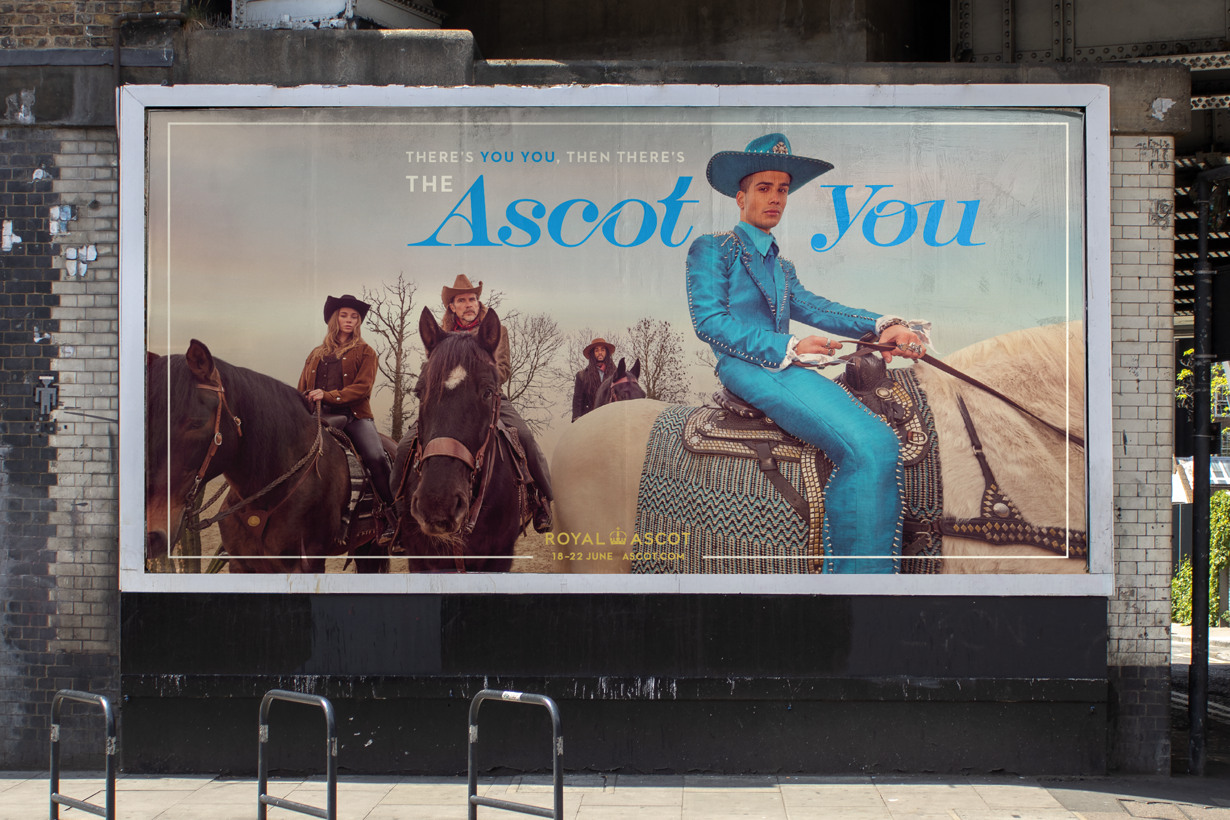
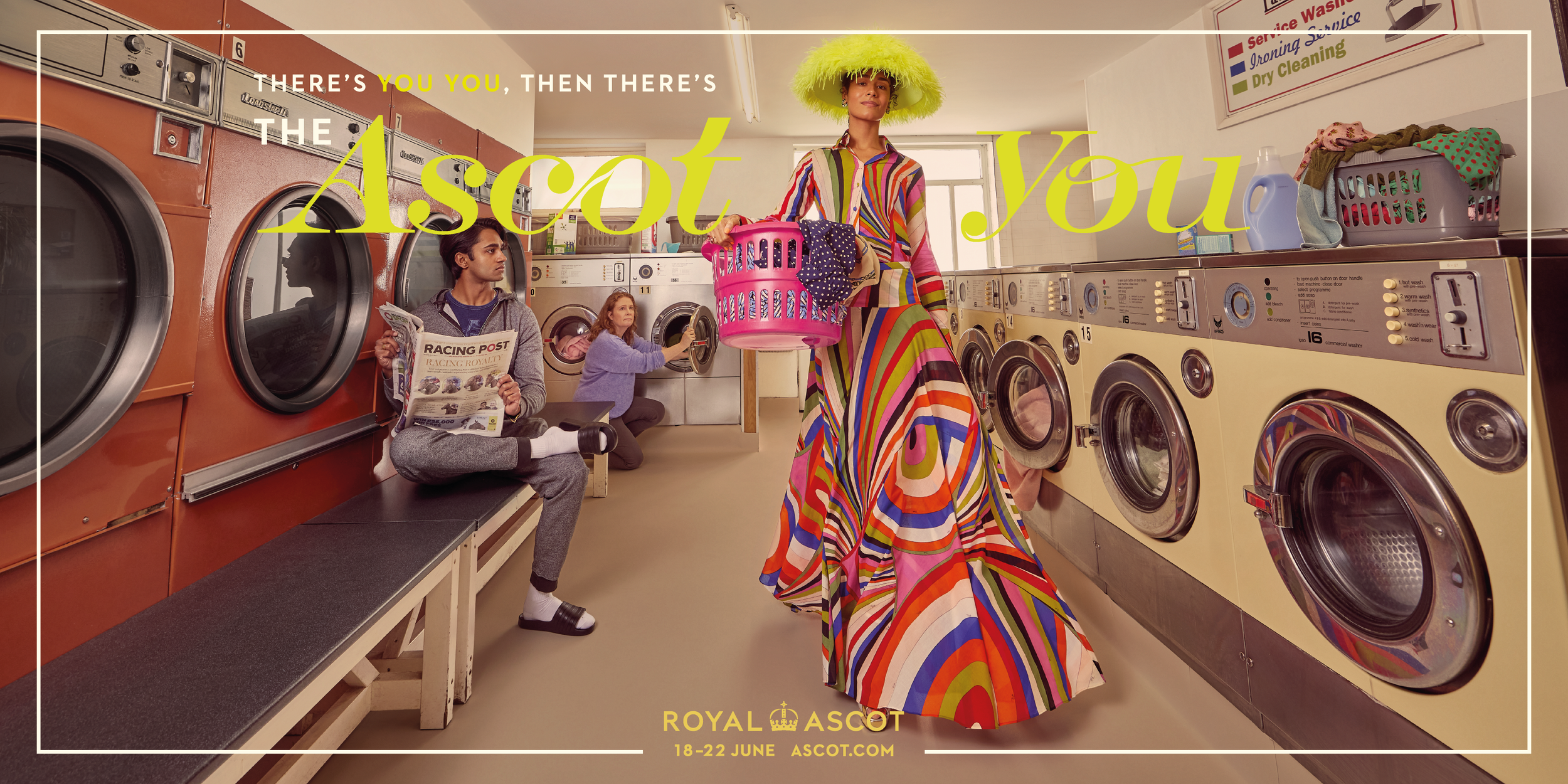
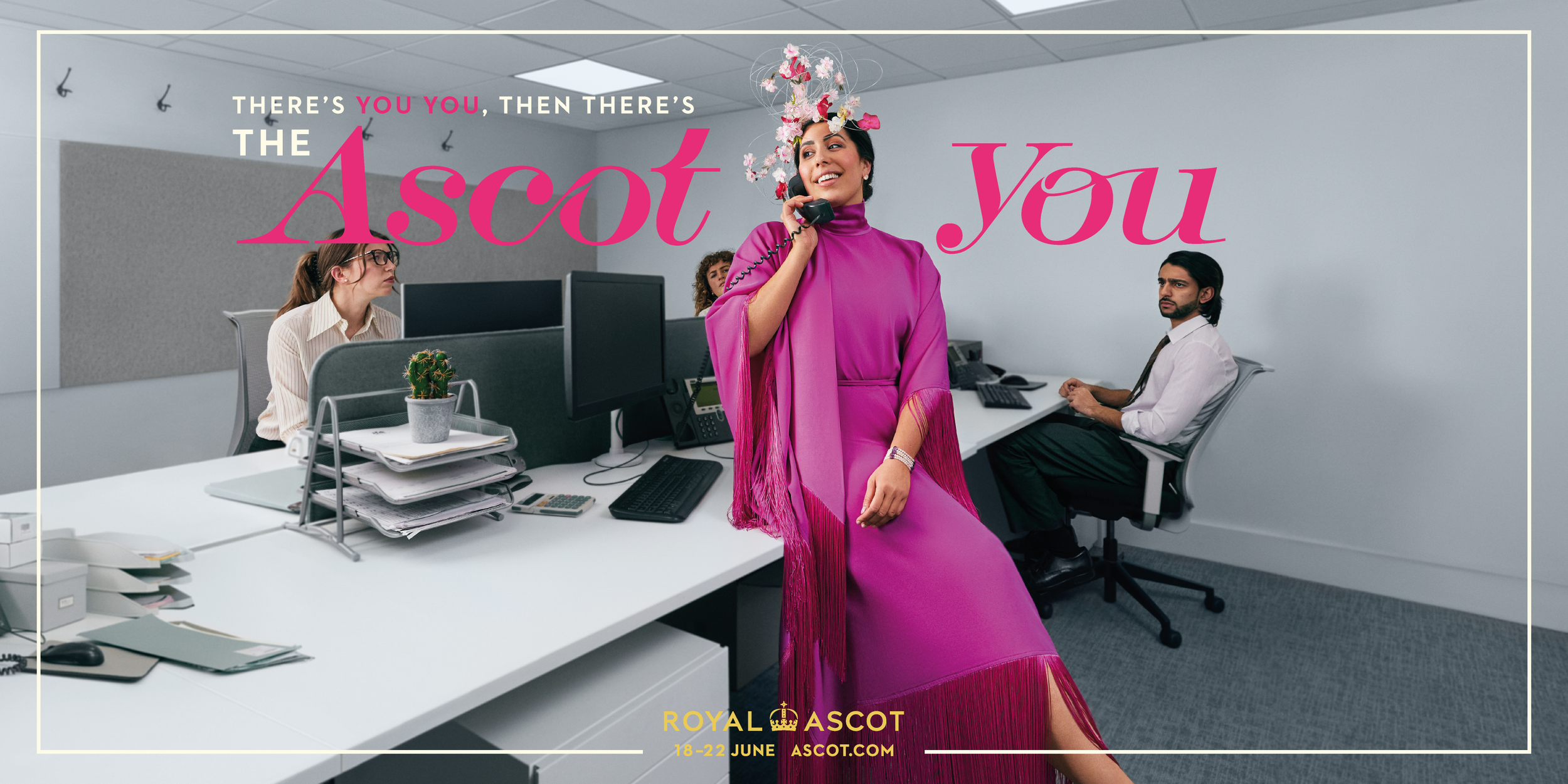
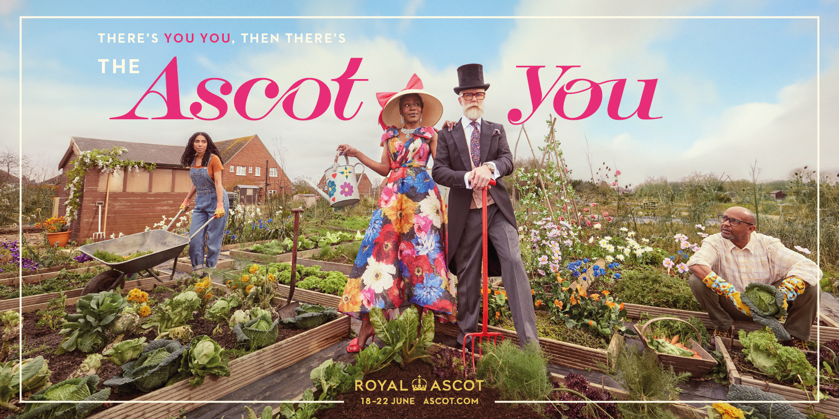
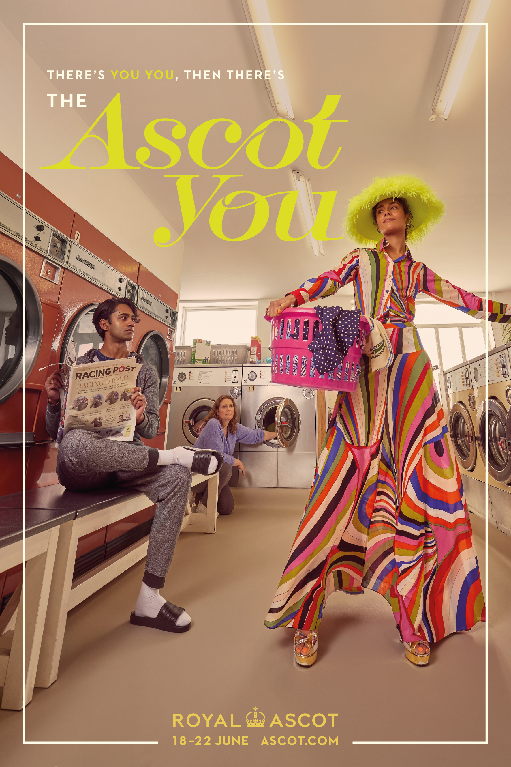
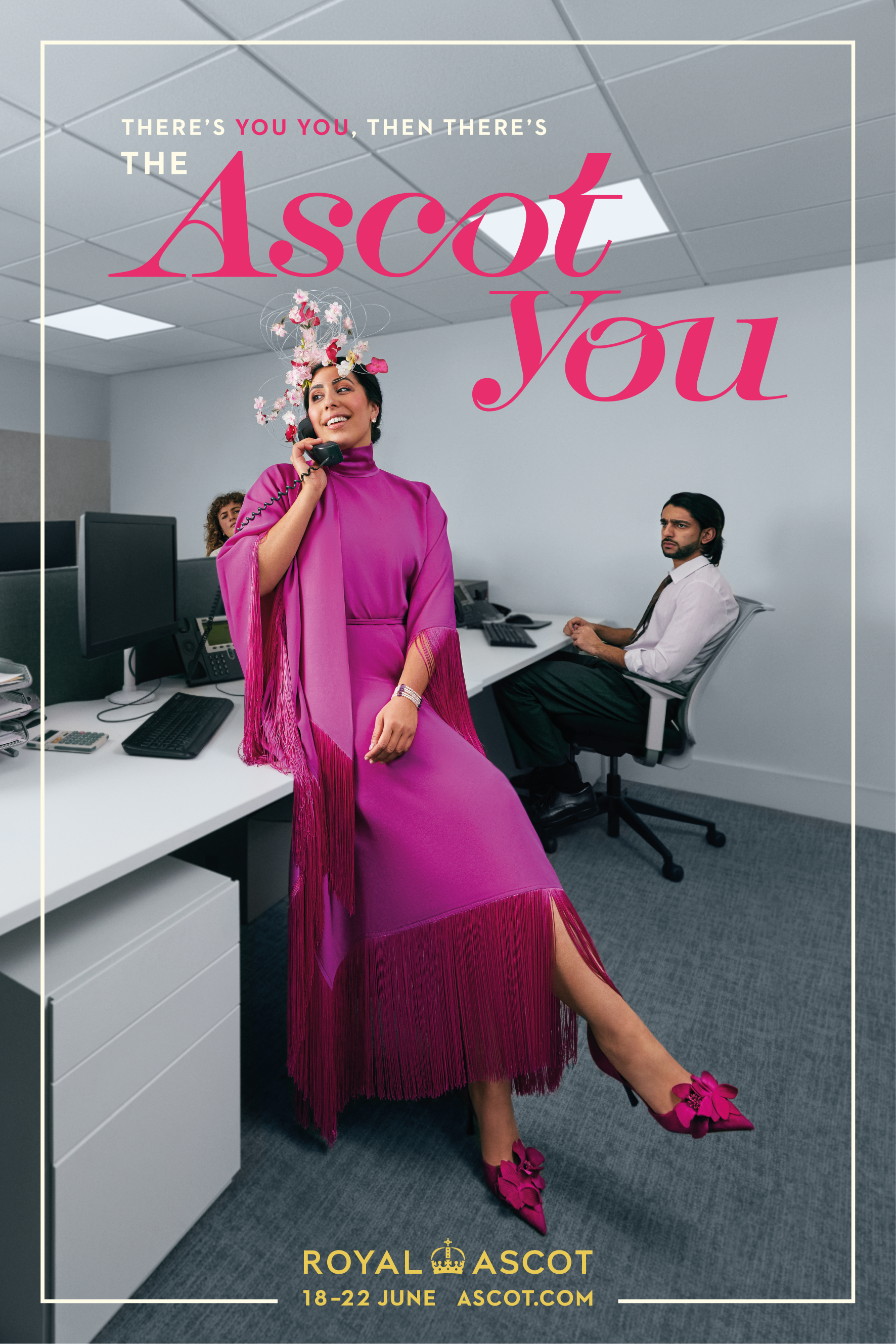
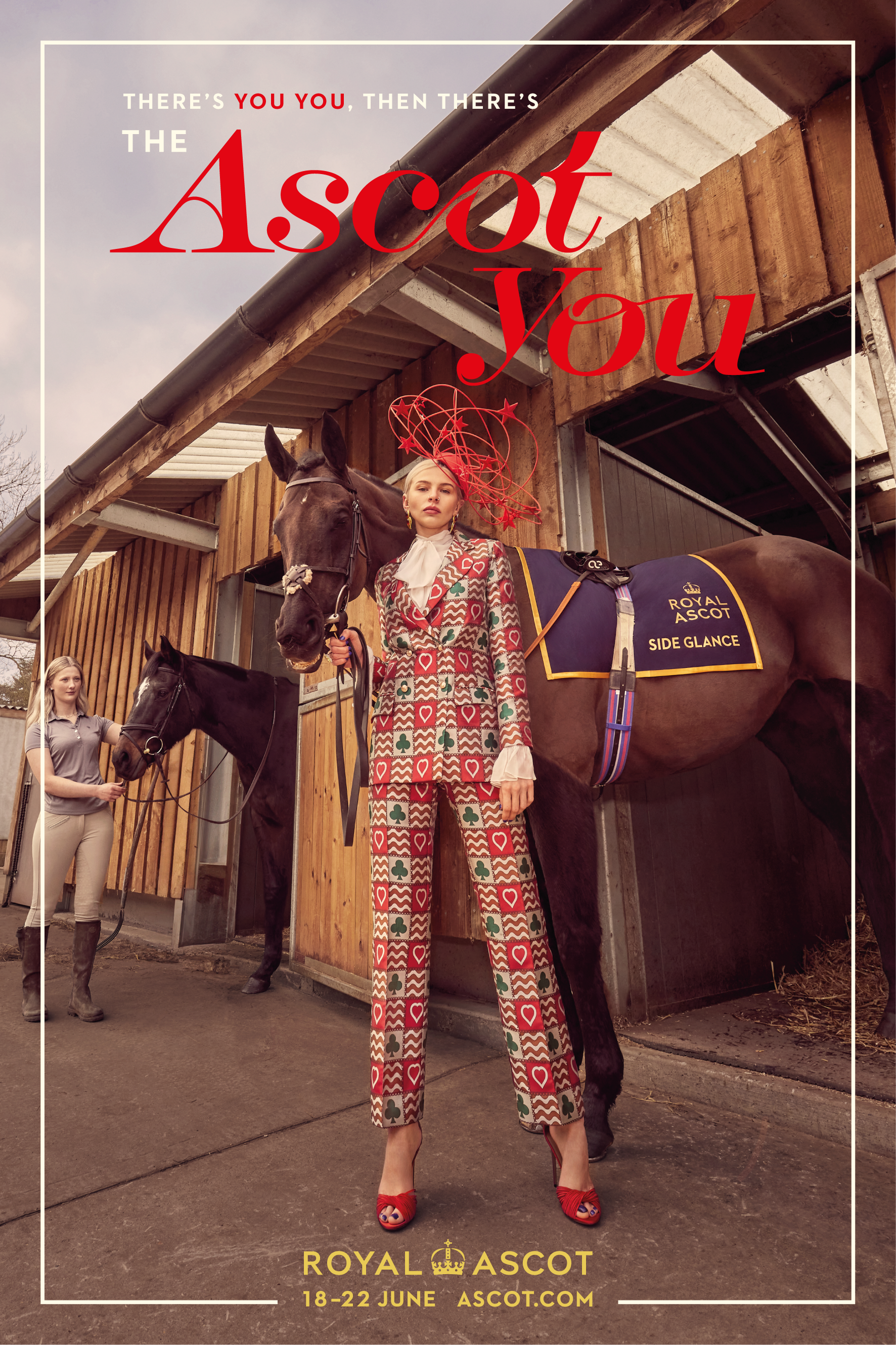
There’s YOU YOU, then there’s ASCOT YOU
“The Ascot You” campaign returns for a second year running, reminding audiences that everyone has an inner elegance which can be released at the world-renowned Ascot Racecourse. With four new lavishly glam scenarios, shot by Carla Guler, the 2024 creative showcases a variety of characters embracing the Ascot version of themselves whilst going about their every day lives, beautifully dressed for an Ascot event.
Client: ROYAL ASCOT
Role: Lead Designer
Year: 2024
HSBC World Rugby SVNS
-
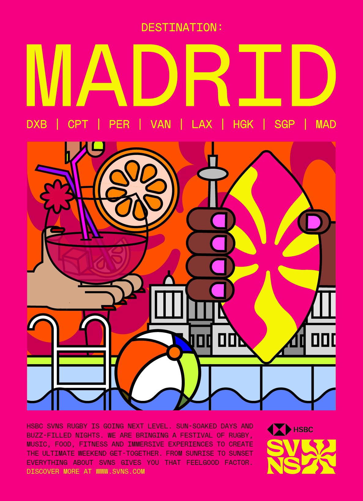
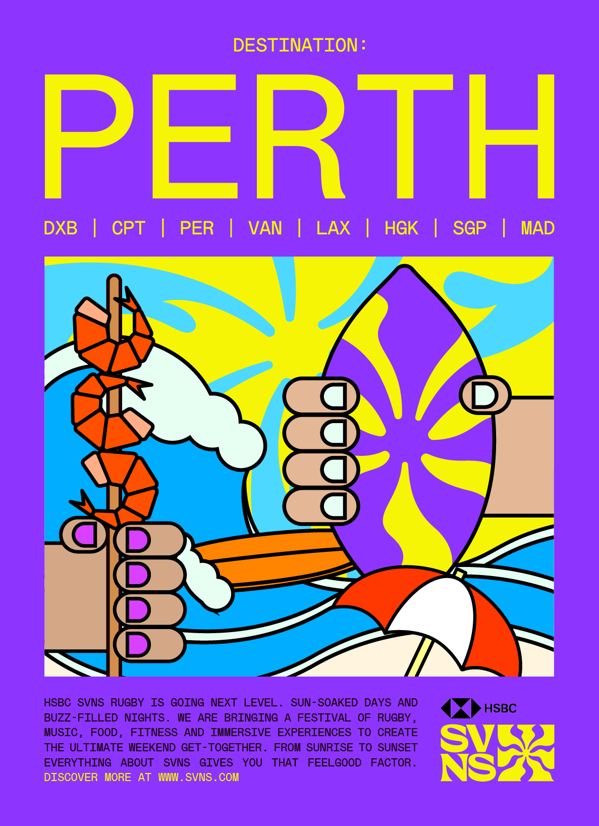
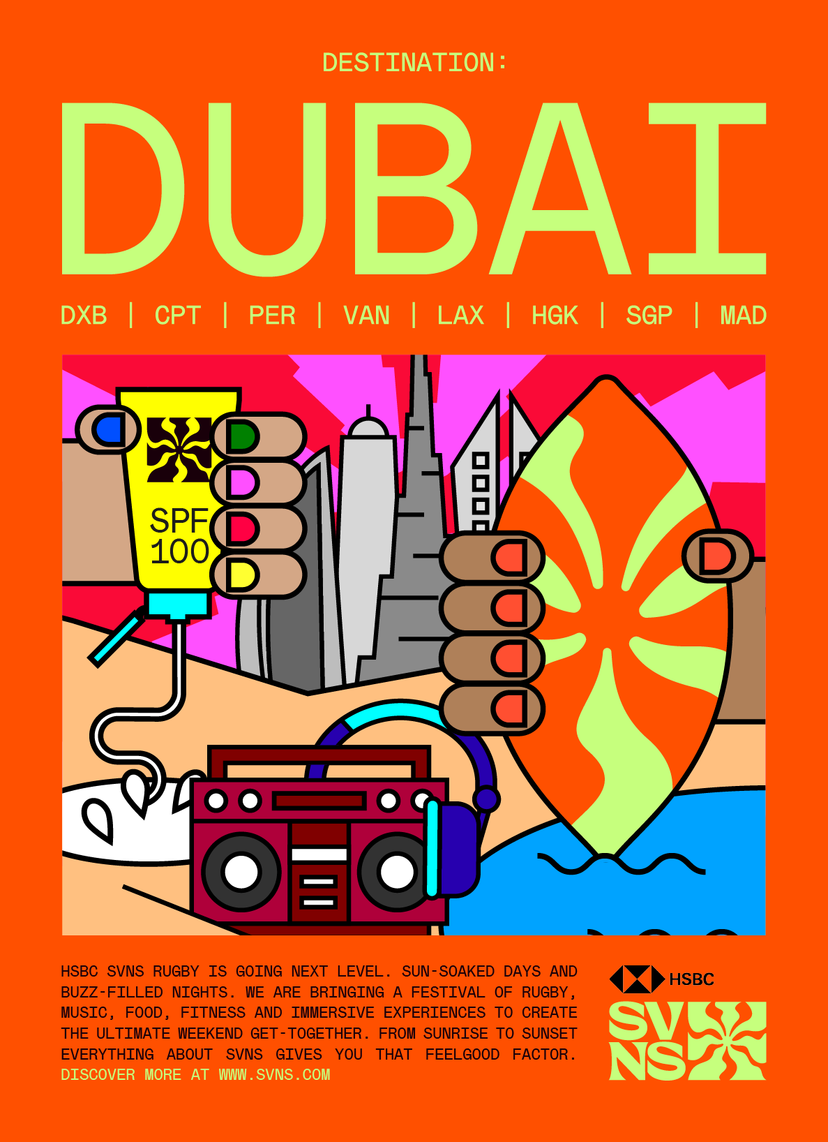
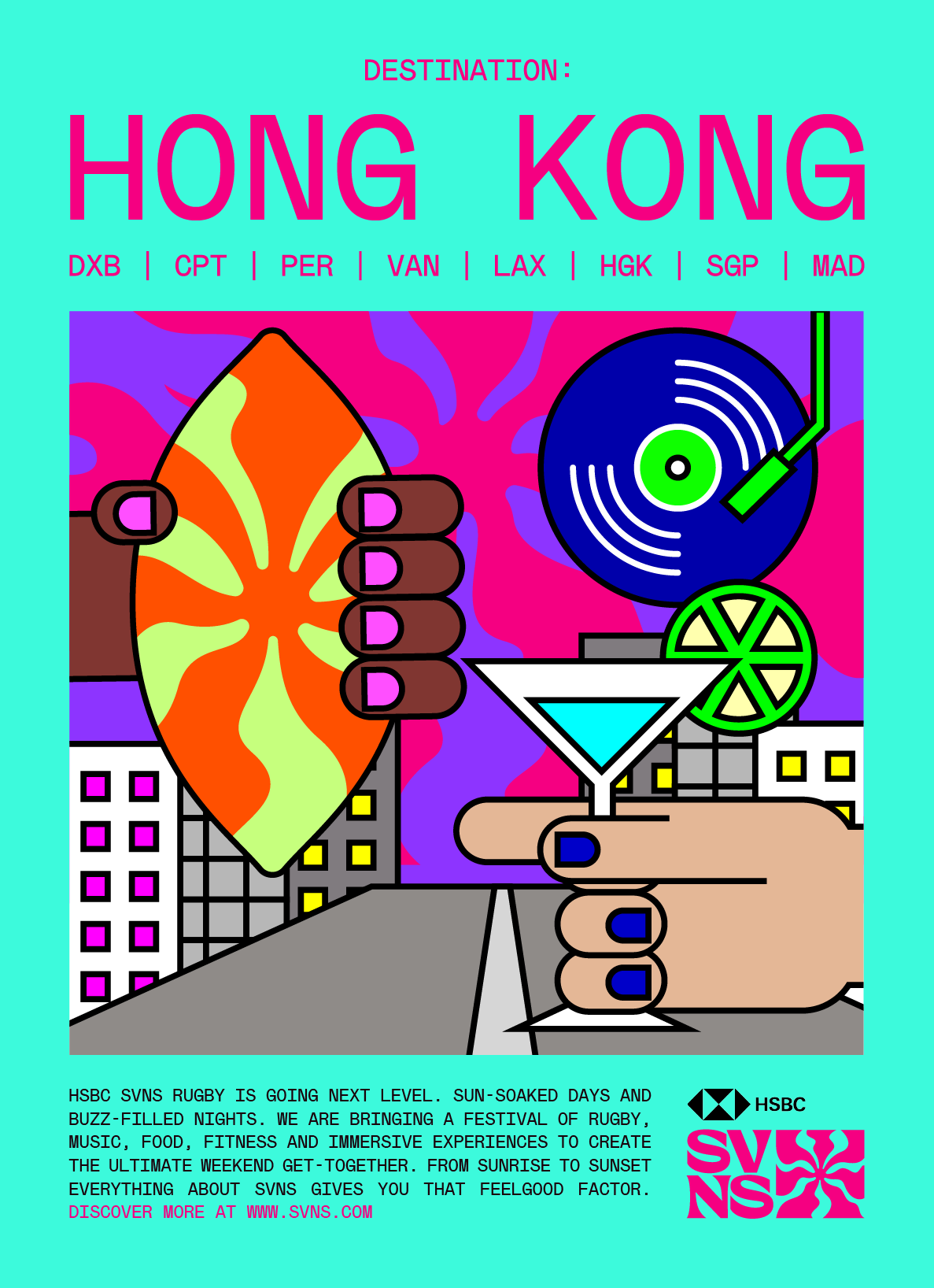
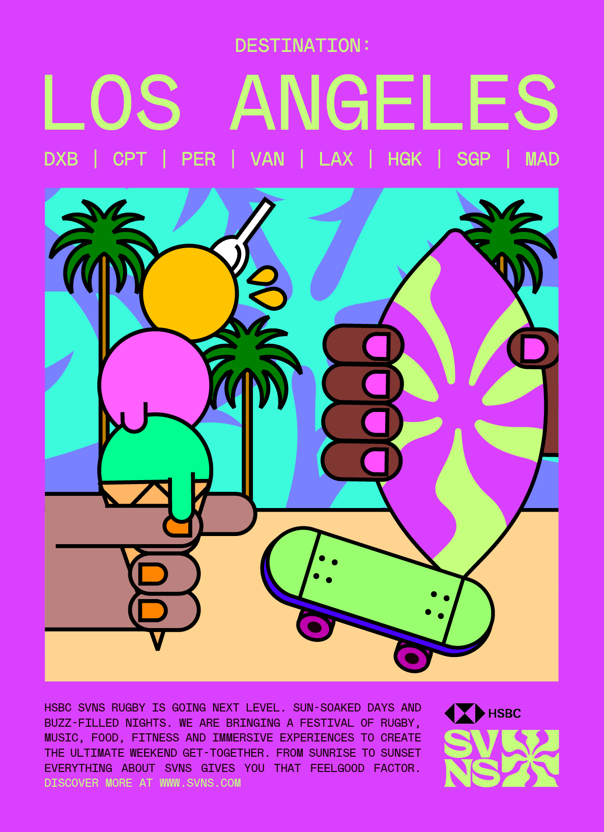
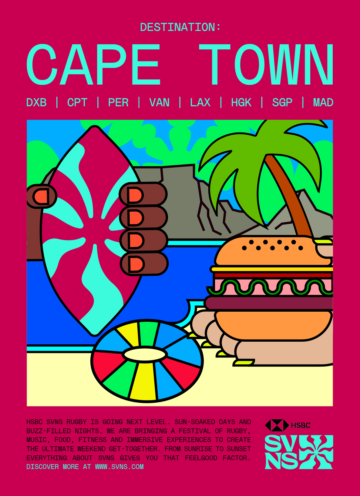
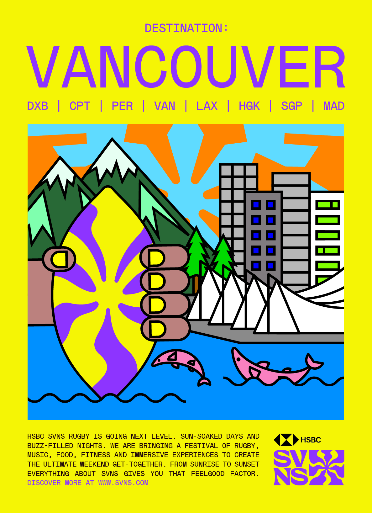
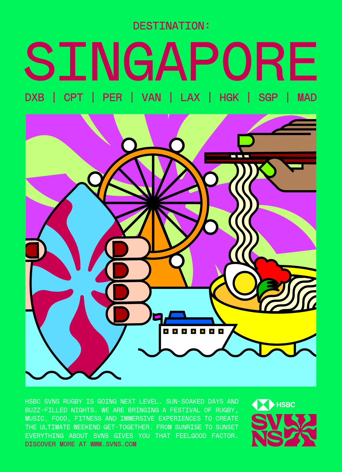
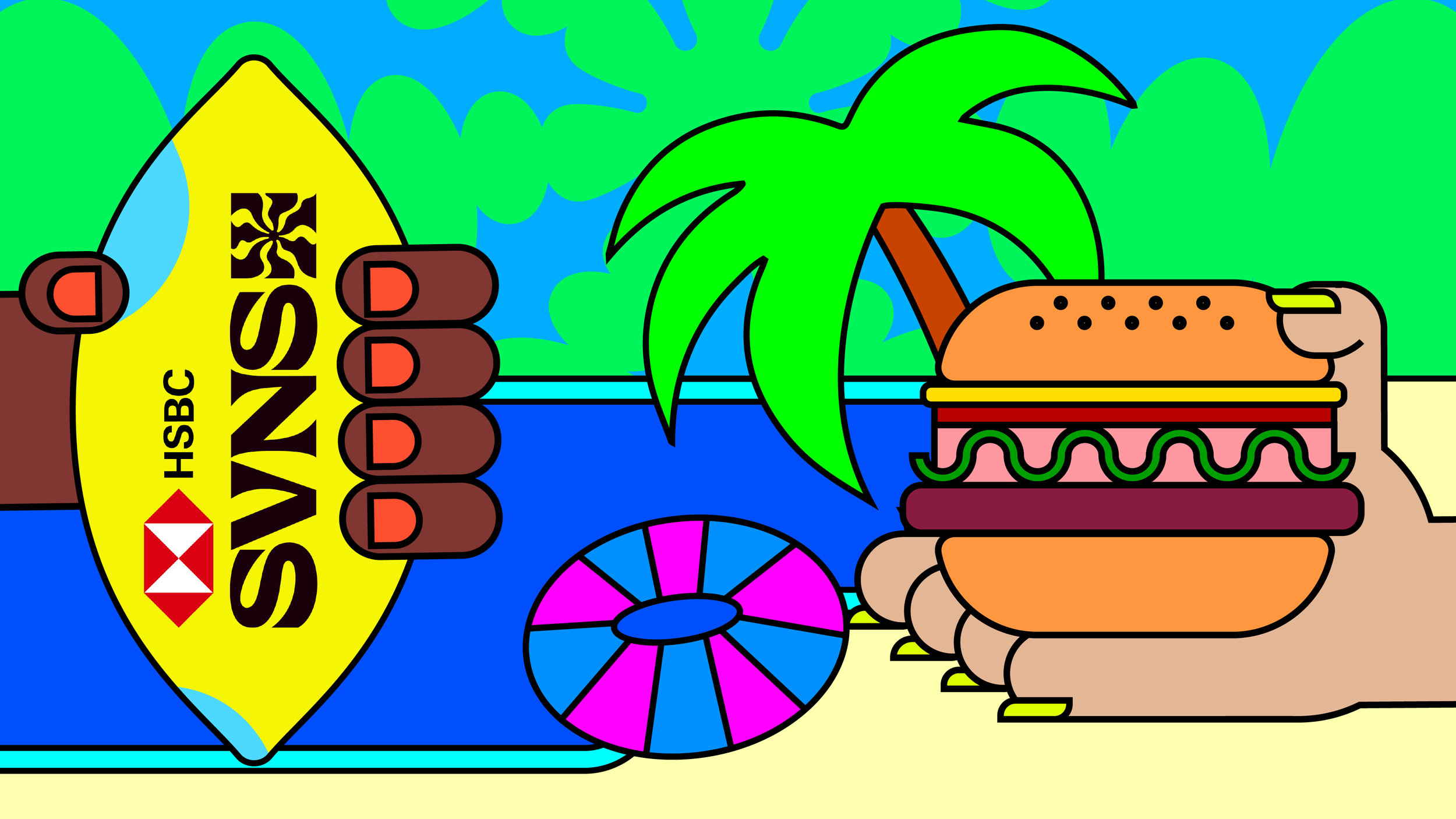
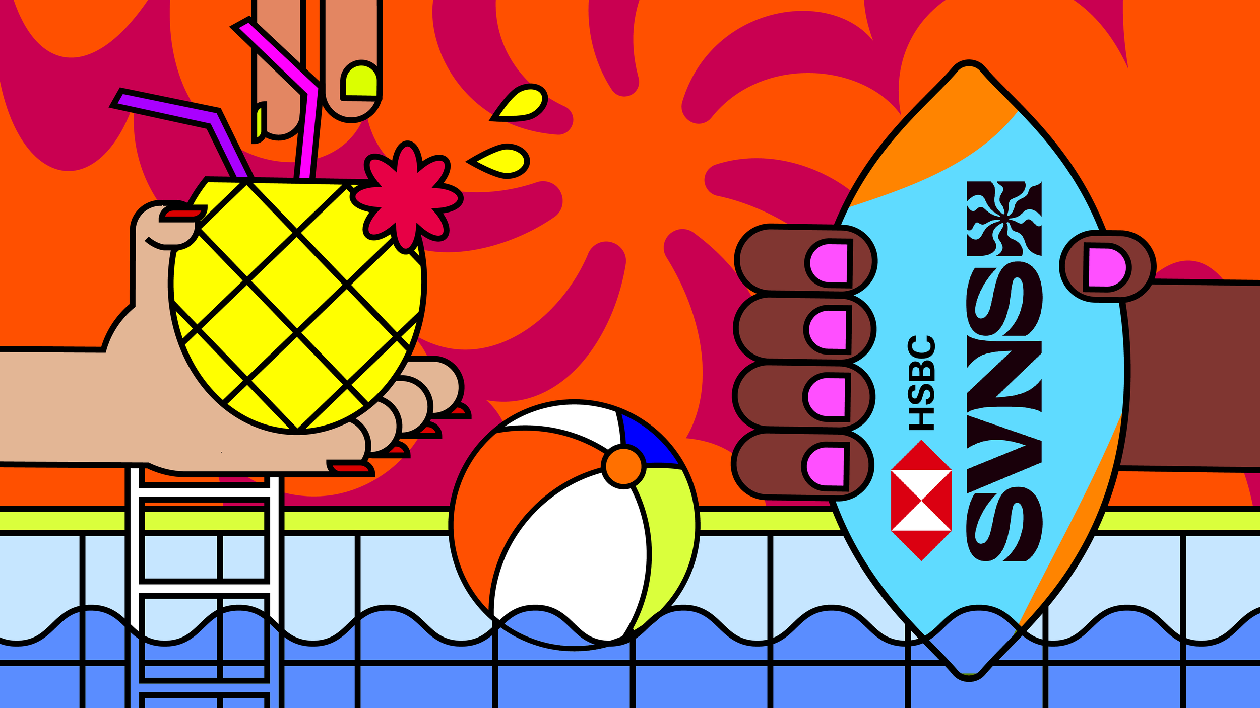
Forget Ibiza, The Caribbean, or the Canary Islands- there is a new hot destination this year. HSBC SVNS, World Rugby’s reimagined and rebranded global celebration of rugby sevens across eight iconic cities, is not just a rugby tournament, but a must-attend experience set in some of the world’s most exciting locations.
To mark the relaunch, the campaign “Destination: SVNS” is all about encapsulating the madness of a weekend watching Rugby Sevens. From the incredible locations and the fancy dress, to the incredible food, fairground rides, live music and a fair bit of world-class rugby thrown in, too. Converting those who are not typically rugby fans by positioning the tournament as the ultimate summer destination, packed with entertainment from dawn till dusk.
Campaign Design
Client: HSBC World Rugby Sevens
Role: Lead Designer
Produced in 2023 at Dark Horses



Barclays WSL
-
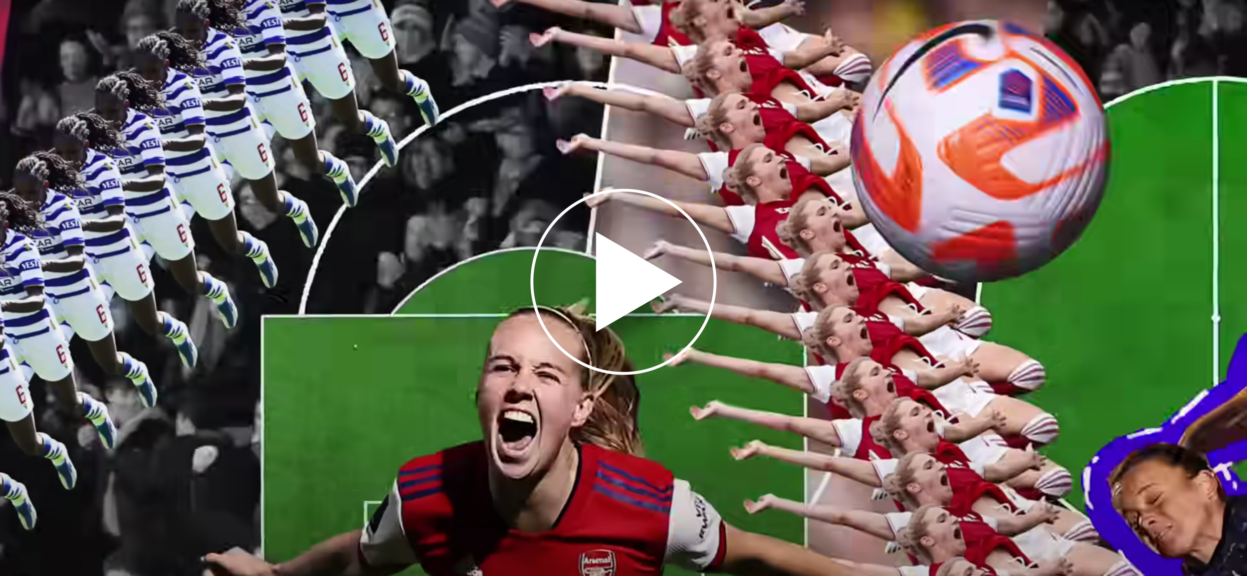
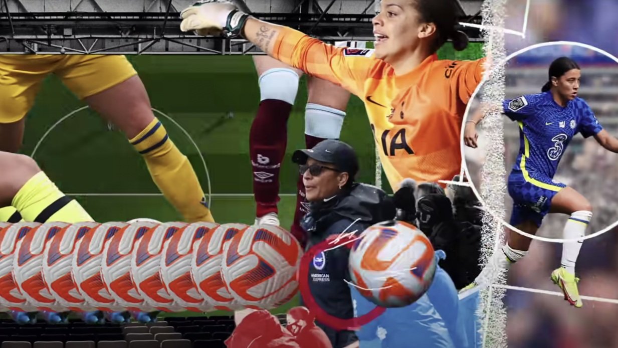
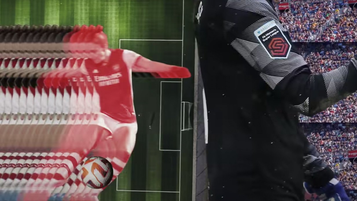
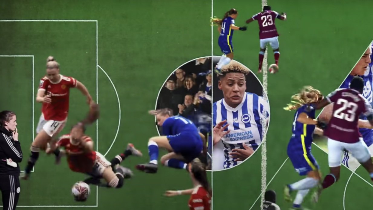
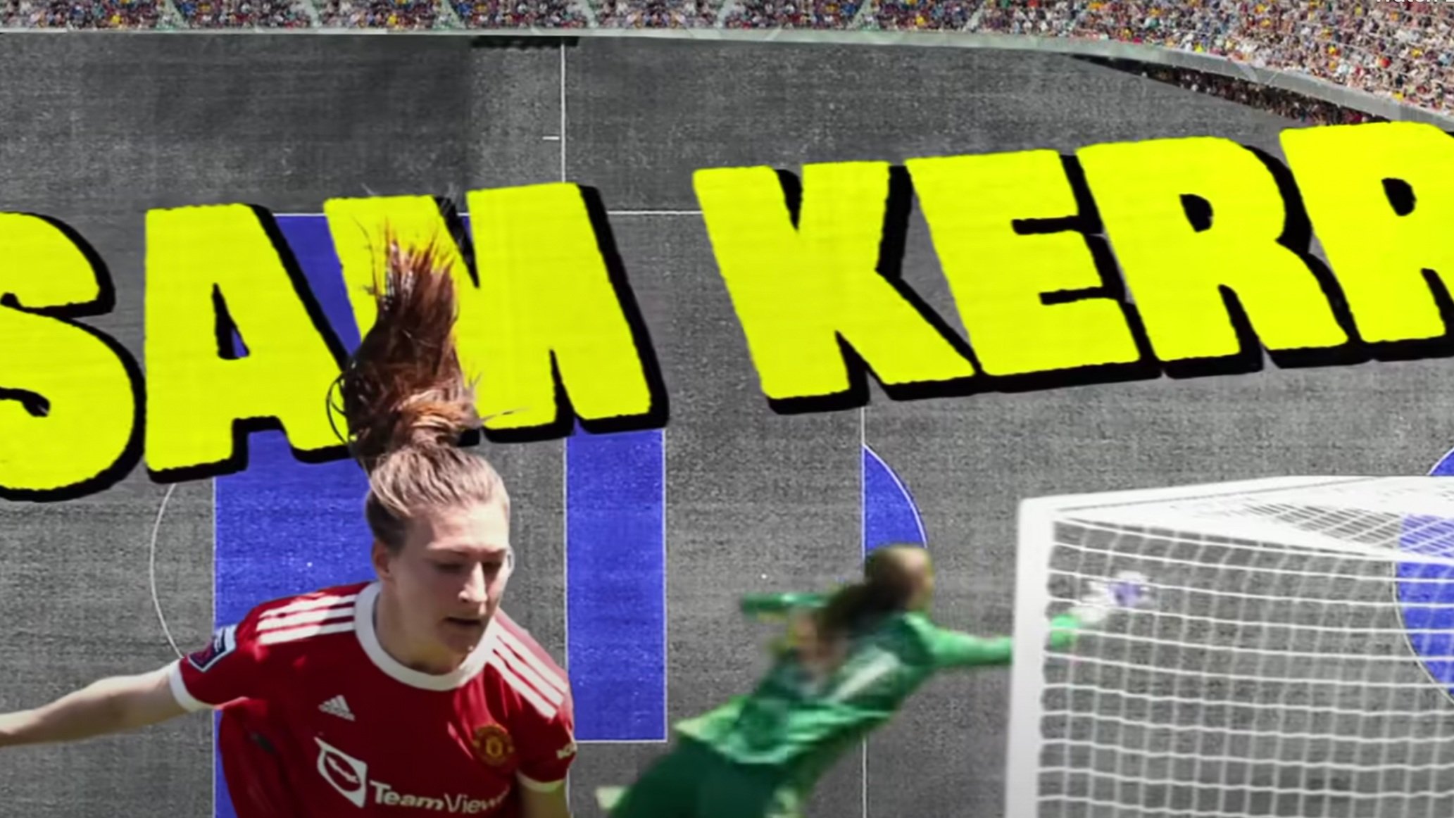
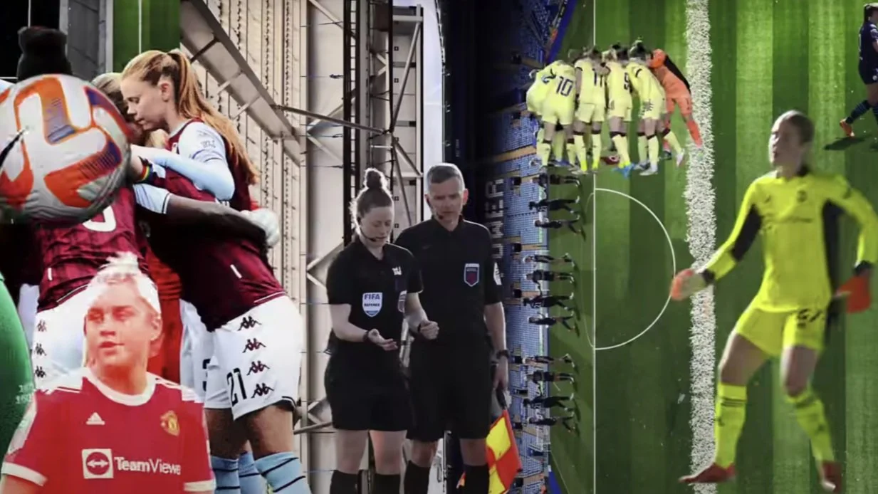
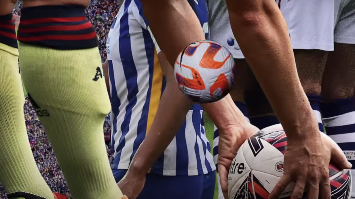
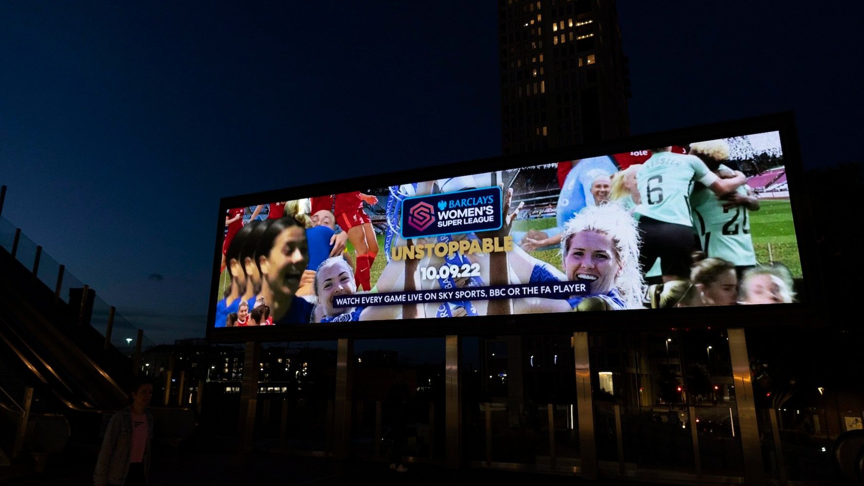
The campaign built off the success of the Euros whilst launching the FA Barclays Women’s Super League’s new brand platform UNSTOPPABLE’. It was designed to demonstrate that women’s football is no longer on a journey. Packed full of the biggest names, moments, stories and rivalries in the game, visually energetic, living breathing collage. From goals and saves, to ferocious tackles, the film is all set to a bespoke track created using match day commentary.
Client: Barclays Womens Super League
Agency: Dark Horses
Year: 2022
Role: Visual Designer
G.O.A.T PRINTS
-
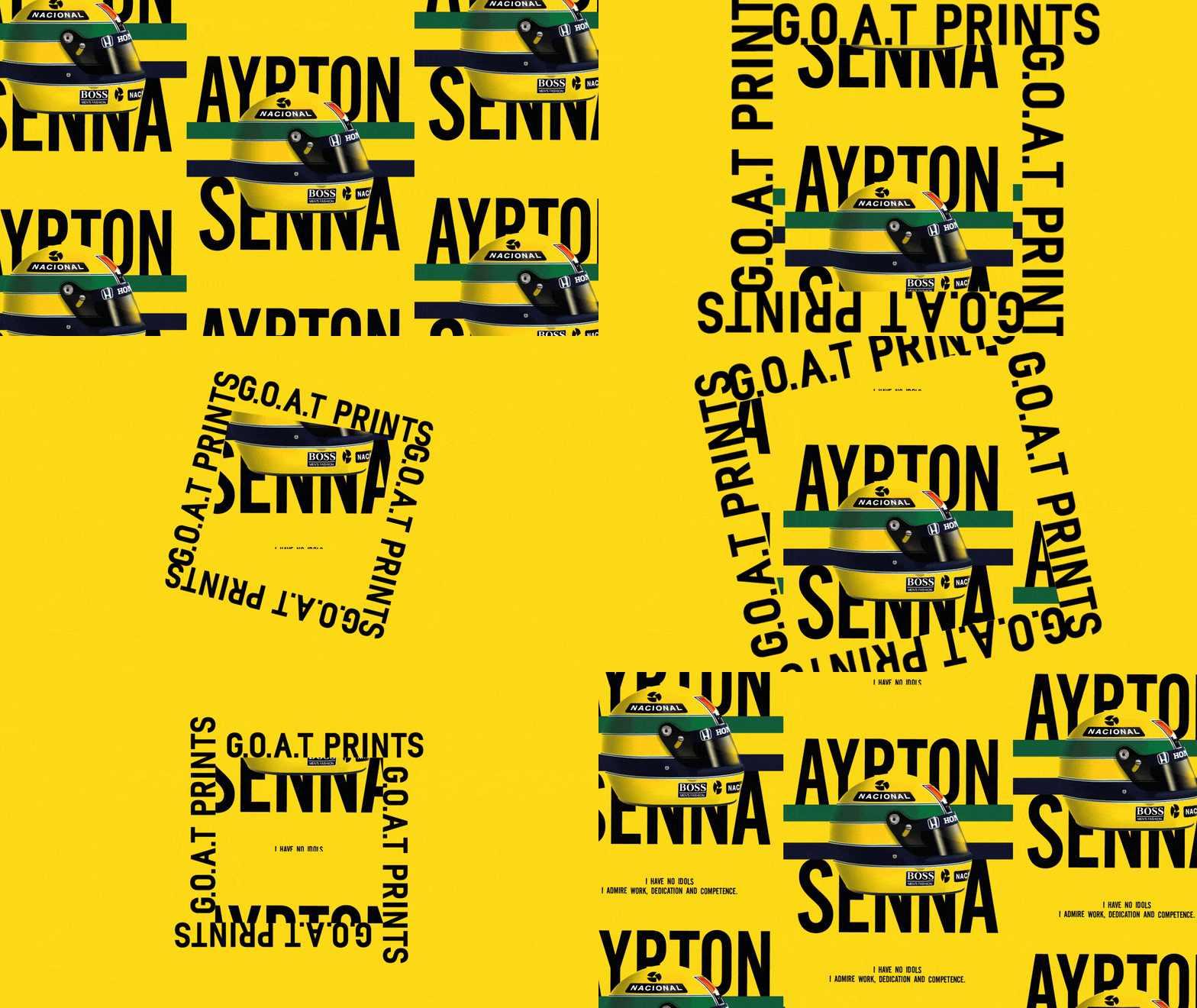
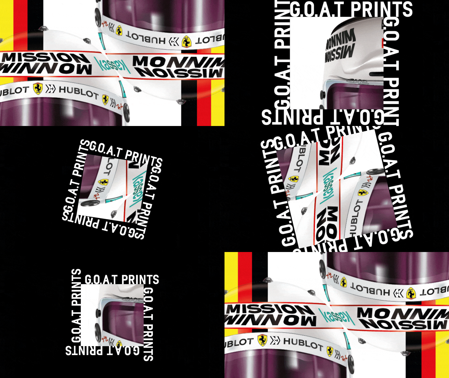
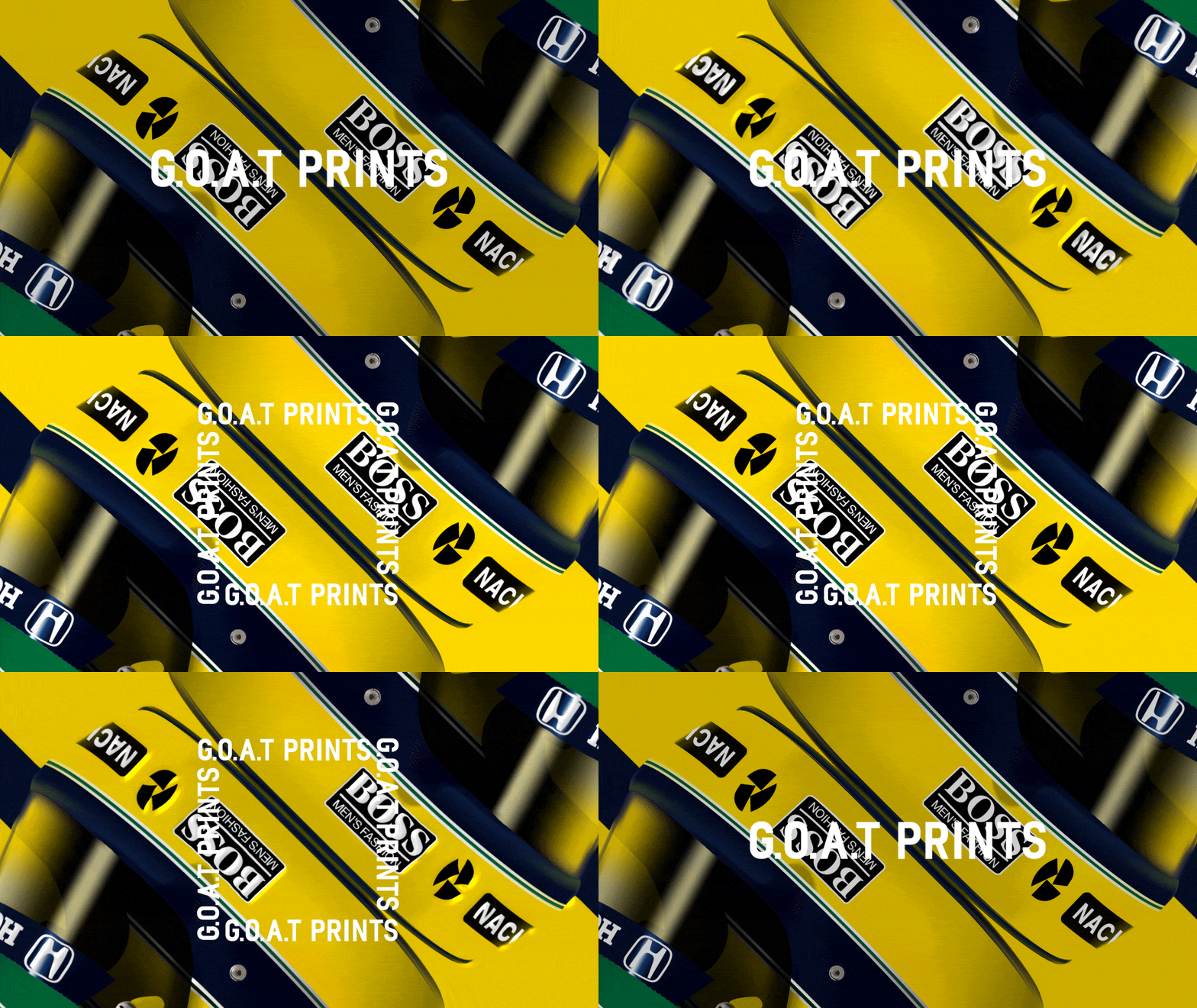
Minimum brings maximum motorsport world from square.
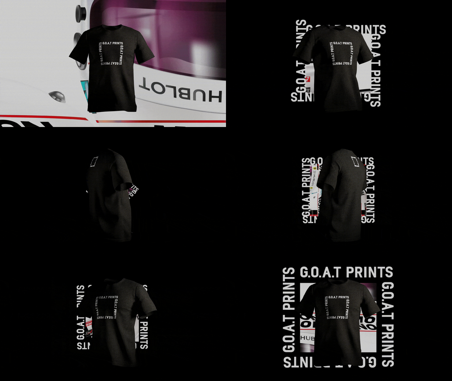
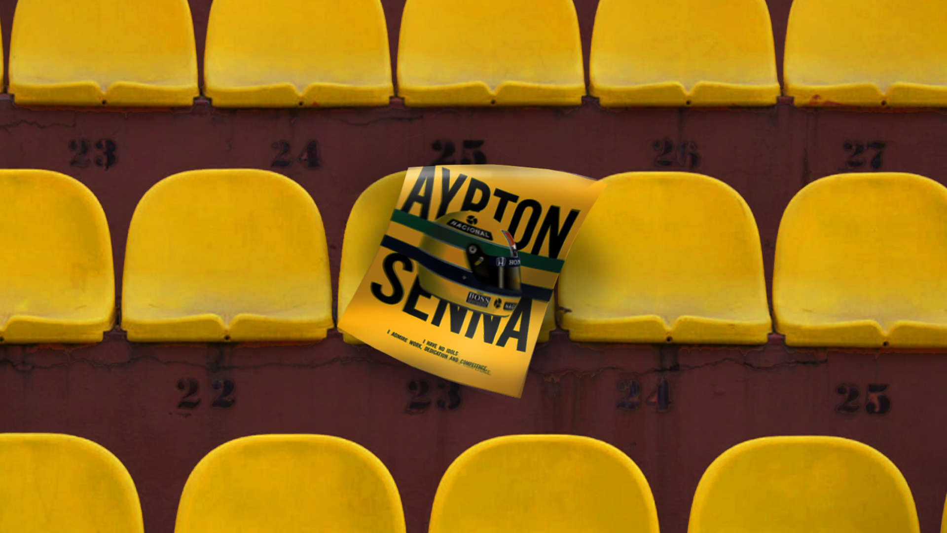
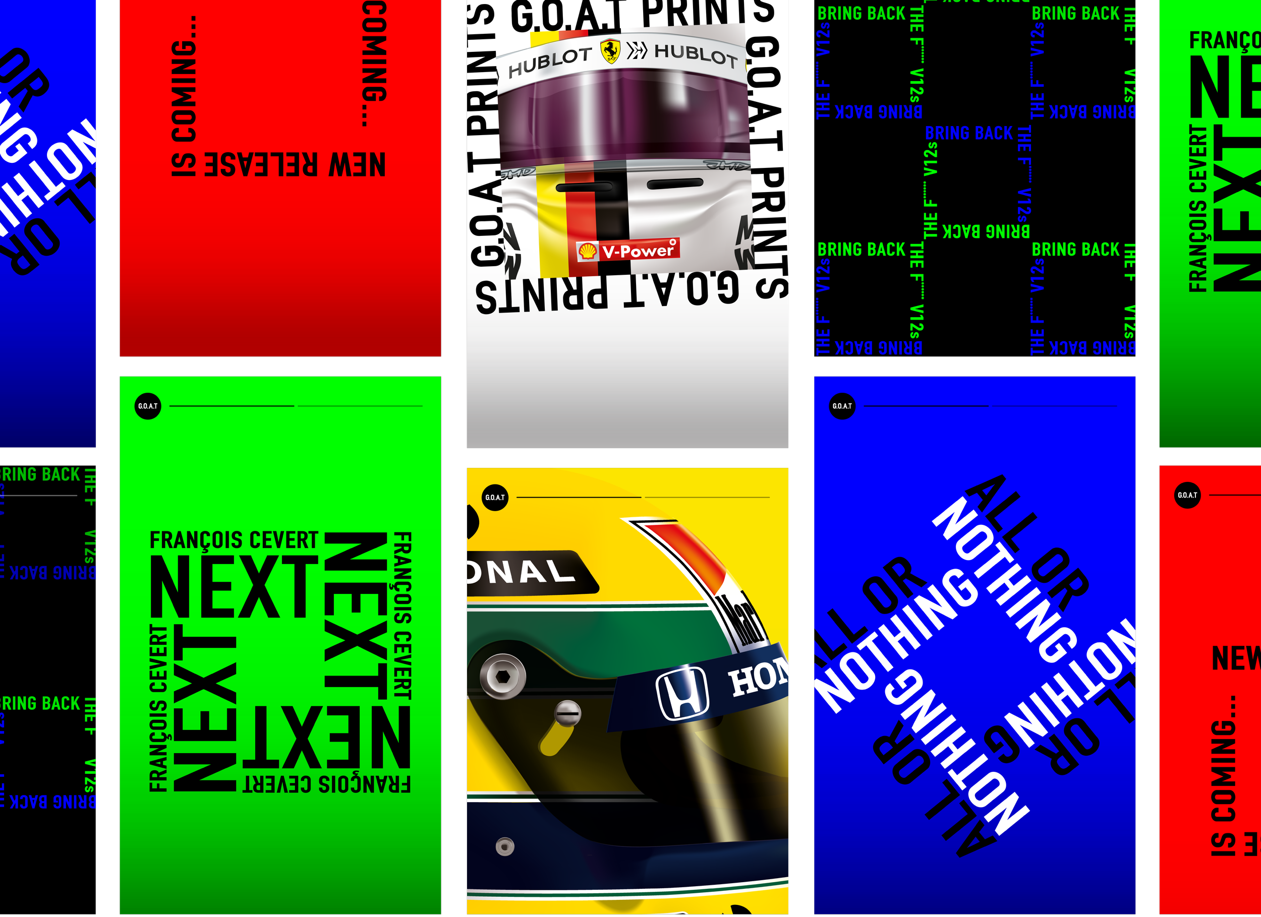
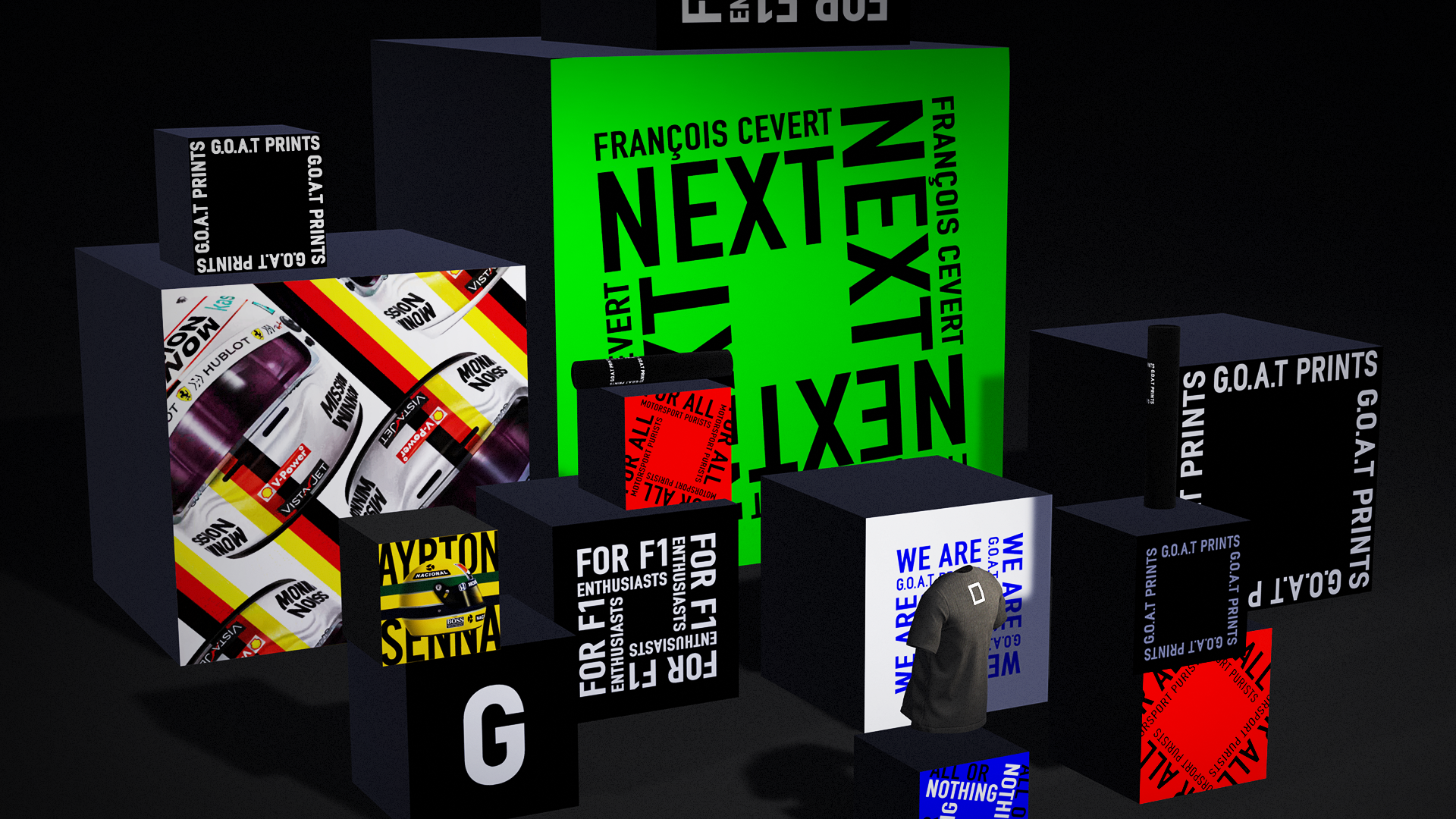
G.O.A.T PRINTS focuses on visual impact of motorsport. Using a minimum assets such as a trademark object or colour or voice from a driver to showcase the motorsport world to its maximum.
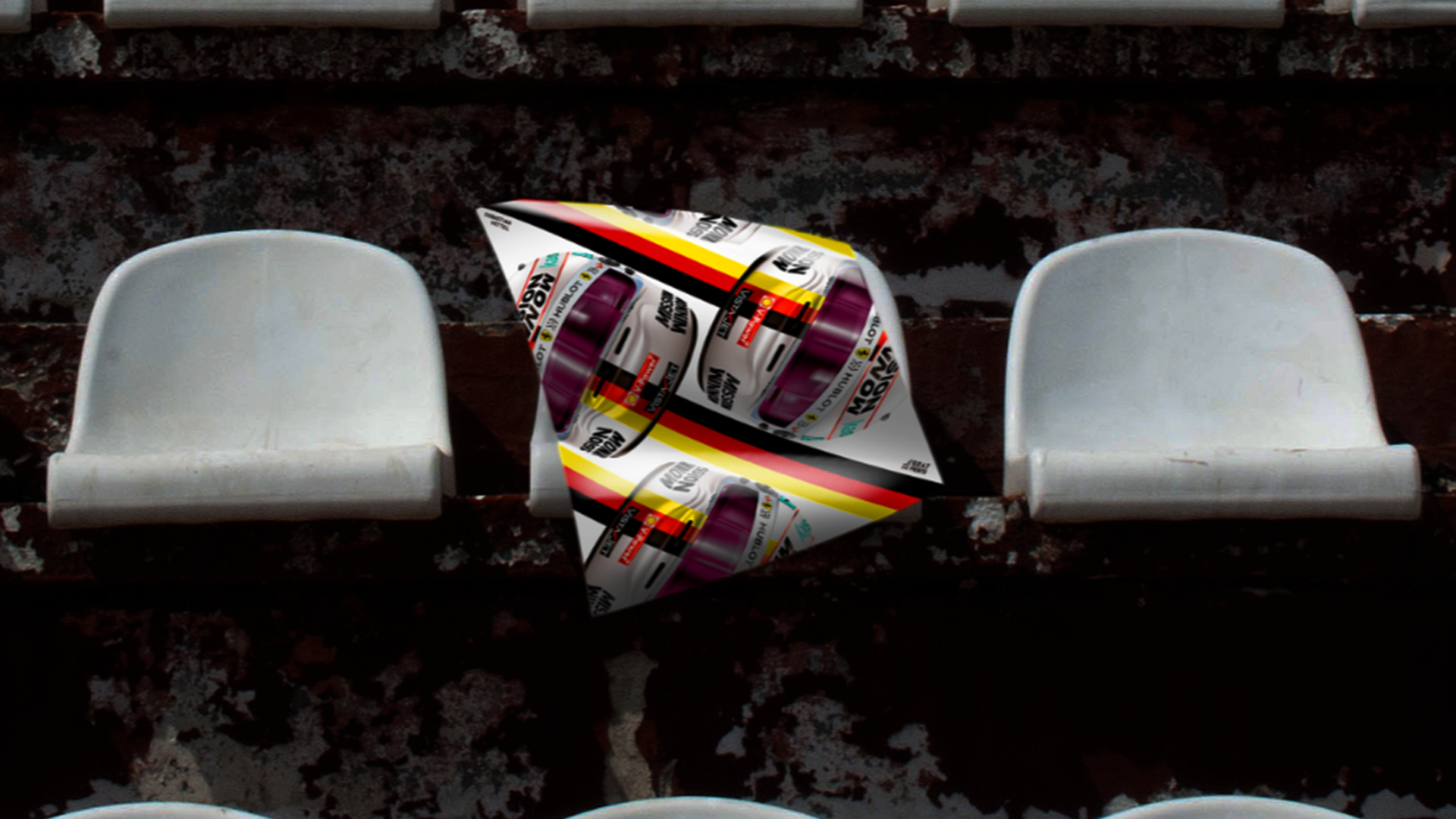
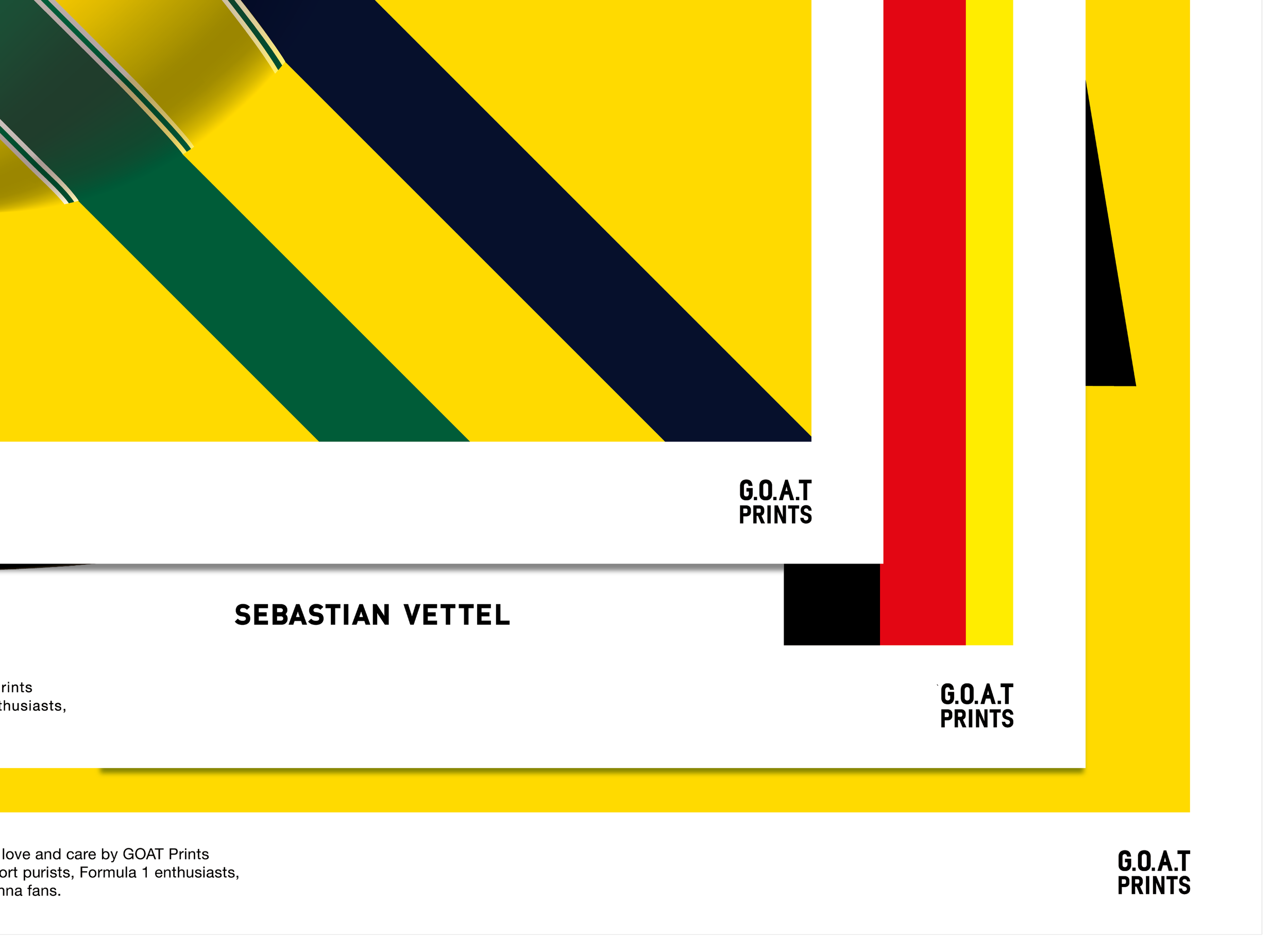
Iconic 3D graphics with graphical layouts and striking colour showcasing the pleasant sensation of the racing and maximise the motorsport world in the square. The logo is developed with the minimum elements to be based on the brand philosophy. Suitable in various layouts, the square communicates the story of what G.O.A.T brings to us.Sebastian Vettel announced that he was leaving Ferrari on the day we completed this project. It made these designs even more special for the team.
Client: G.O.A.T PRINTS
Role: Art Director/Lead Designer
Year: 2020



WOMEN’S RUGBY
-
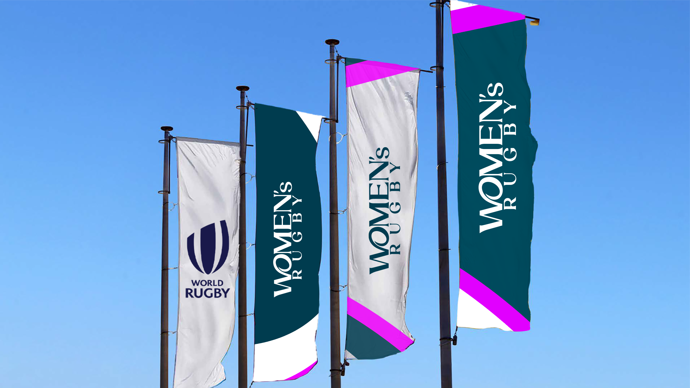
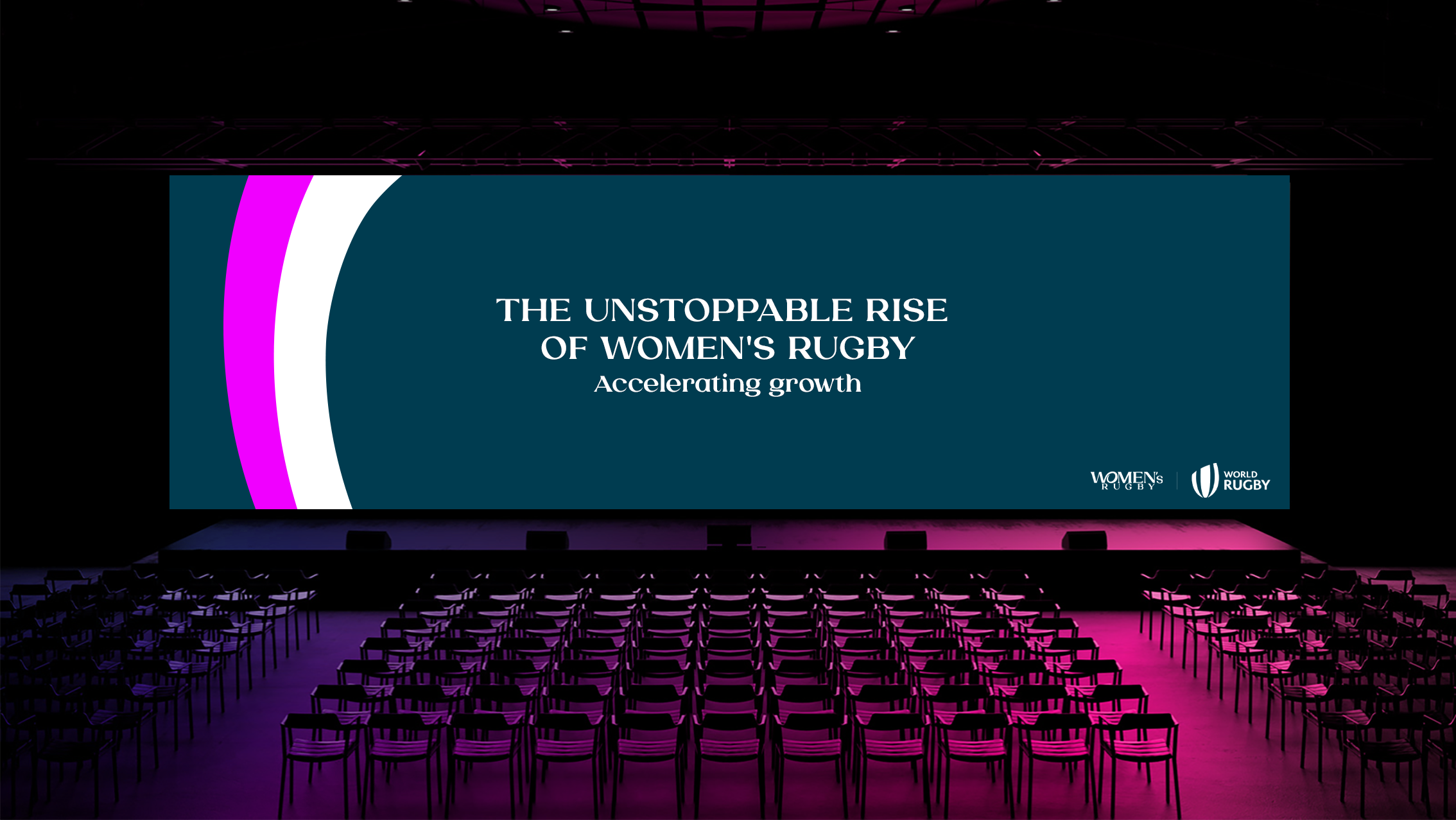
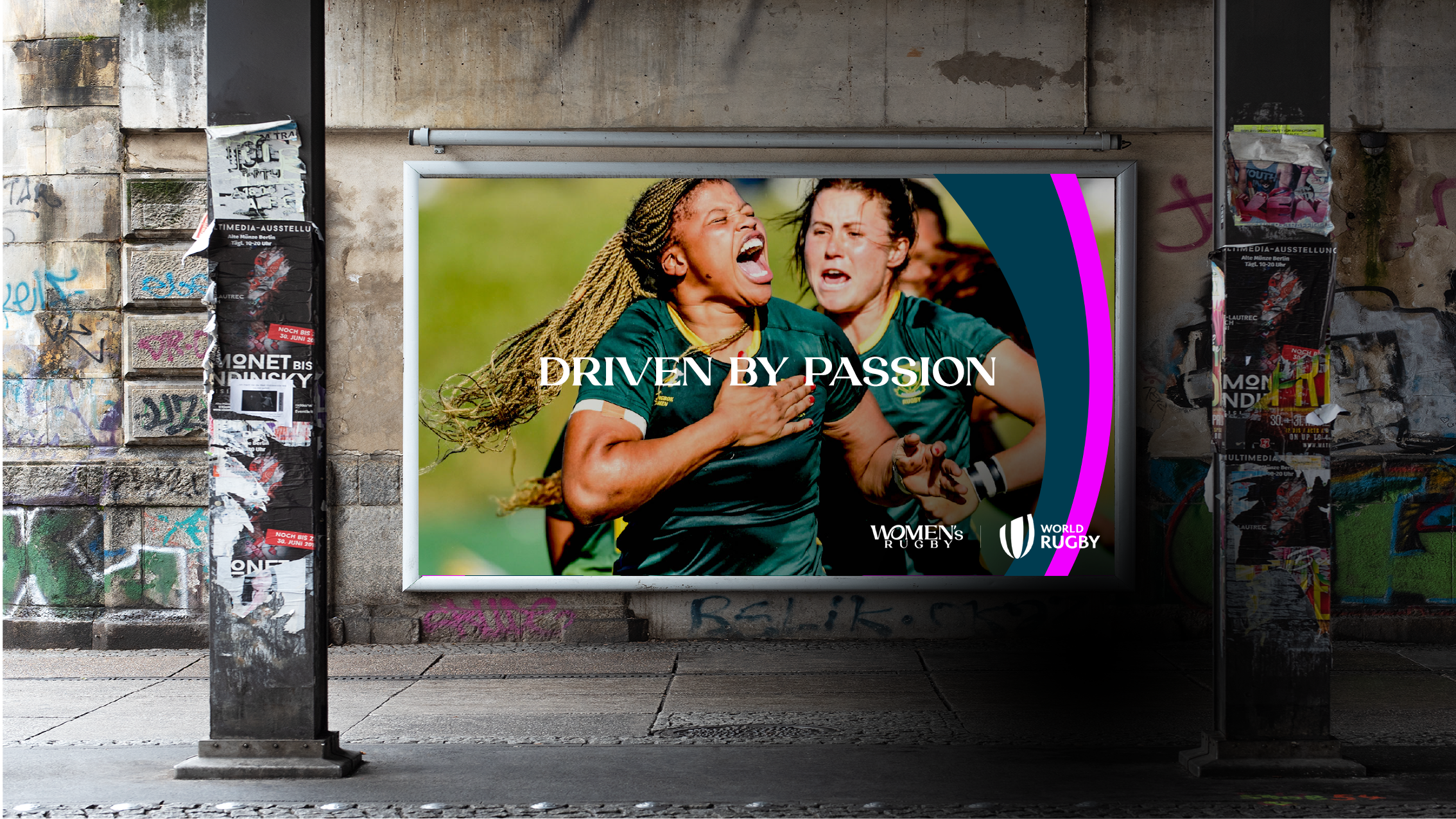
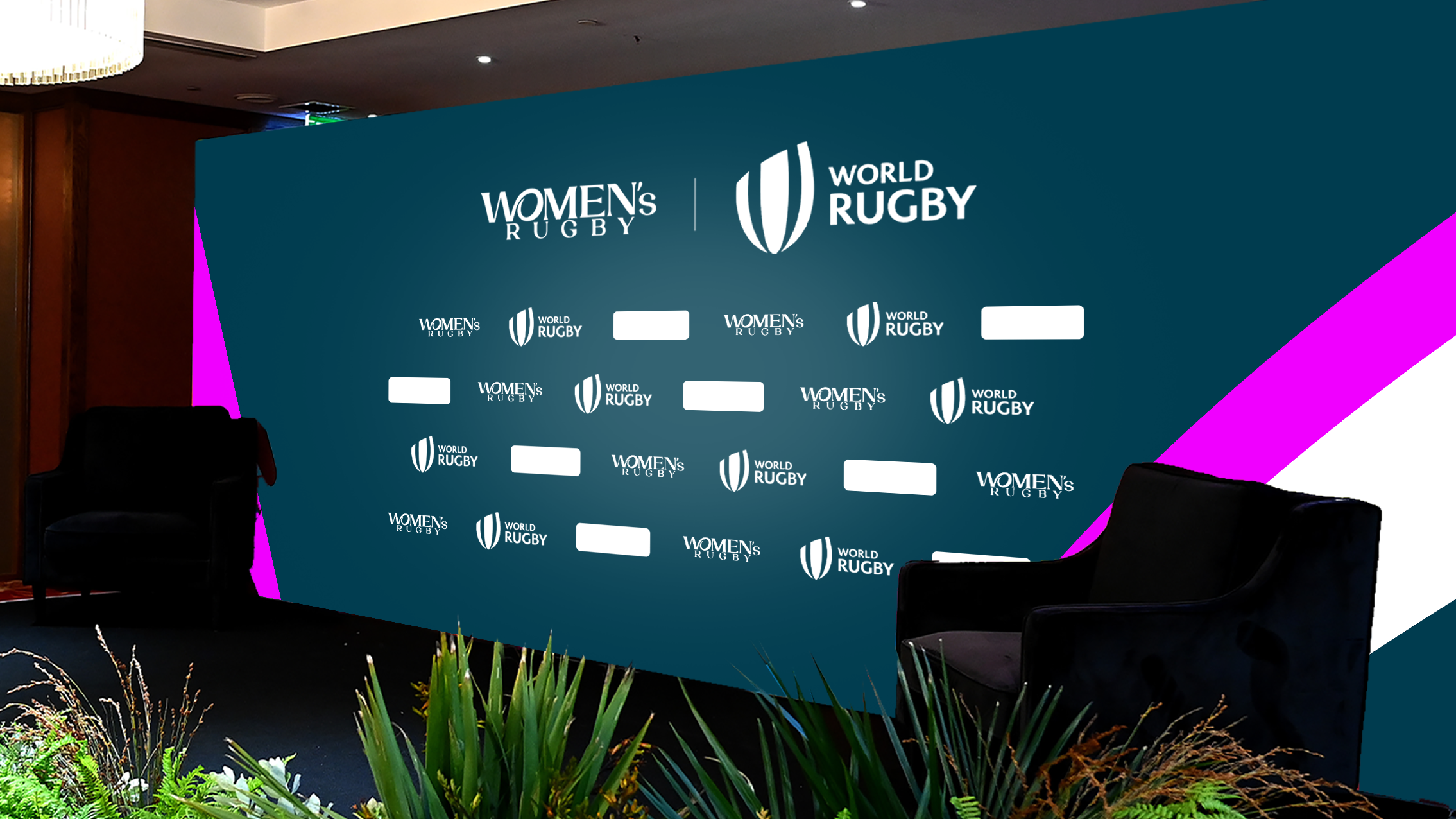
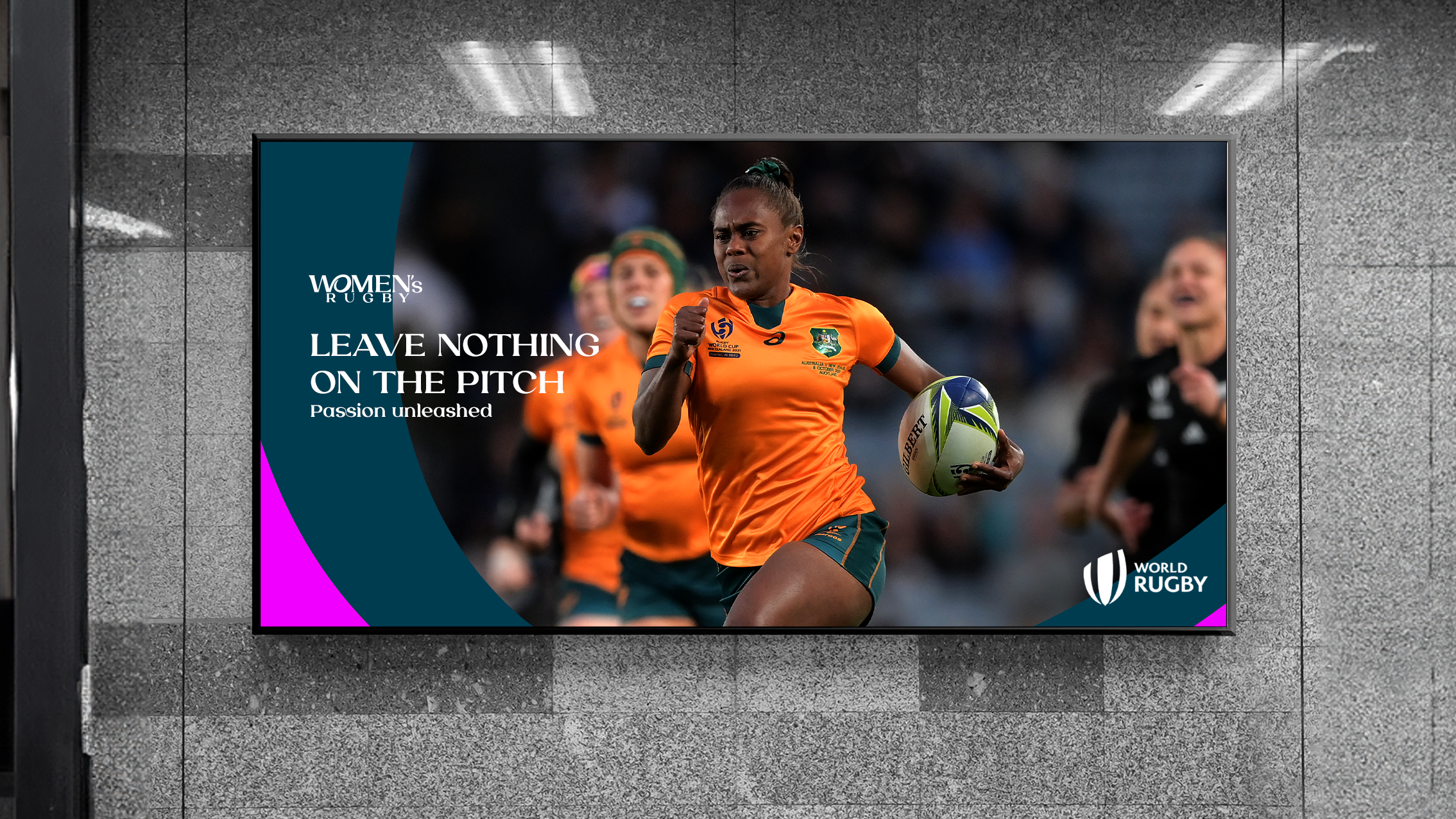
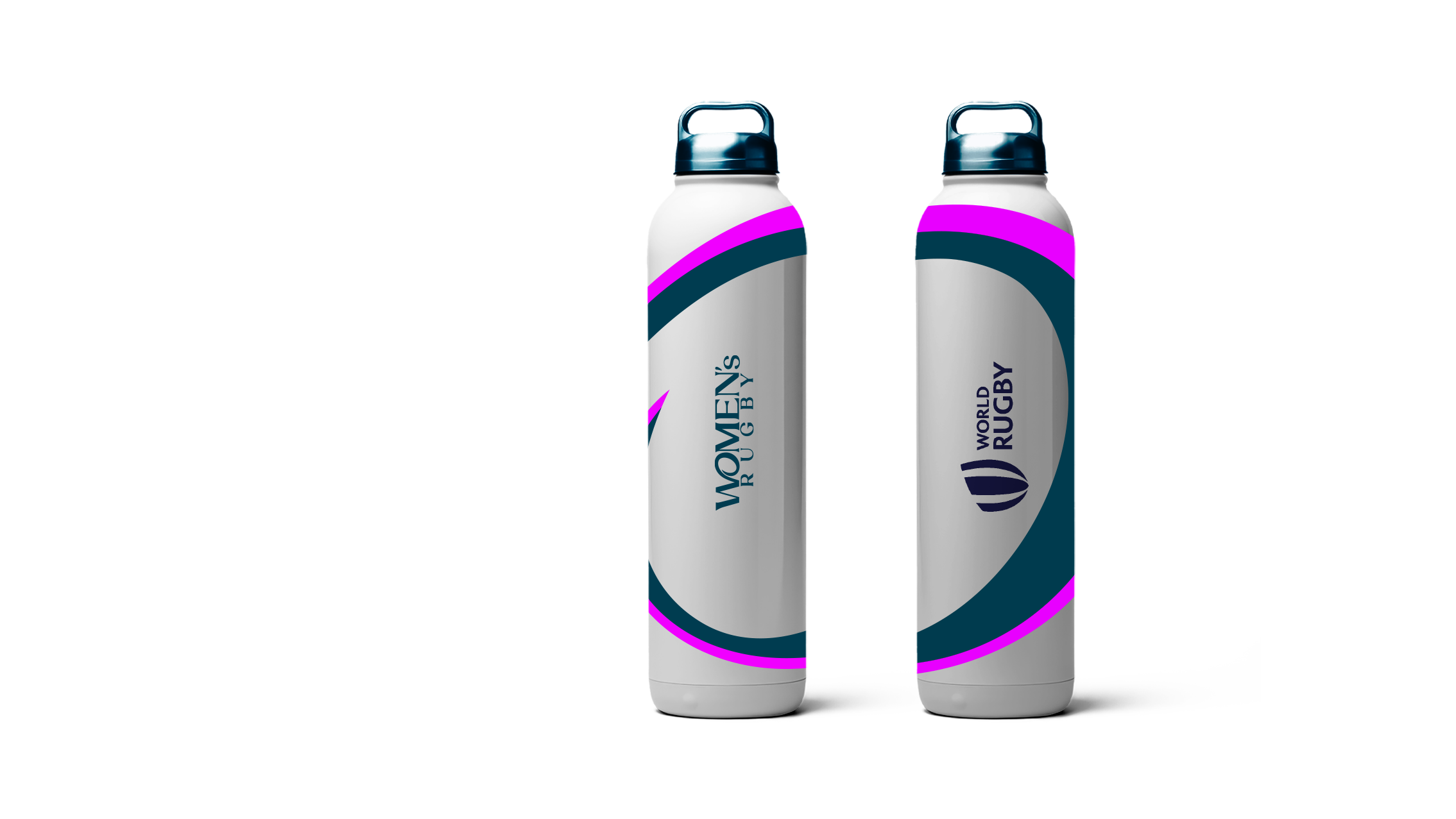
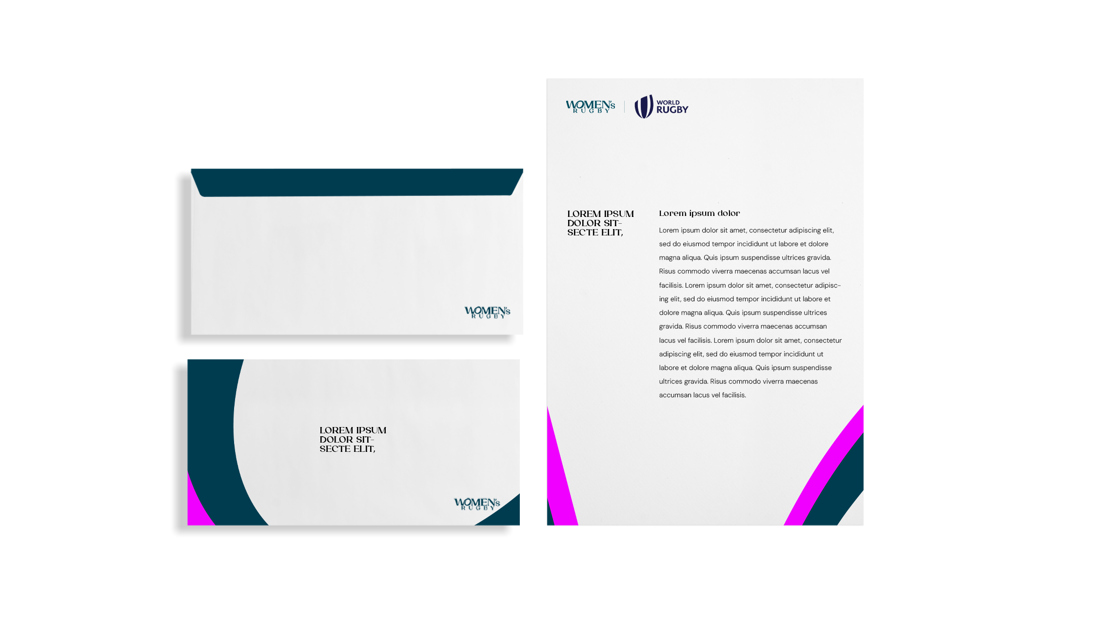
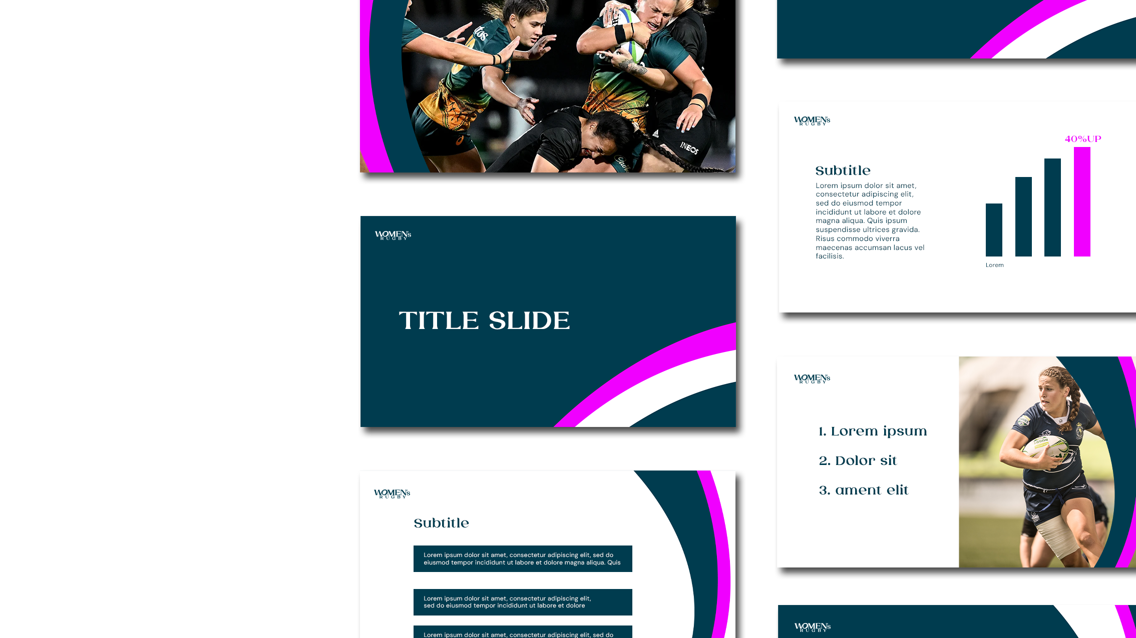
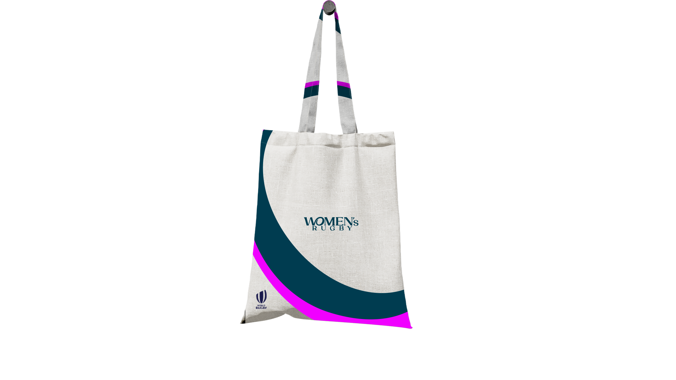
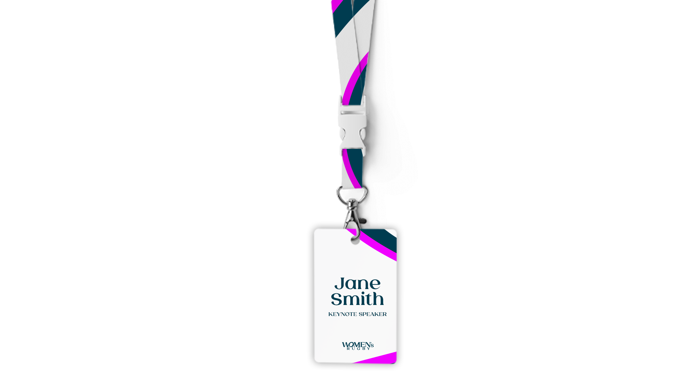
Ahead of the biggest ever Women’s Rugby World Cup in 2025, World Rugby has asked us to develop a refreshed brand, one that is
a statement of intent for the women’s game as it continues
to experience accelerated growth globally.
The ‘W’ and ‘O’ are connected to signify women with their arm around a rugby ball, creating a central narrative that the two are constantly connected. It represents all women and girls
in our sport through a consistent, modern positioning of the women’s game, making it global, accessible and fun. An inclusive sport that is prepared for the future.
Client: World Rugby
Agency: Dark Horses
Year: 2024
Role: Concept, Lead Designer
J.League
-
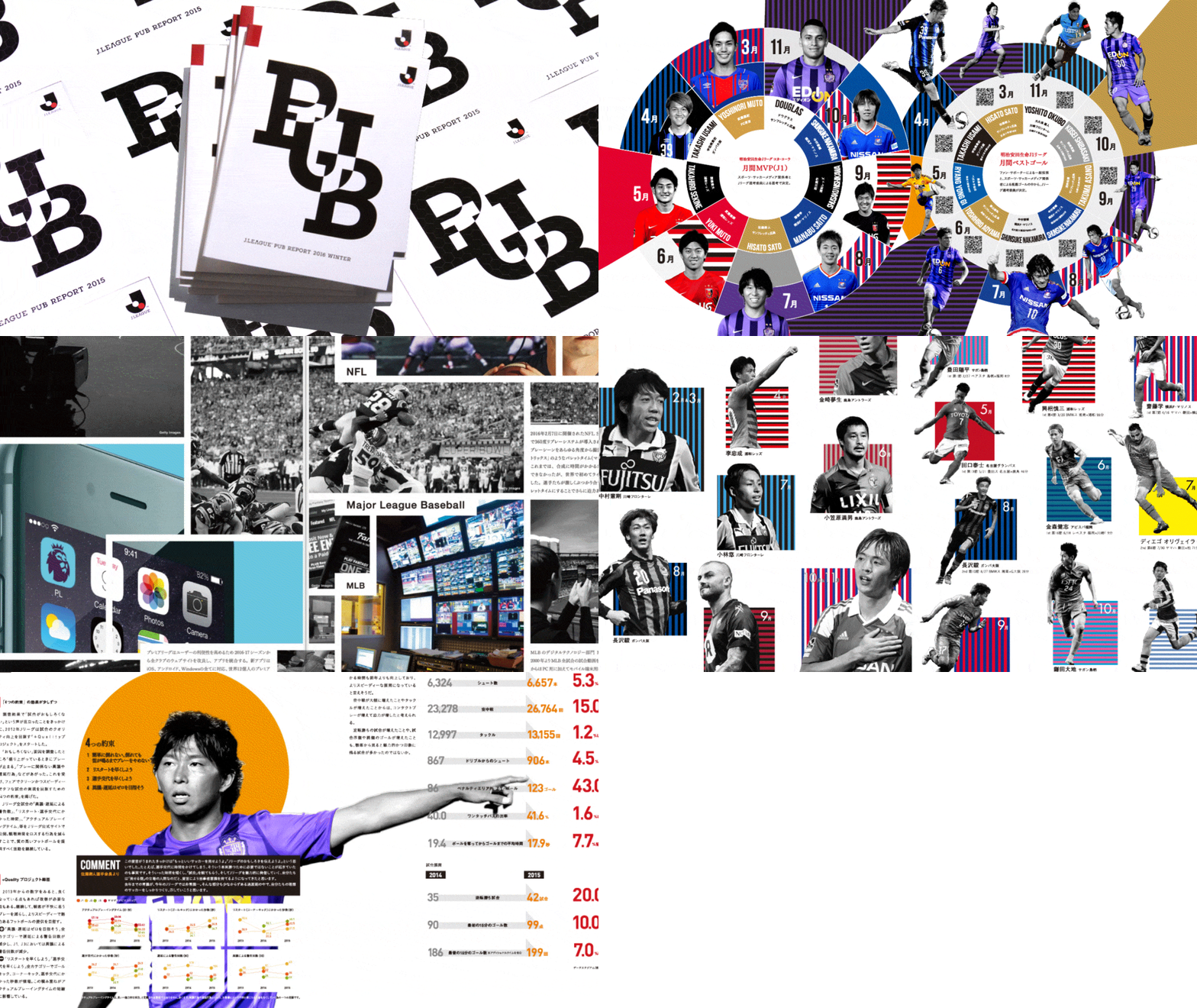
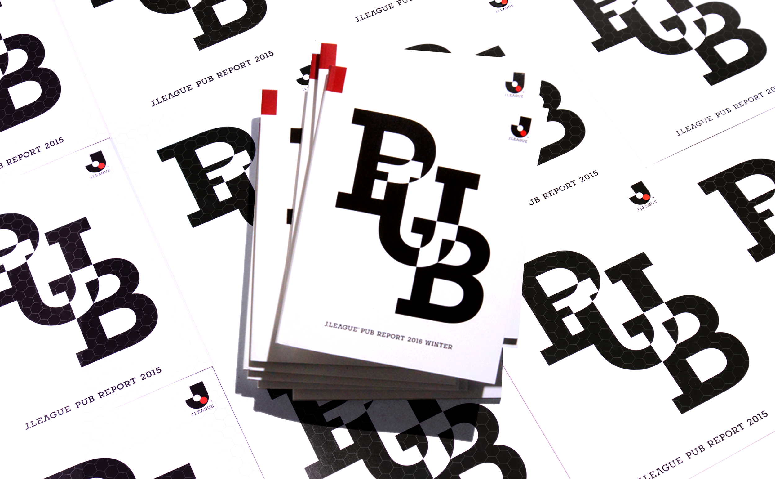
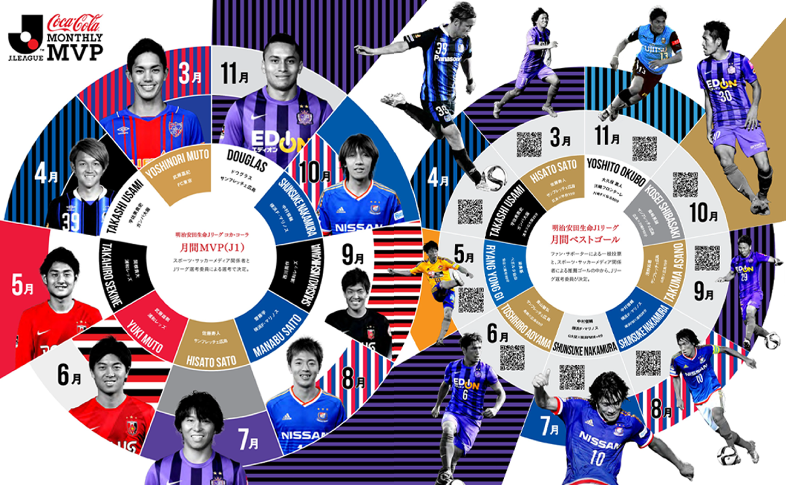
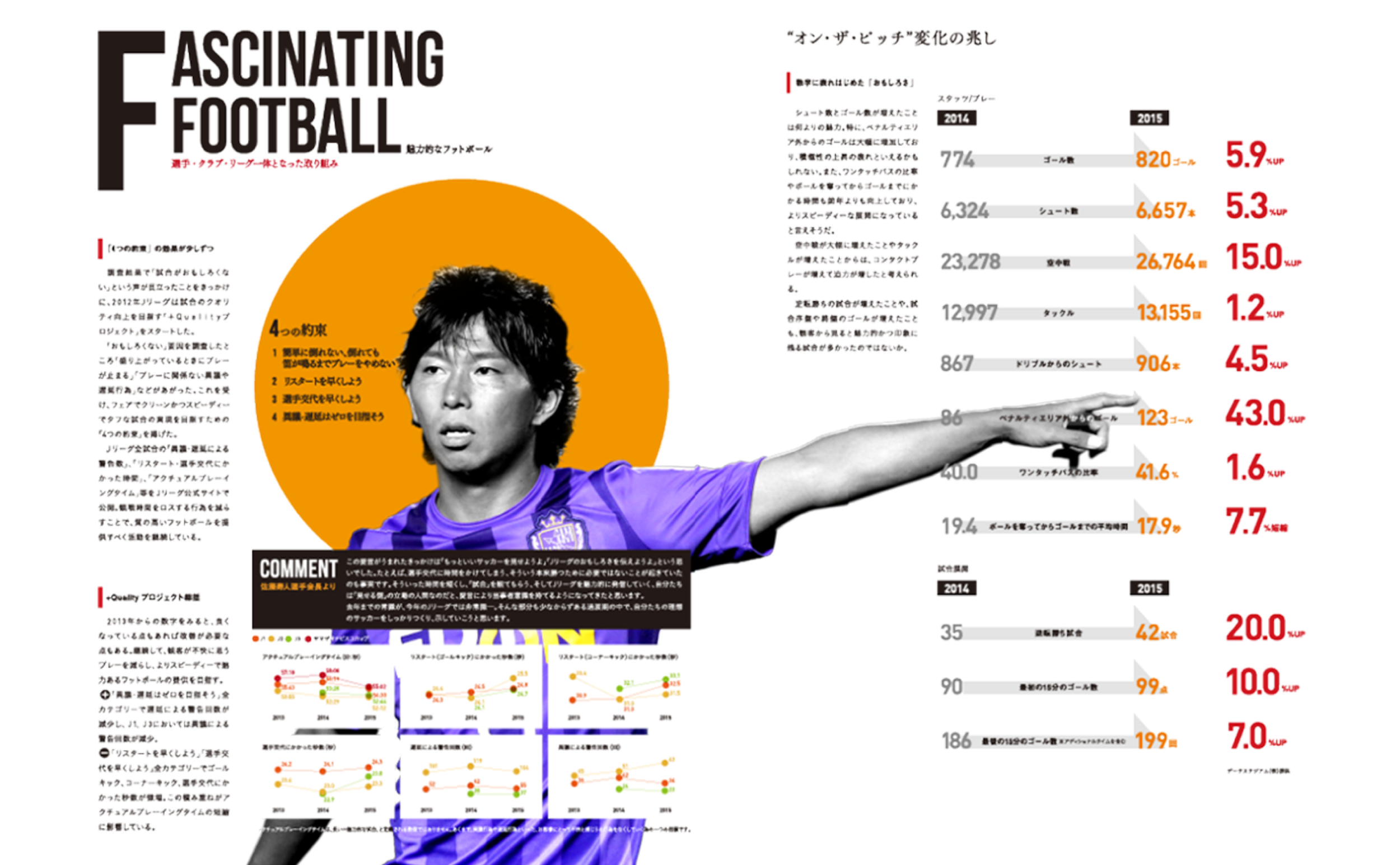
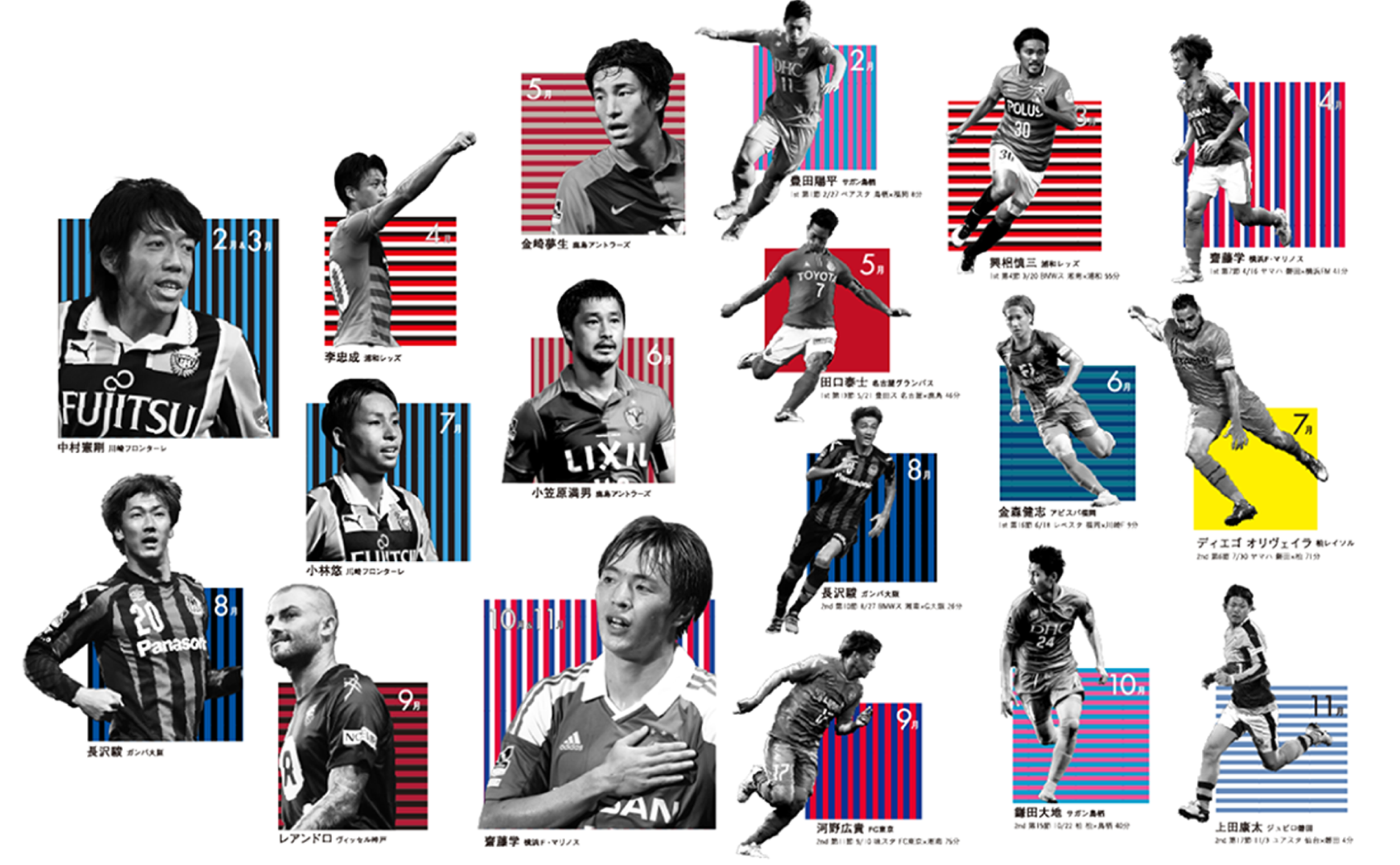
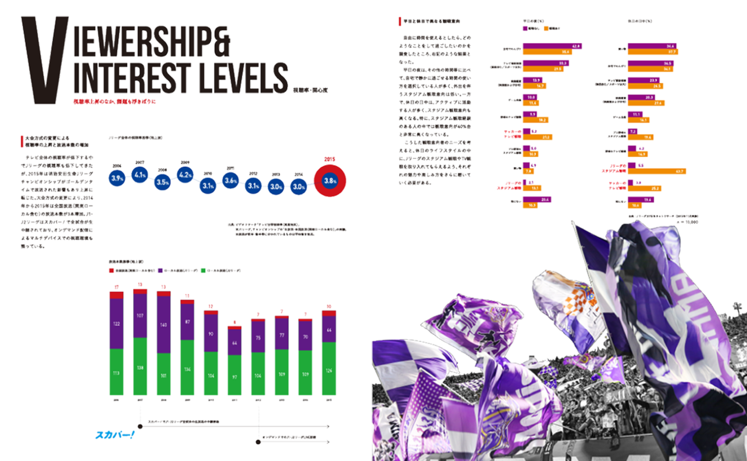
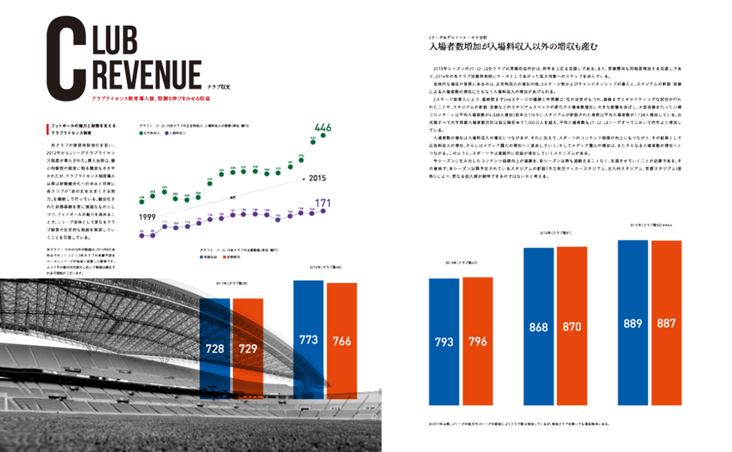
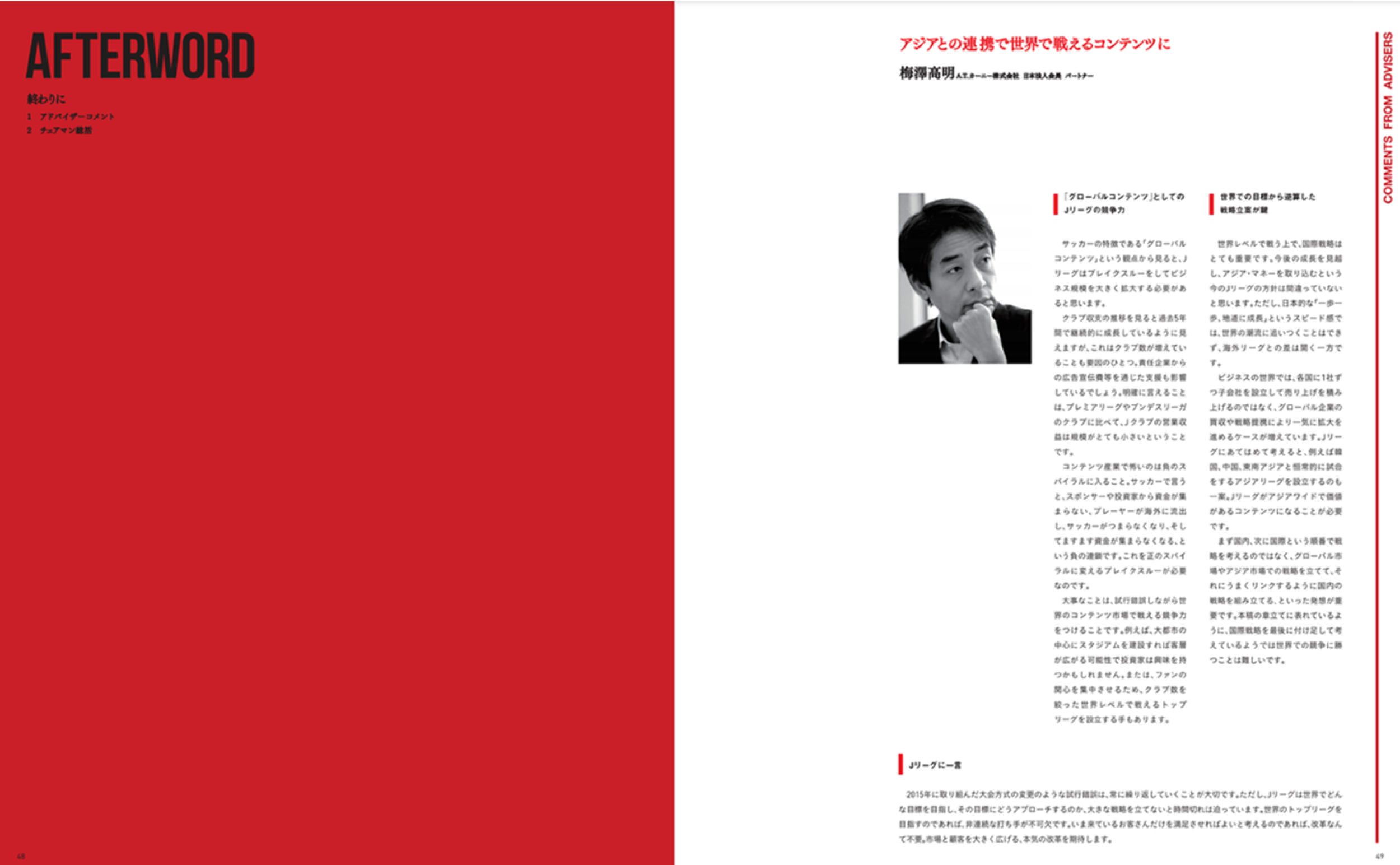
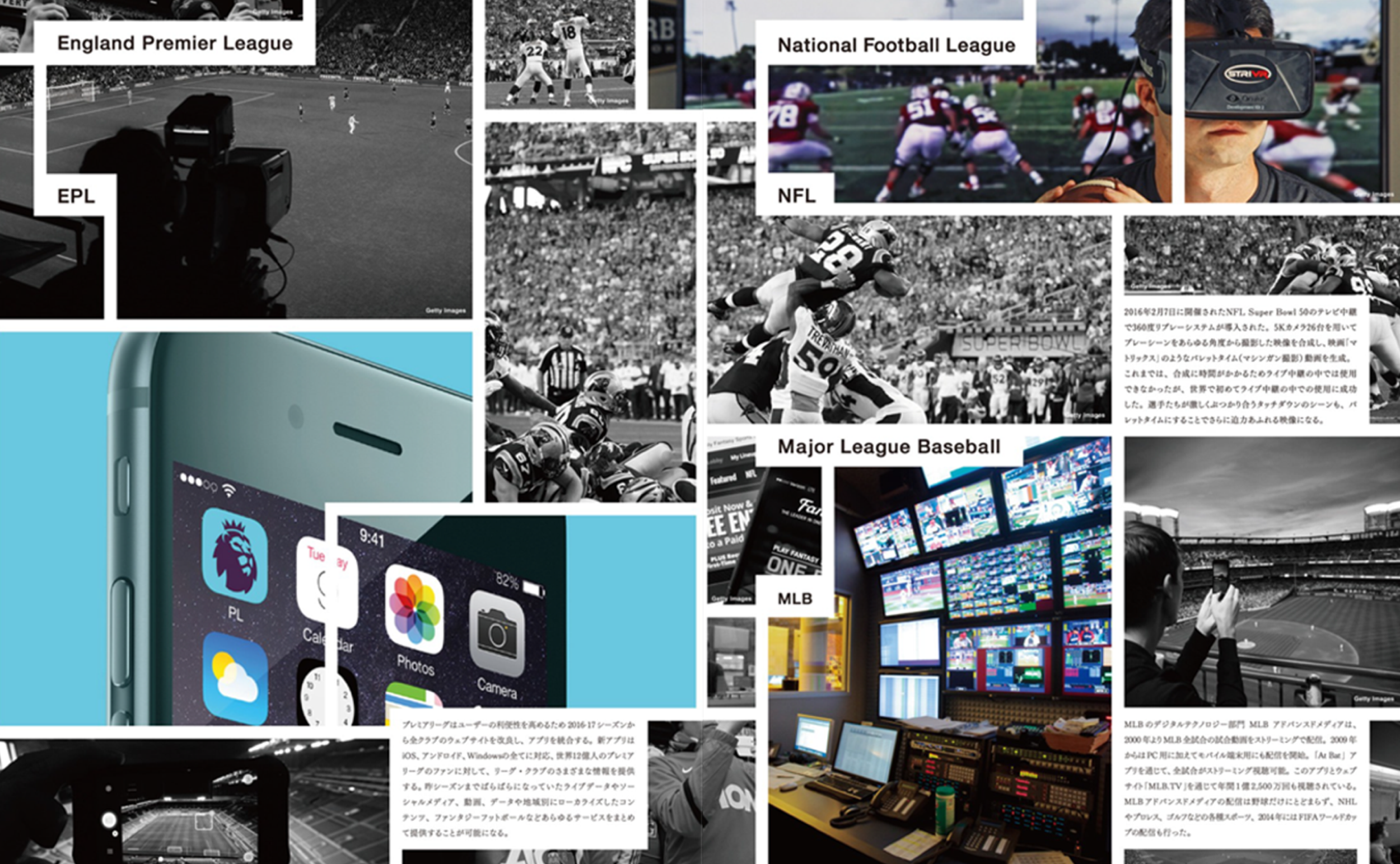
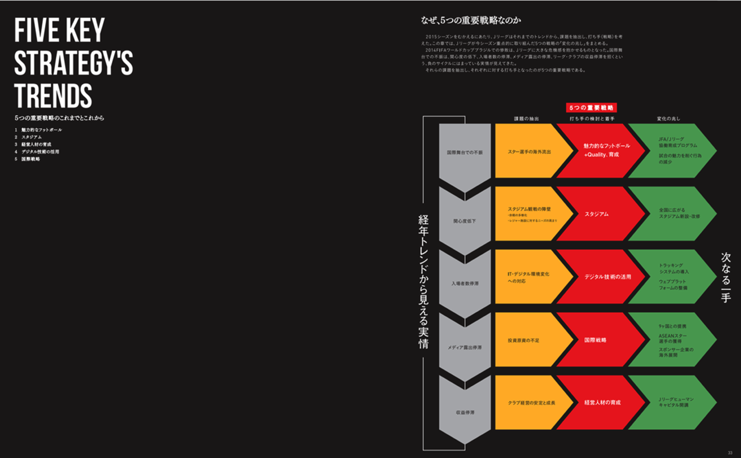
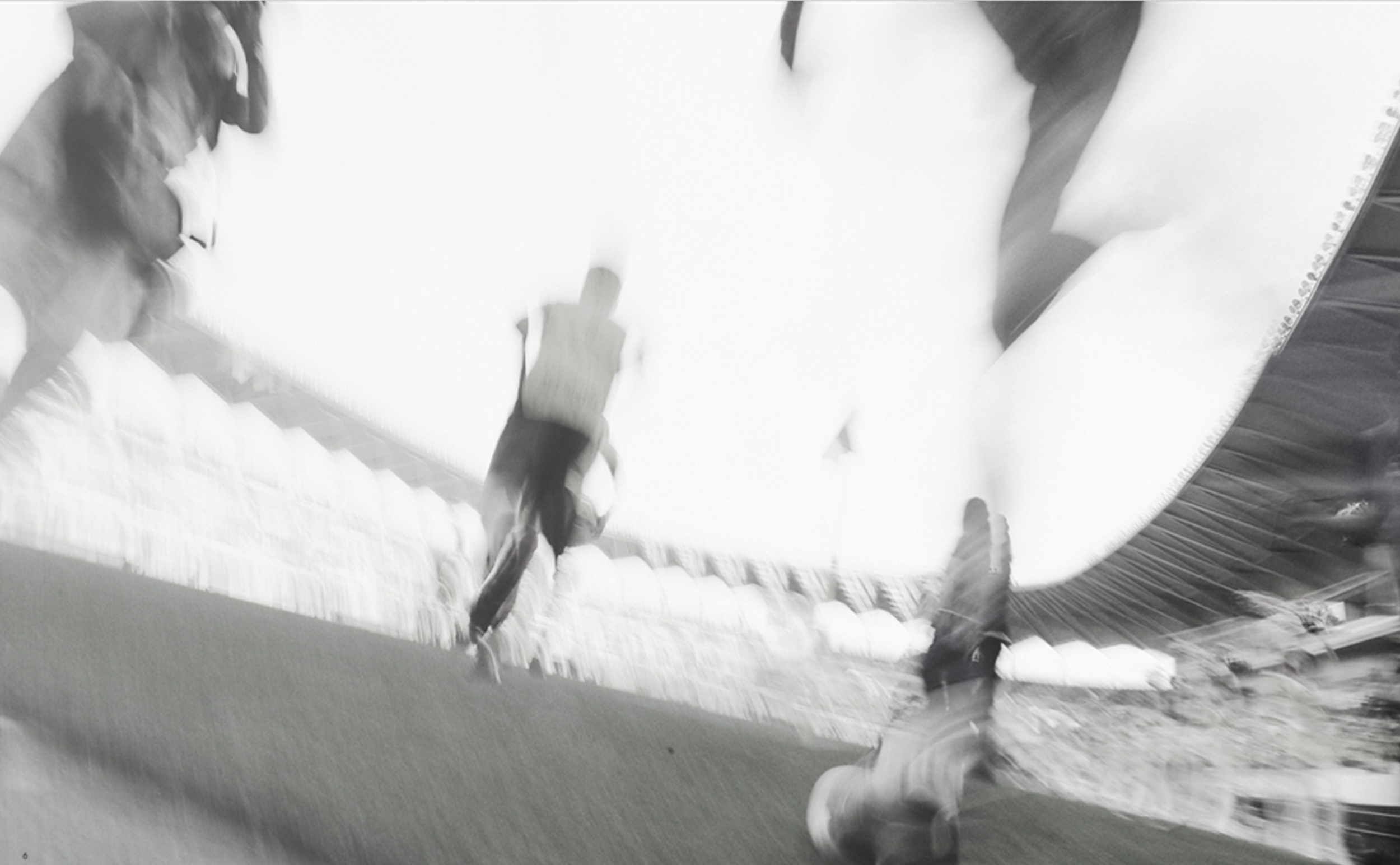
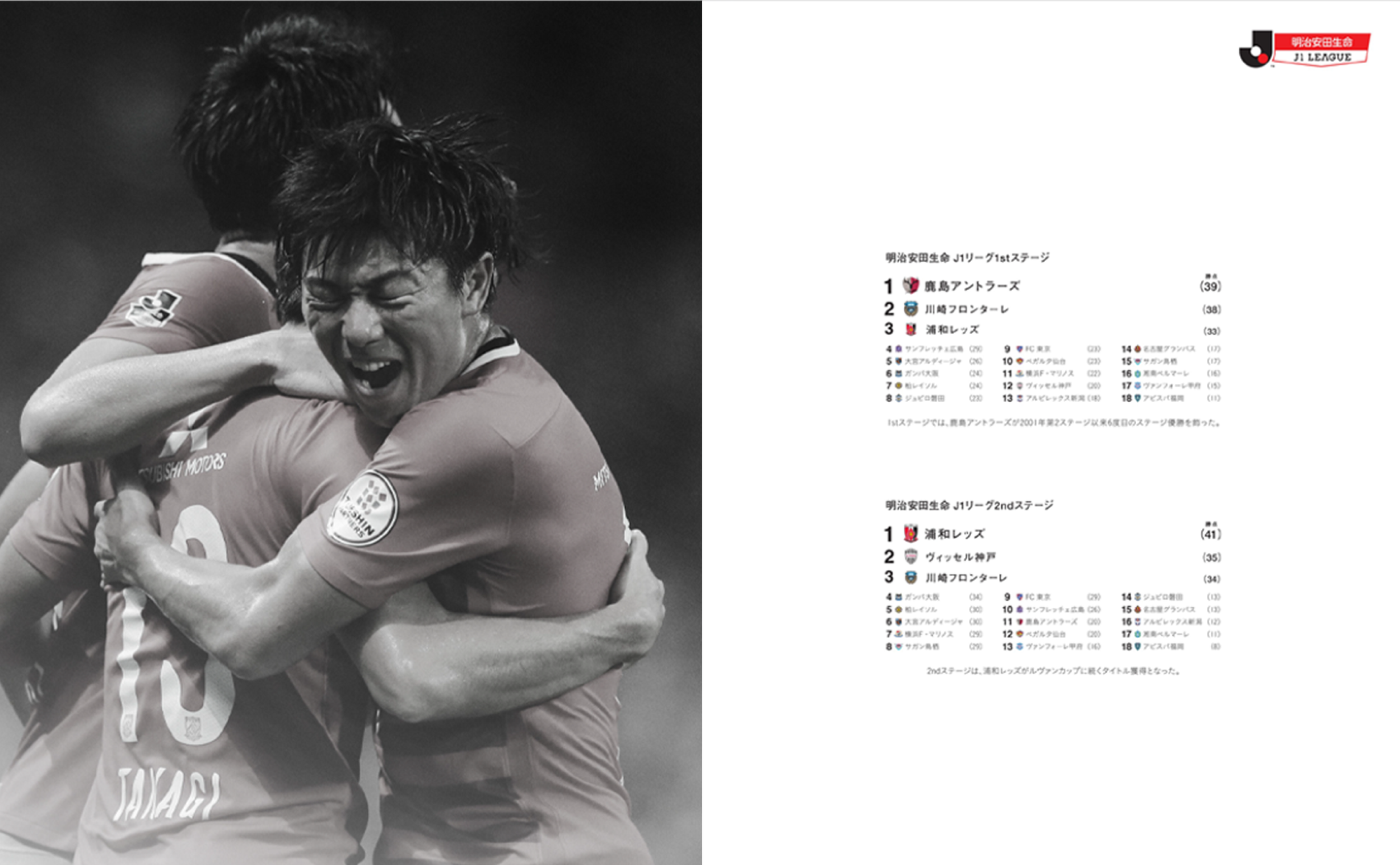
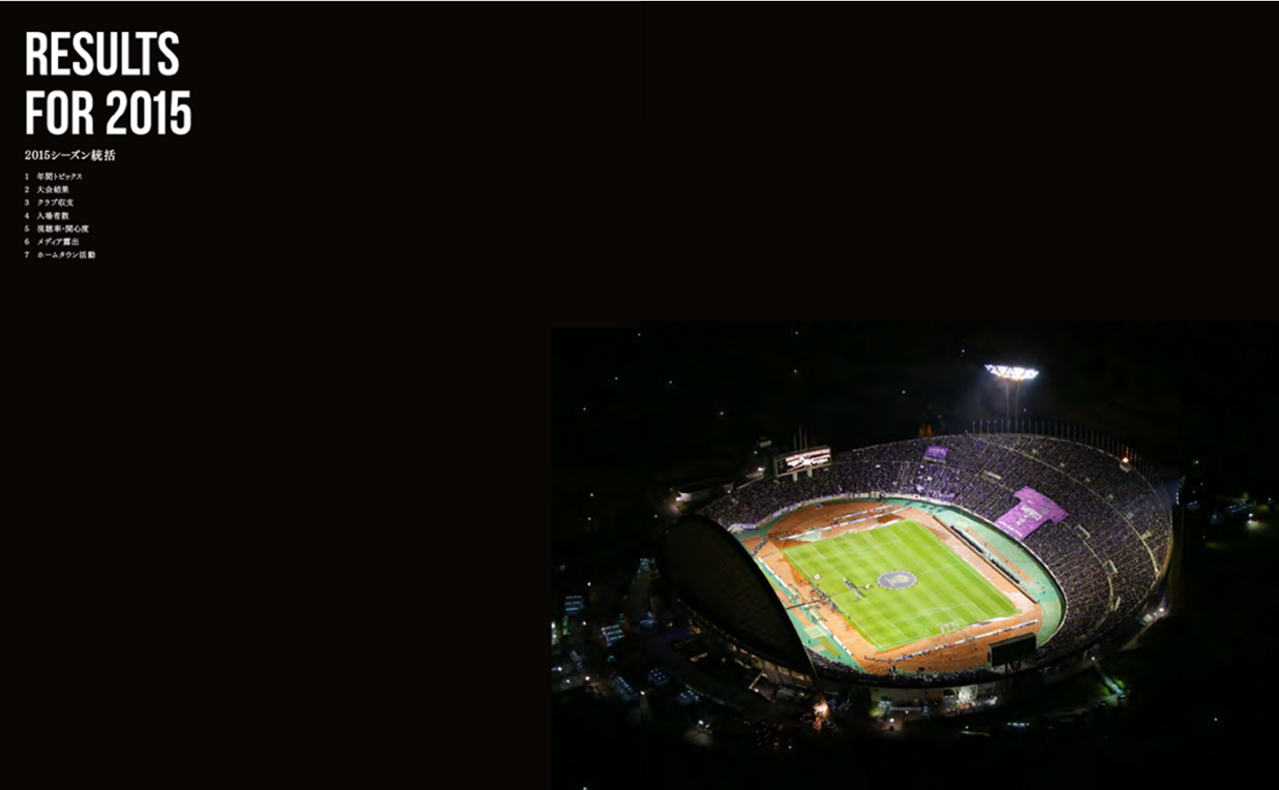
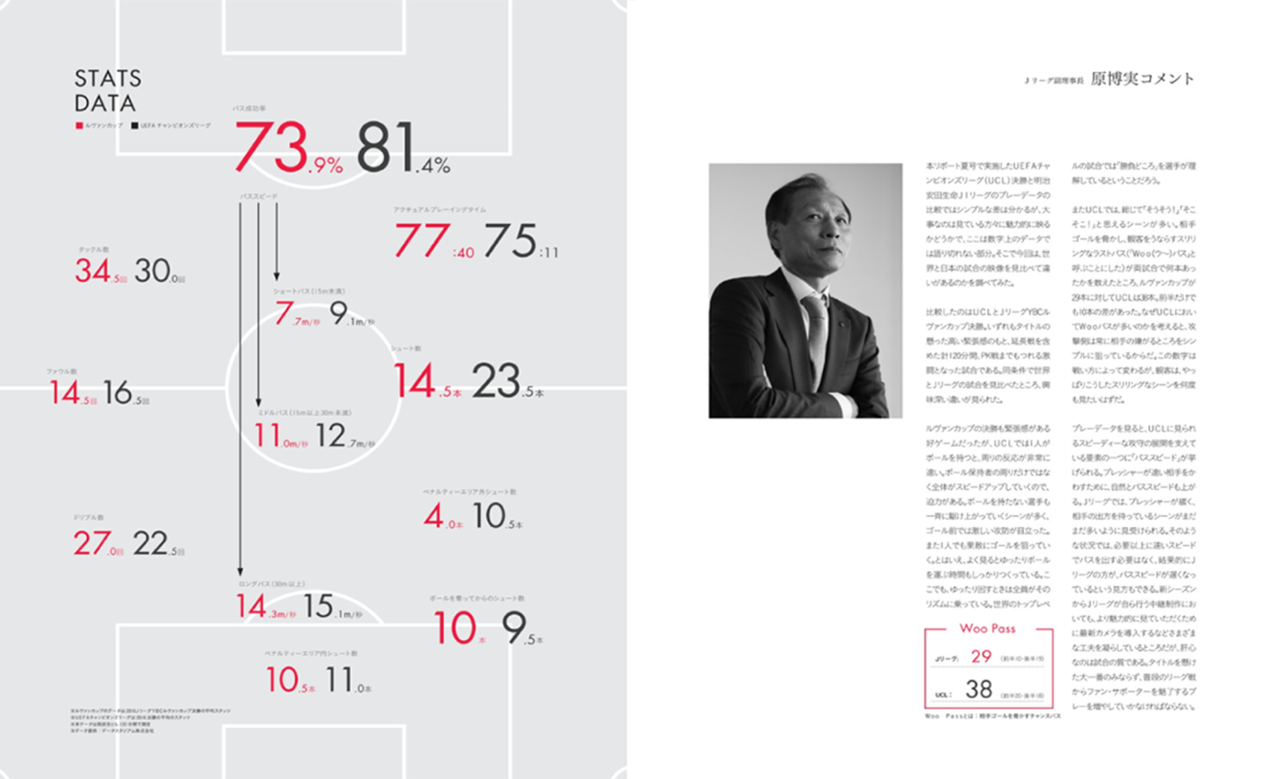
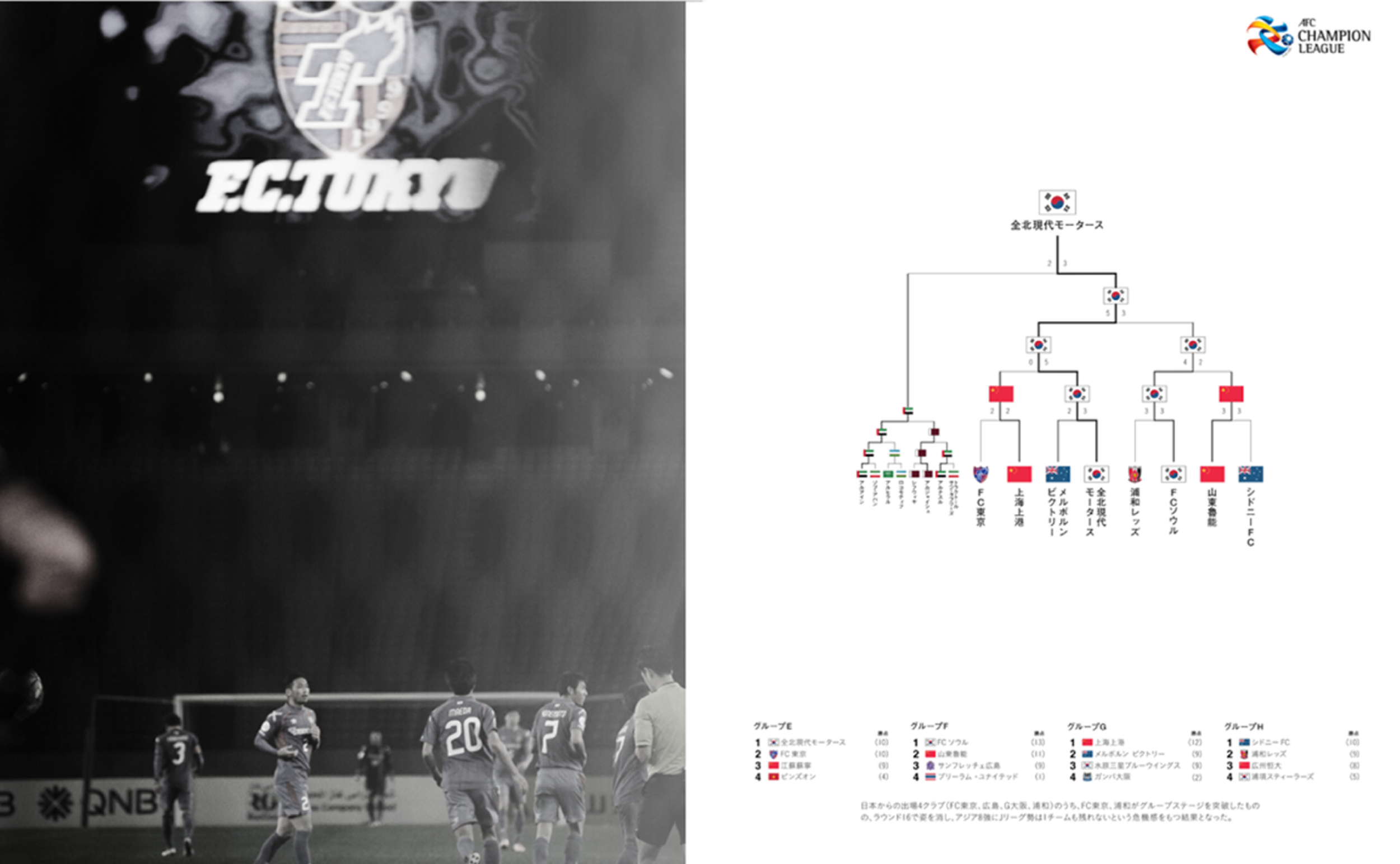
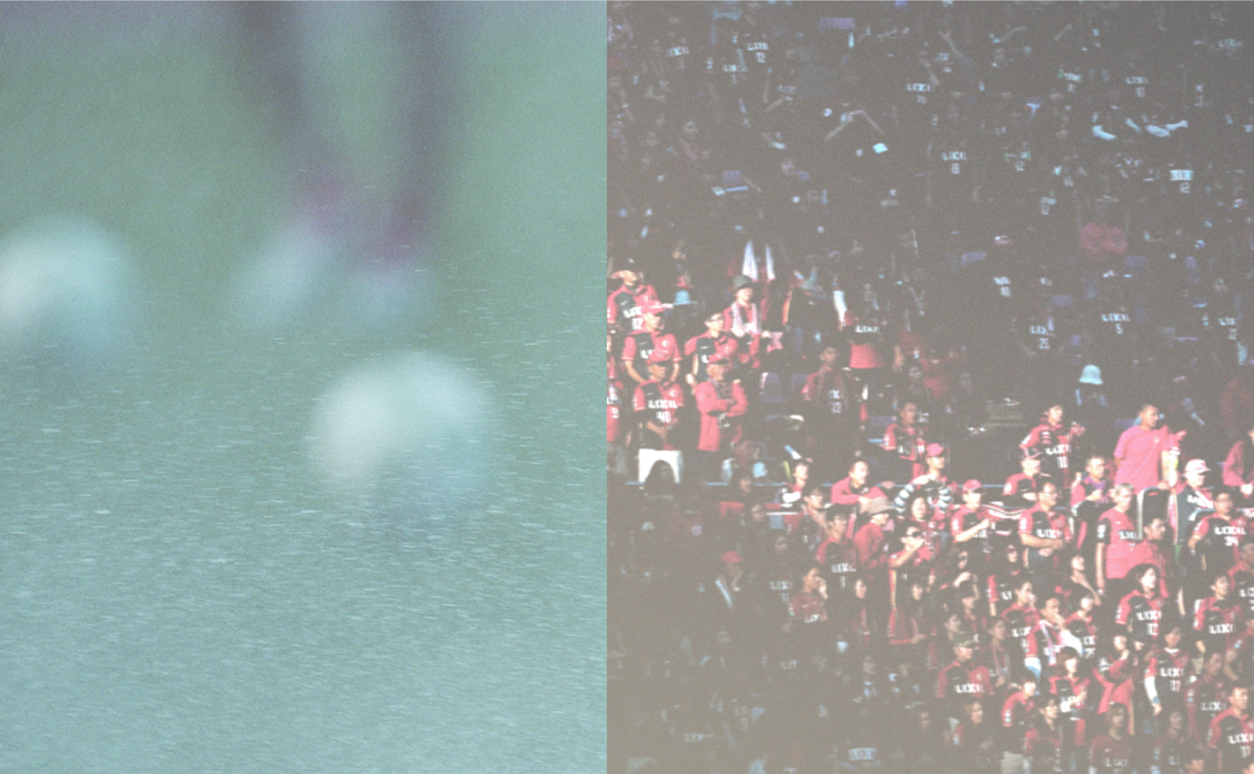
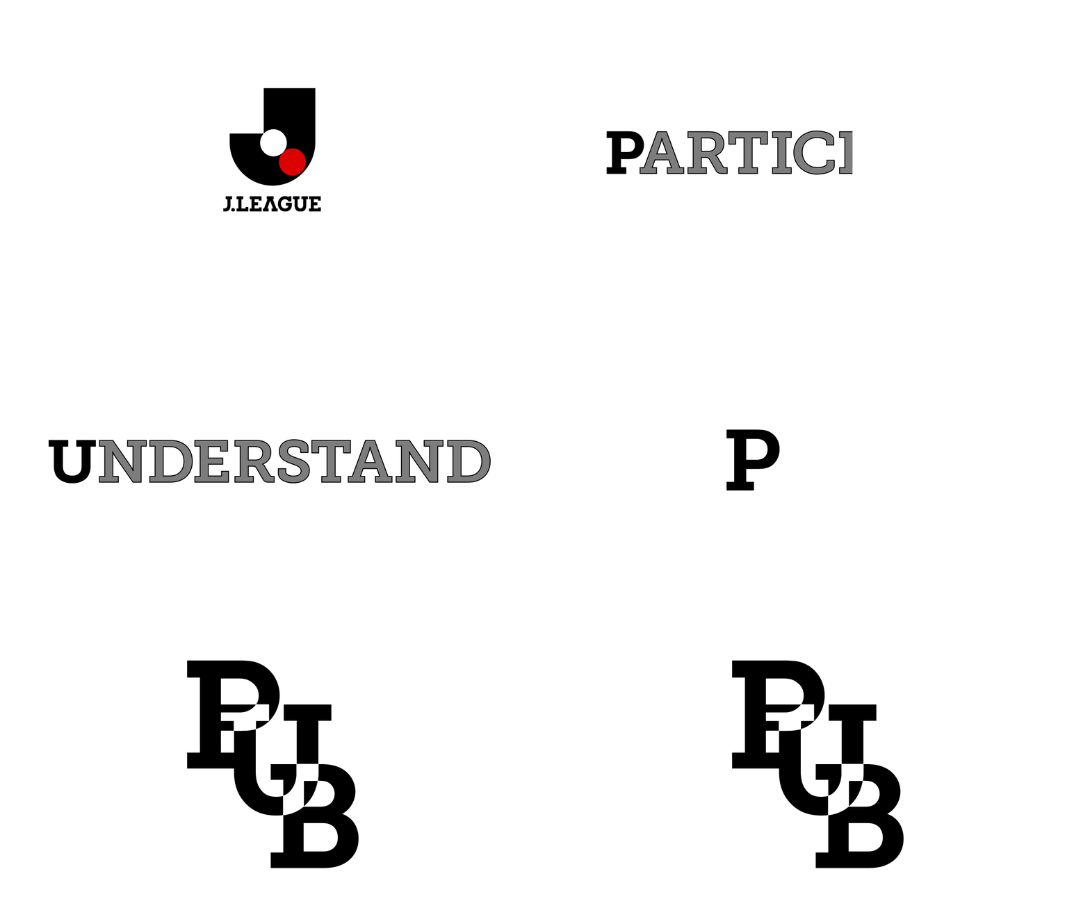
The game is not only in the field, a different game is playing off the field, which is the sports business strategy game. This is the e-book and the hard-copy book to tell J. League's business strategy. This should be showcased like an exciting football game. The energetic visuals speak sports enthusiasm along with colourful and punchy infographics to meet sports photography. It also supports the comprehension of the sports business side in an attractive manner.
Client: Japan Professional Football League
Agency: Hochkiss
Year: 2014-2017
Role: Art/Design Director
PEELER
-
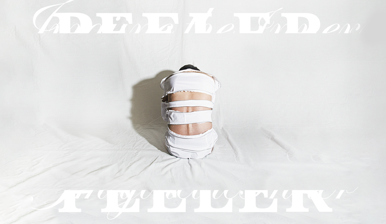
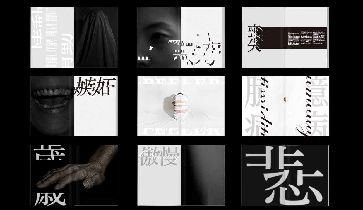
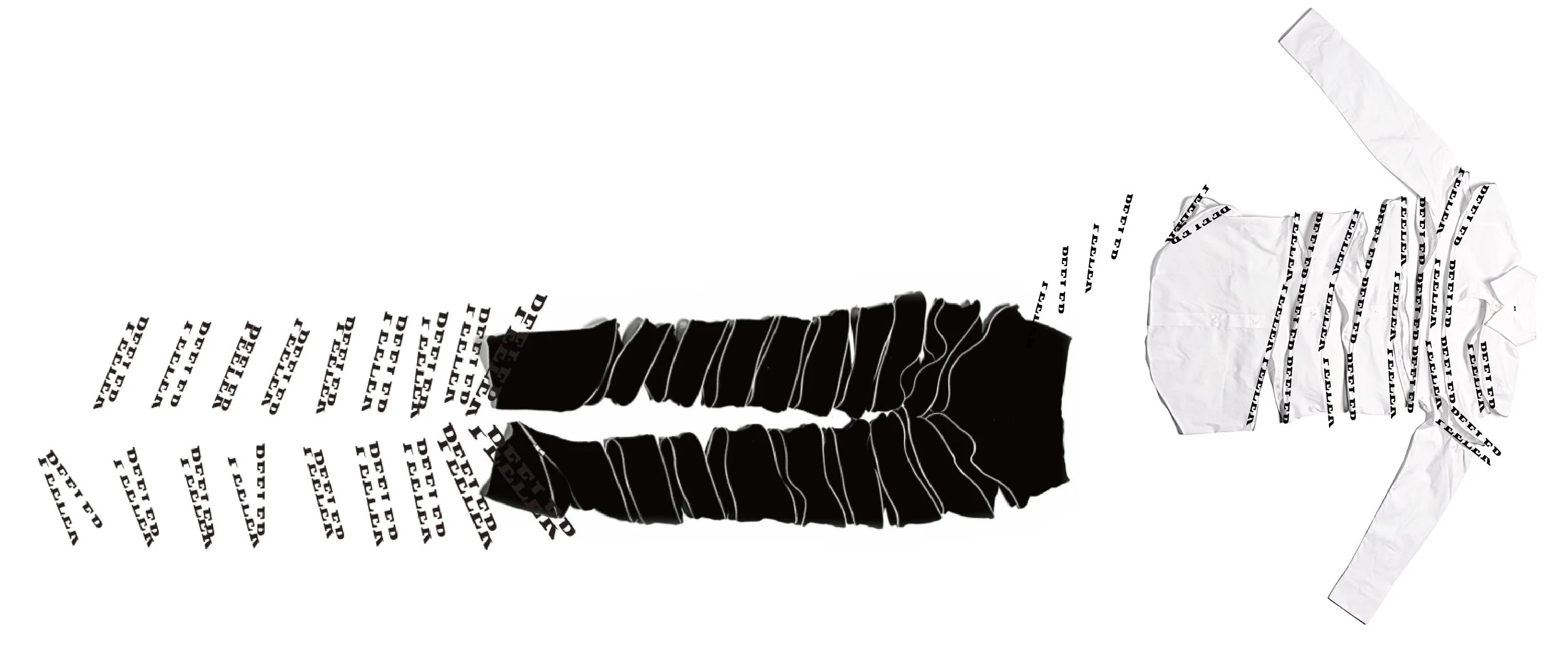
Peeler has a philosophy of ‘imagining an inner being’. Its clothes have a long fastening open/closing style, much like peeling a banana or an apple. PEELER is against a current age that seems too instant and superficial.
The brand identity cutting the centre of the letter based on its fasteners. I took the photography that gives the feeling something inside, and its mixing with Japanese and English typography showcasing the message quietly but strongly.
Self initiated project
Year: 2015
Role: Art Director & Designer
DAILY TOHOKU
-
Re-born.
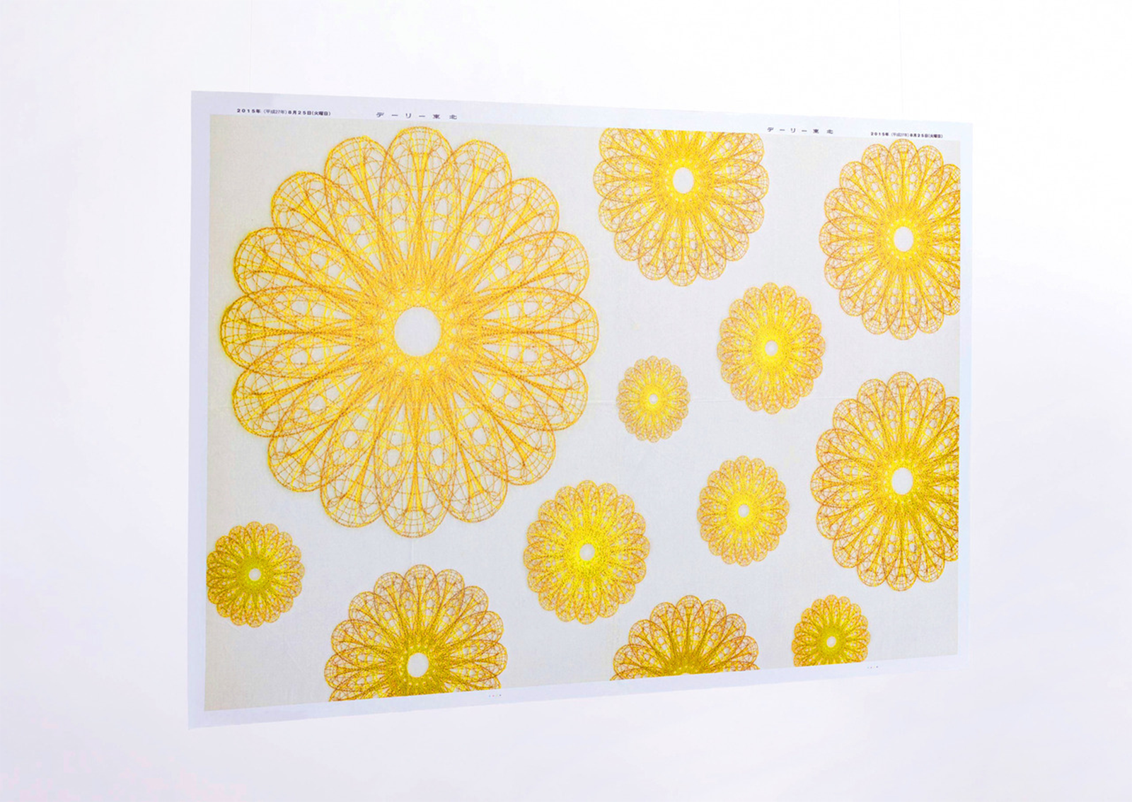
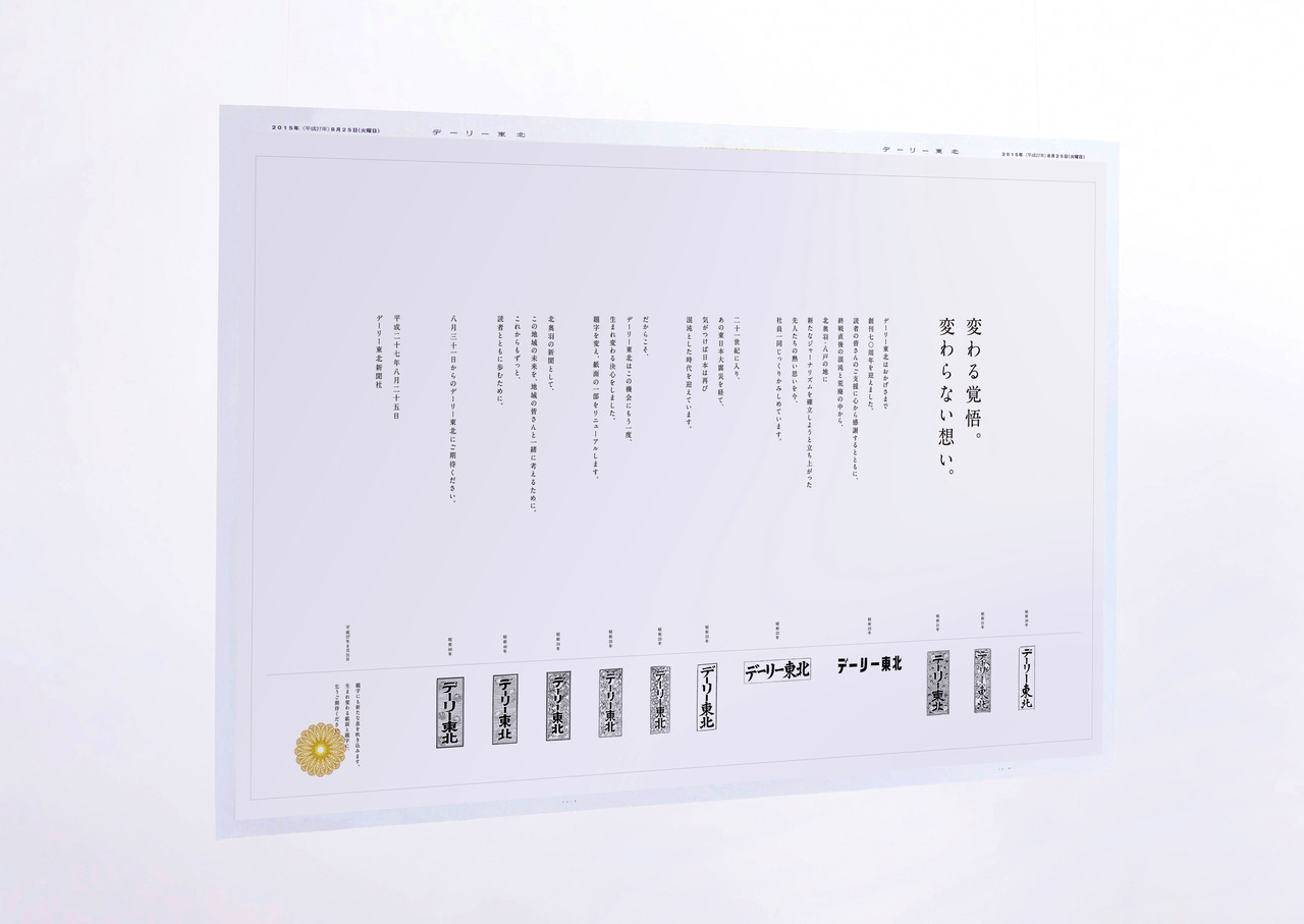
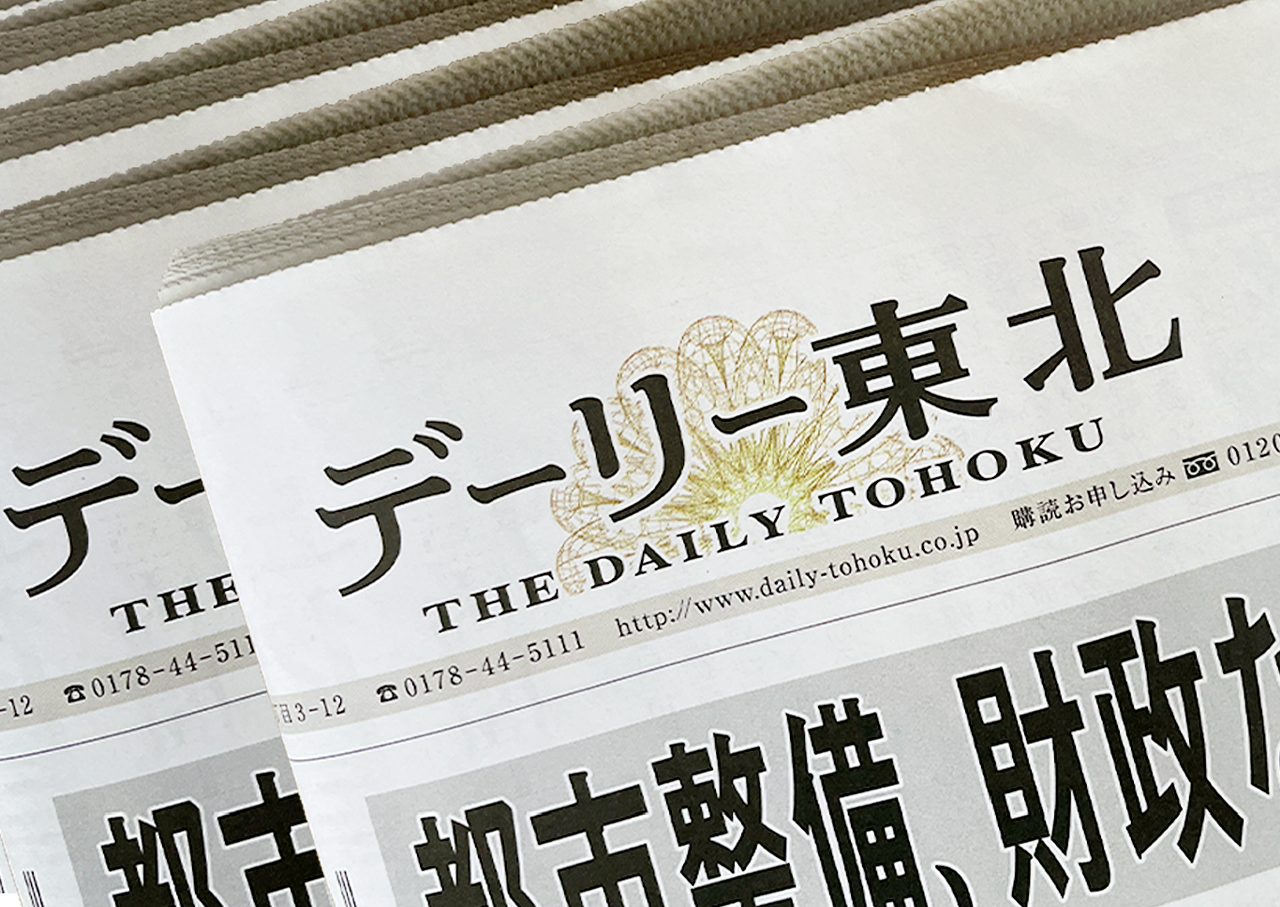
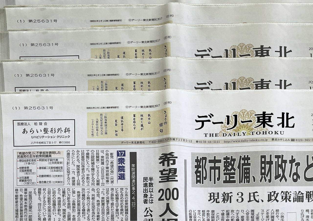
The Daily Tohoku Newspaper asked us to design their corporate identity. It was their 70th anniversary and also 70 years since World War II had ended so changing the corporate identity was very important at that time. As it was announced to their customers to promise their commitment to trusted journalism, and to be re-born as the best local newspaper, once again.Bloom again.
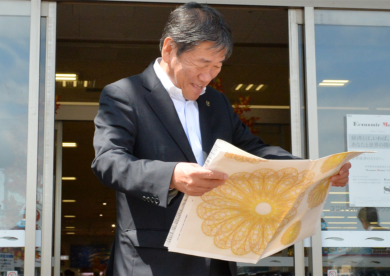
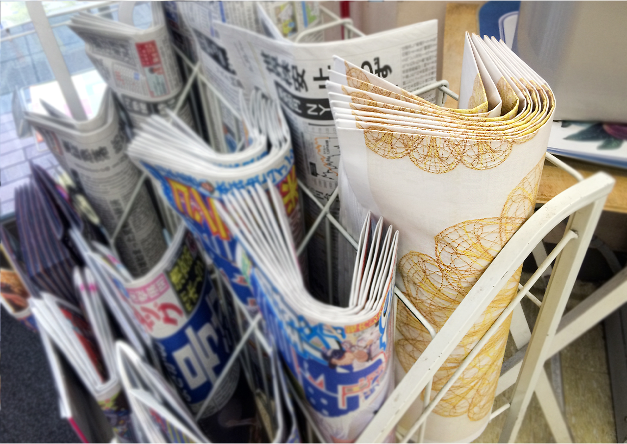
The unique logotype combined English and Japanese typography symbolising both the global and local perspectives. Chrysanthemum logo was based on a globe design and the 3D appearance was to communicate their journalism from all angles. And it showing their determination to bloom again as the best local newspaper.A wrapping newspaper advertisement that inside is a written their history and passionate spirit for the 70th anniversary as a teaser.
Year: 2014
Agency: Hochkiss
Role: Art Director/Designer
KENNEDY
-
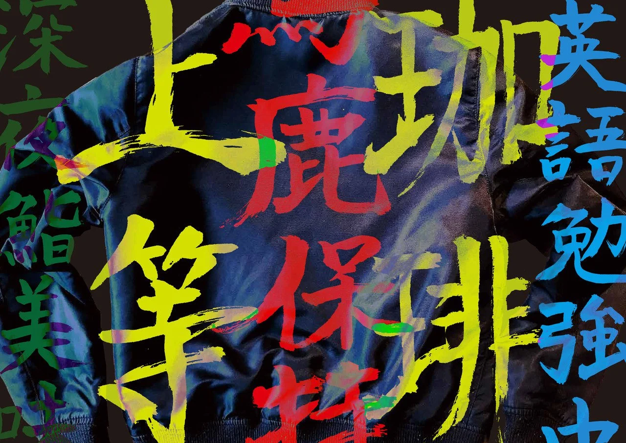
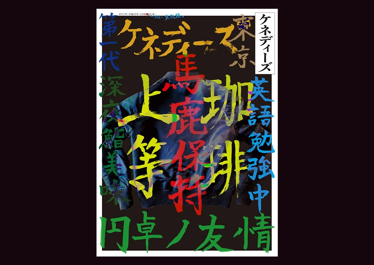
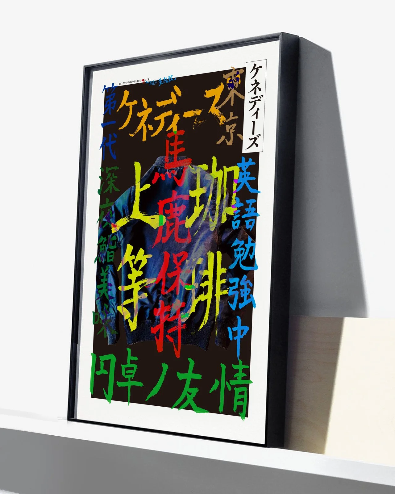
This is the printing trial that DAIICHI Printing Plc asked me to create the print design using a new printing machine that is high quality and fast speed On-Demand Printing. Designed with colourful Kanjis that are inspired from the equivalent Japanese ruff riders.
If you can’t read Japanese, that is great for me!!
Client: DAIICHI PRINTING Inc
Agency: Wieden + Kennedy
Year: 2018
Role: Art/Design Director
STREET Magazine
-
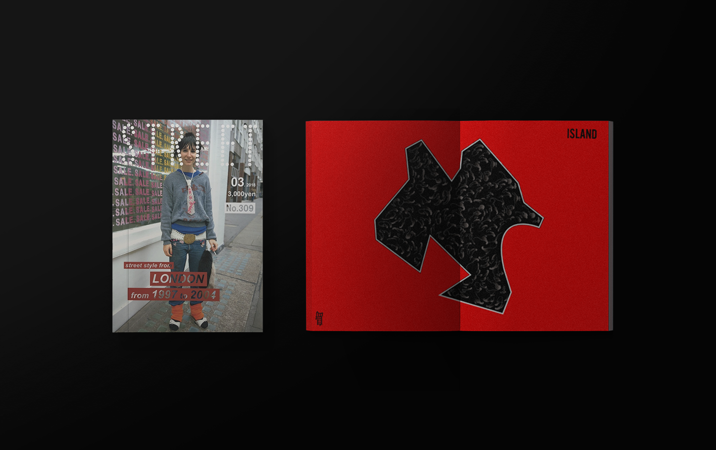
Client: STREET Magazine Tokyo
Agency: Freelance
Year: 2018
Role: Designer
